The first thing to learn something new is to try to do it yourself. This is especially true for UX and Design, as prototyping and Usability testing of the app or software is an integral part of the process.
Well in the case of Virtual Reality this may not be true. In current time the perception of Virtual Reality Technology is that it will be a very expensive machine setup with bulky high configuration hardware and tons of code to write to make it work.
This was true when the question was asked around 3–4 years back. However, today VR tech has evolved to make the hardware headset light and portable. The evolution of software and framework has reached a stage wherein you can create a VR experience by drag and drop with zero programming language.
So the first thing should be to buy a VR cardboard headset available for less than $5 and experience some of the VR apps. You’ll realize that many of the traditional UI and UX principles are broken. You can refer to the 10 Heuristics principles by NN group. Unless you know the medium you won’t be able to design for it.
Also, check out some interesting webVR apps on A-Frame — Make WebVR These do not require to install any app on your phone but to open the link in your browser. So with webVR, you’ll be able to experience VR right on your smartphone.
How to check if your smartphone is VR ready
Next is to explore some really interesting articles available online The User Experience of Virtual Reality is an amazing collection of videos from industry experts explaining their learning from VR experiments. Please refer to Design for Virtual Reality — VR
Some of the unique Design Principles of Virtual reality are as follows
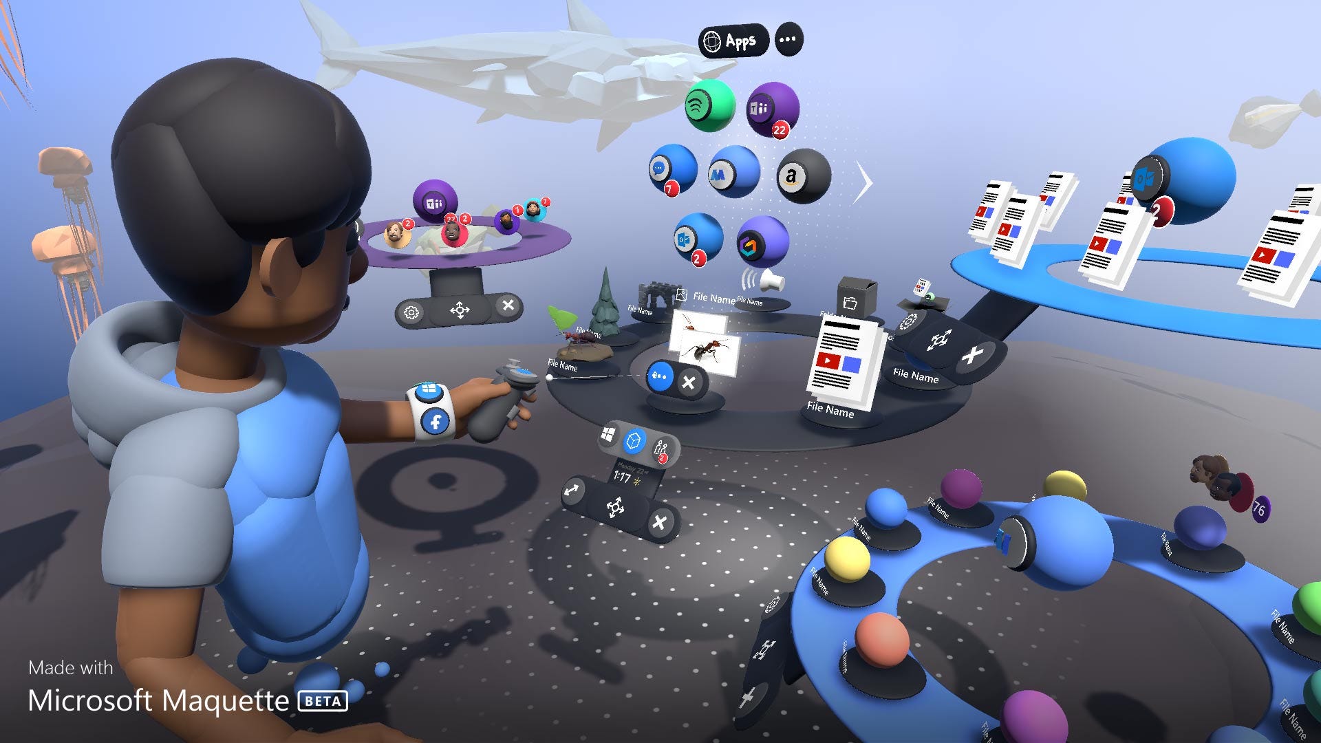
User Comfort
Since the user will be teleported to a totally new world while being shut from the real physical world, we need to make sure their transition is smooth and comfortable. Information overload either in form of too many UI panels or some cluttered room can cause confusion for the user and they will get overwhelmed. The first thing that they’ll do will be start looking around. I have experienced users just stuck to one view and looking up and down but not side ways until asked to. So a good designed UI will always make user feel comfortable and guide on the next steps.
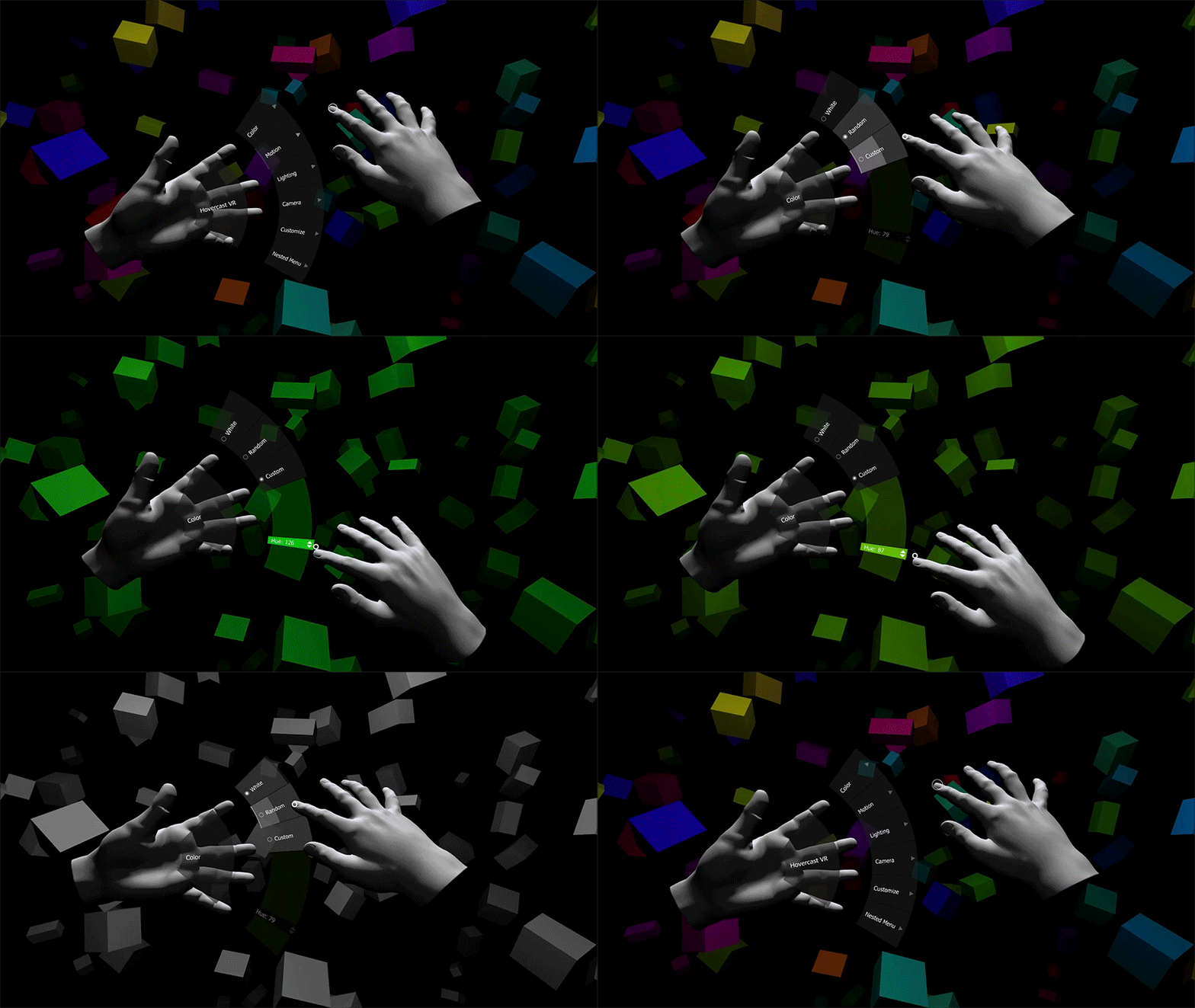
Multimodal Interaction
Traditional Flat-screen UI had only one mode of interaction — touch or mouse. However, with VR we can interact with digital objects by moving our head, arms, finger, and body. And the hardware is capable to track our gaze and speech. So understanding of ergonomics is essential
Spatial Audio
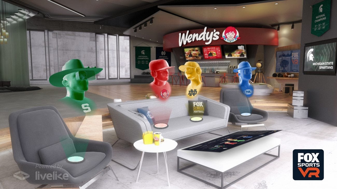
In VR we can effectively use audio to draw users attention to different places in a 3D environment. It also allows creating a sense of immersion in the space
Designing for physical space
Traditional UI used px and pts as units whereas in VR it’s all up in front of us. So we have to consider the physical and macro units like inches, feet, meter, etc.
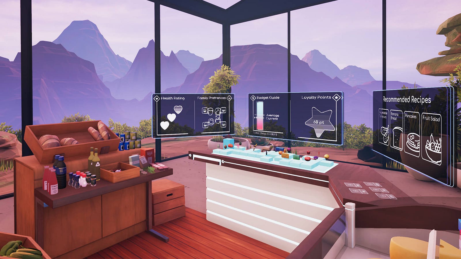
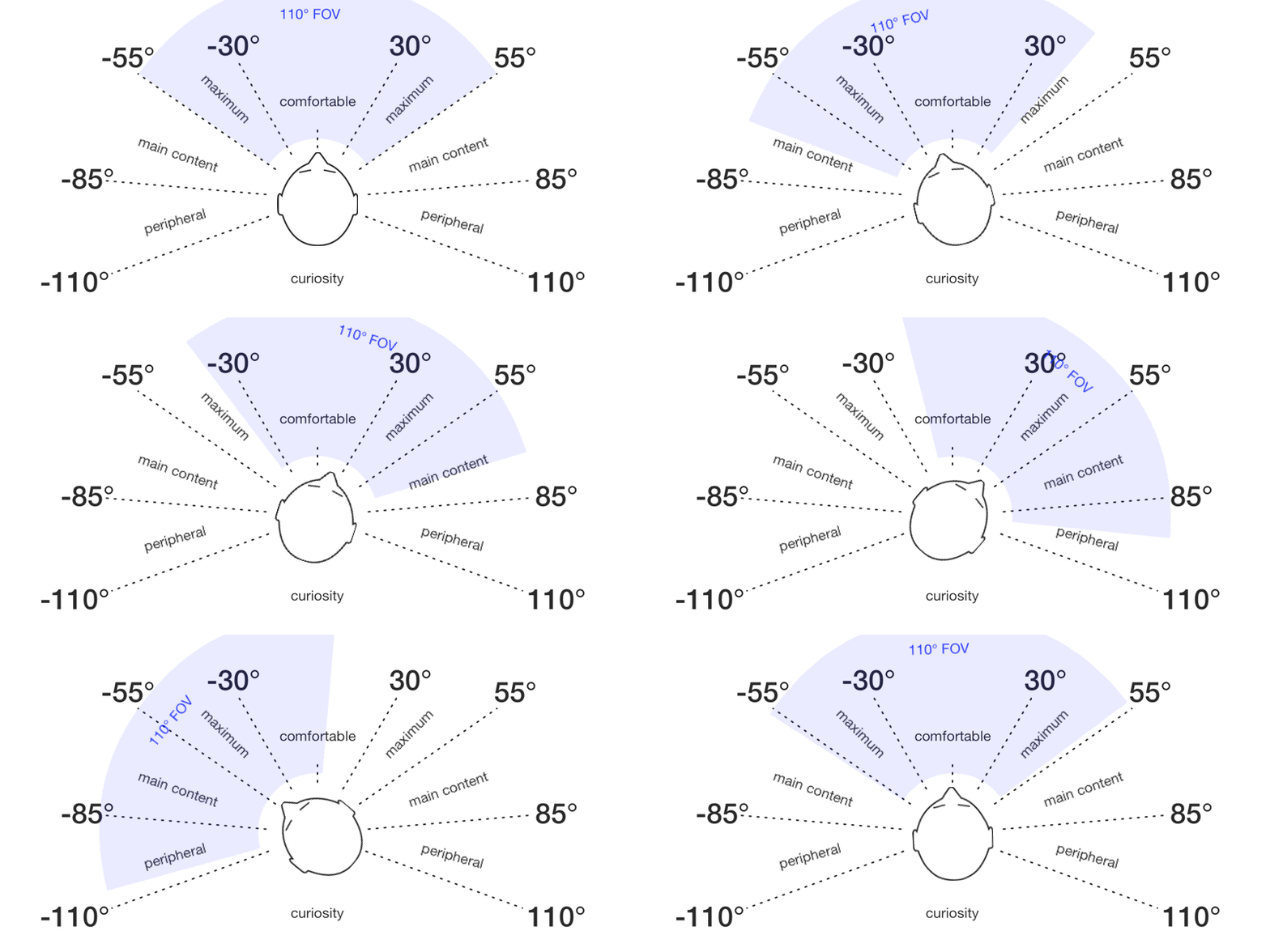
Text Legibility
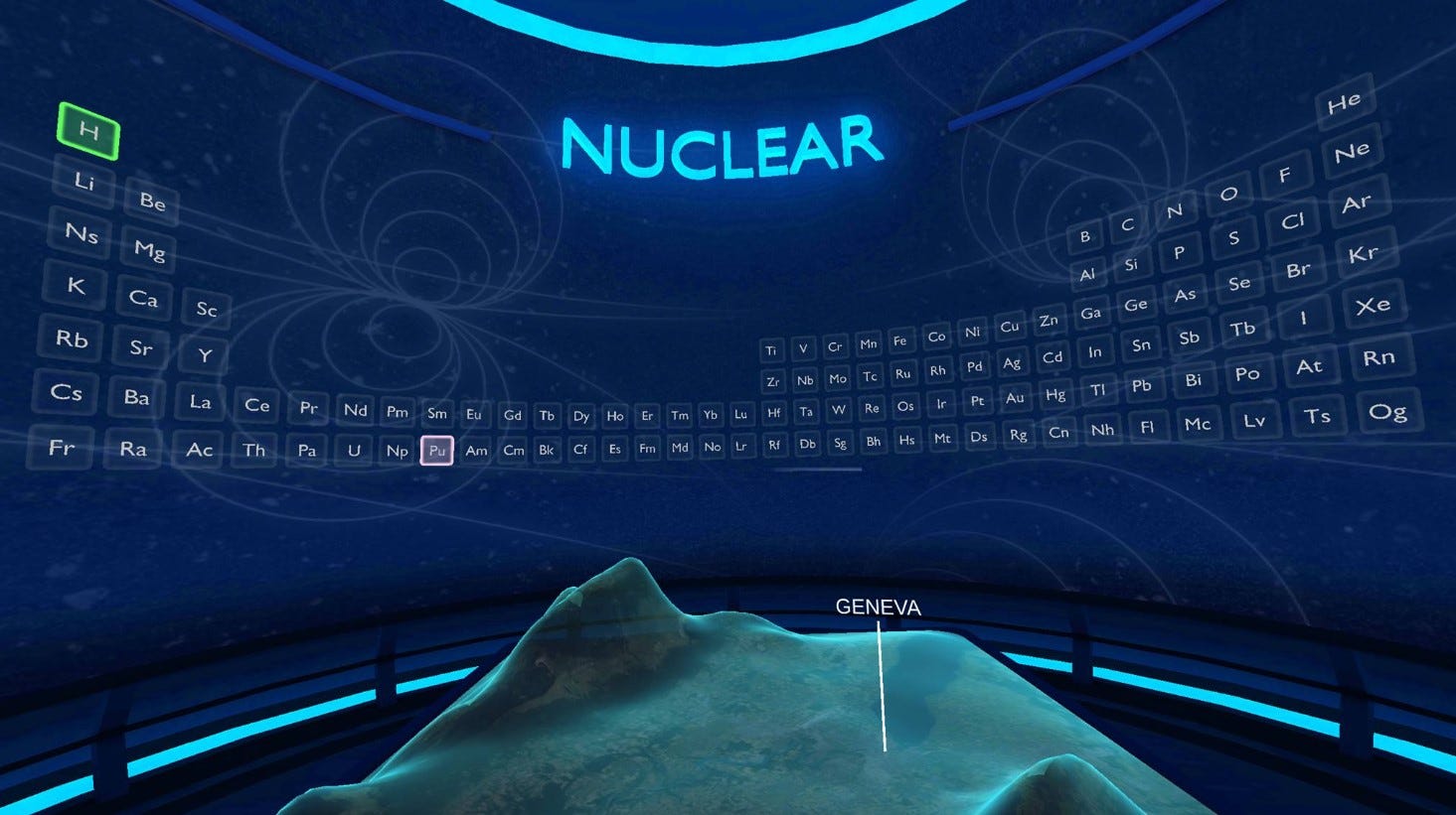
Take inspiration from billboards put up in the city. That’s how the UI will by lying around you in VR. Or it can be as natural as games wherein the actions and information are always tied to the object (it’s called Diagetic UI)
There are some interesting courses going on which teach end to the Design process for Virtual Reality. In terms of process is no different but there are a lot of new ways of working with the medium. For example, wireframing for VR is completely different, Storyboarding is different, a framework to validate the design is different.
To learn UI/UX Design for Virtual Reality using Oculus, Get mentorship from industry experts from Samsung, Microsoft, Cisco, IDF and start your career as a VR UX Designer, check out this course offered by Designerrs Lab on “Designing for Virtual Reality”.
