Make your Design Workflow and Documentation Efficient
The Story behind UX Journal
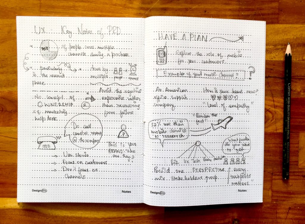
The Learning Experience Research Team at Designerrs is focused on creating an Interactive and Practical Hands-on learning experience to give a personalized learning experience to participants, enabling them to start their life-changing journey as UX/UI Designer in the industry. This team is actively involved in the training sessions, conducts interviews with trainees, and interacts with design industry experts on a daily basis. Here are some of their observations and insights from their initial pilots, which lead to the conceptualization of UX Journal:
1. Often new designers are not well acquainted with design process and methods initially and they need guidance on the flow of the process.
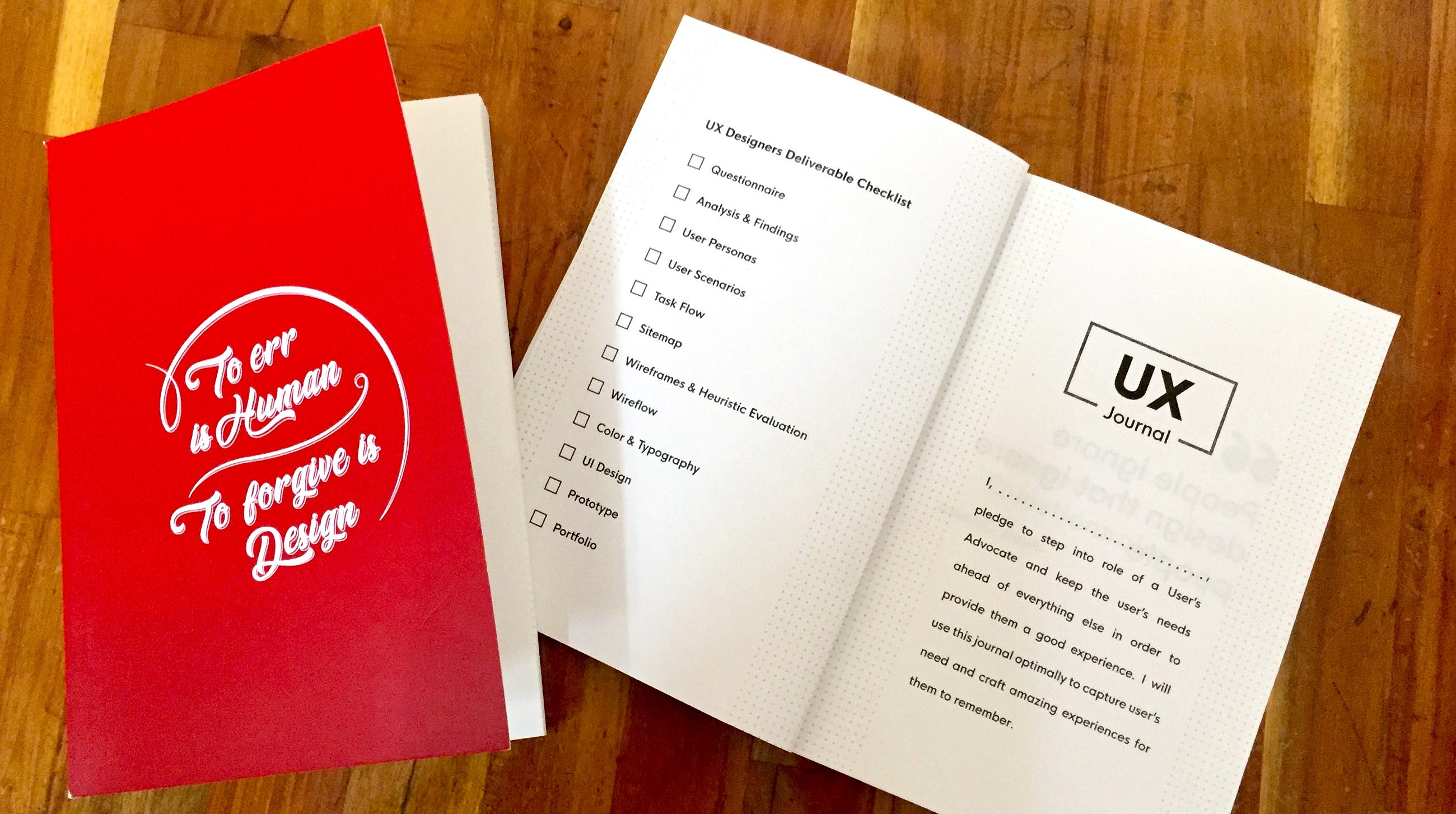
2. Designers often document their research, analysis, wireframes on UX Designer on multiple papers which makes it become difficult for them to refer to different stages especially in the case when they want to back in the design process.
3. Often designers have ideas, thoughts, insights during design discussion, capturing these are important to not miss out on important ideas.
Who can use UX Journal?
-
Design Enthusiasts/Beginners/ Students
-
Professional UX/UI Designers
-
Product Managers, Startup Founders
How to use UX Journal?
A typical design project starts with a Product Manager listing out functionalities in a Product Requirements Document in the form of user stories. Consuming PRD, the design team starts to understand the business requirements of the company and what problems the product aims to solve for its target users.
Step 1 | Preparing a Questionnaire
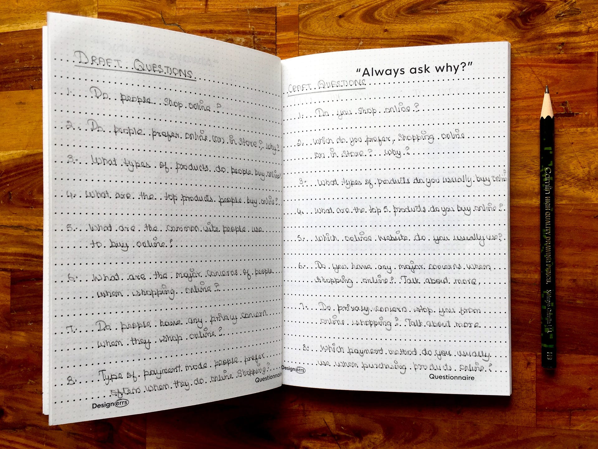
To have a better understanding of the user’s behavior, needs, and pain points, user interviews are a commonly used research method. For the same, designers prepare a questionnaire to inquire about certain specific aspects of users’ life such as their lifestyle, pain points, needs, motivation around the problem we are trying to solve.
A questionnaire is a set of questions typically used for research purposes which can be both qualitative as well as quantitative in nature. A good practice during interviews is to ask follow up questions by asking “Why” more and gather stories from users past experiences. Carry UX Journal during your interviews to refer questions in case you miss anything and to also write notes.
Step 2 | Analysis and Capturing Findings
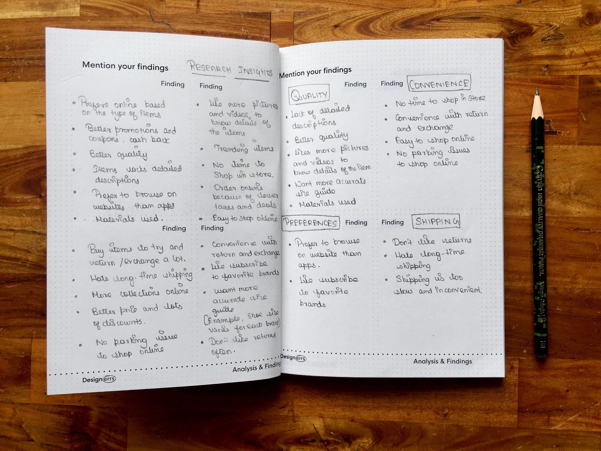
After conducting these sets of user interviews with our target audience, time to now makes sense out of our research data. Till now all our research date is randomly distributed on papers, recordings and in our mind. To gather all at one place and make it easier to do analyse, We put down all our observations and user statements on sticky notes. Affinity Mapping is a method, which
helps designers find common behaviours, pain points amongst various users so that major and common issues faced by users can be solved. In this case, we use the UX Journal to write our findings and label them into clusters.
Step 3 | Creating User Personas
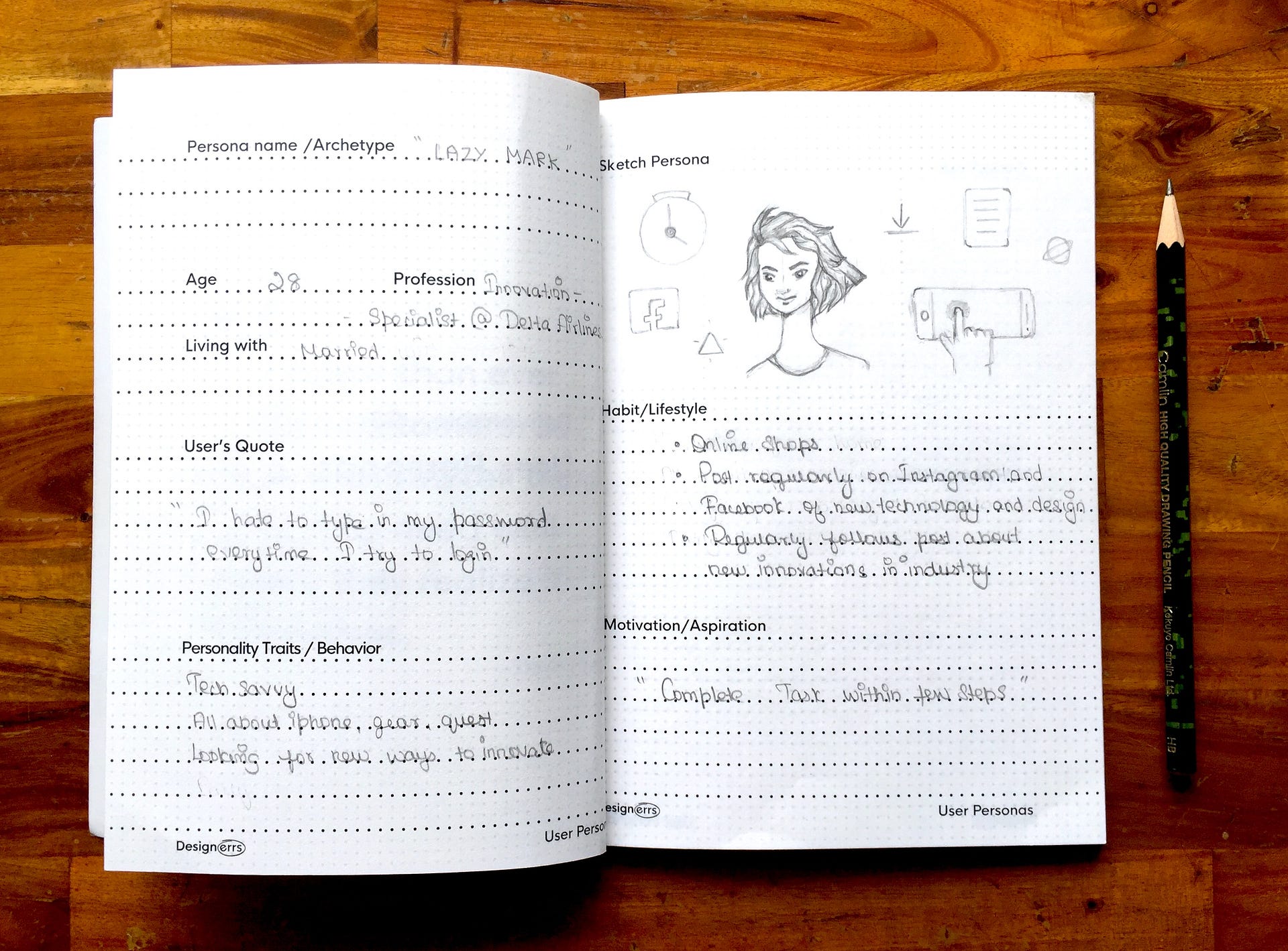
After Affinity Mapping, the patterns of behaviours start emerging which tell us more about our user groups who we are designing for. Not just the demographics like Age, Gender, Location, but Psychographics and their Personality Traits. This is the most important stage where in we document User Personas based on which all further design decisions are taken further in the process.
User Personas are the fictional characters created based upon the user research to represent the different user types that will use the service/ product/ application. Effective personas represent major user groups for your applications and gives a clear picture of their lifestyle, pain points, motivations, desires and goals.
Step 4 | Creating User Scenarios
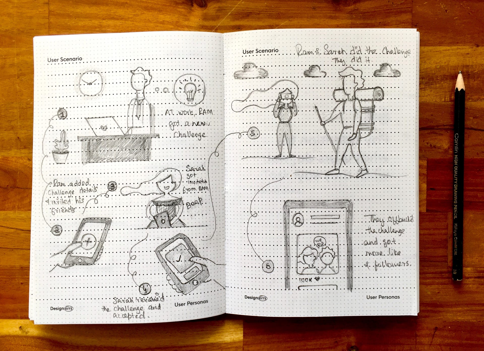
Once we create User Personas, we have a pretty much good idea about the personality traits of our users and their goals. But, what we are missing out is the situation and scenarios in which users face pain points or will be using our product. Knowing about social and environment “context” help us empathise better with our users. User Scenarios can be documented in text as well as visual format through storyboarding technique.
Step 5 | Creating Task Flows
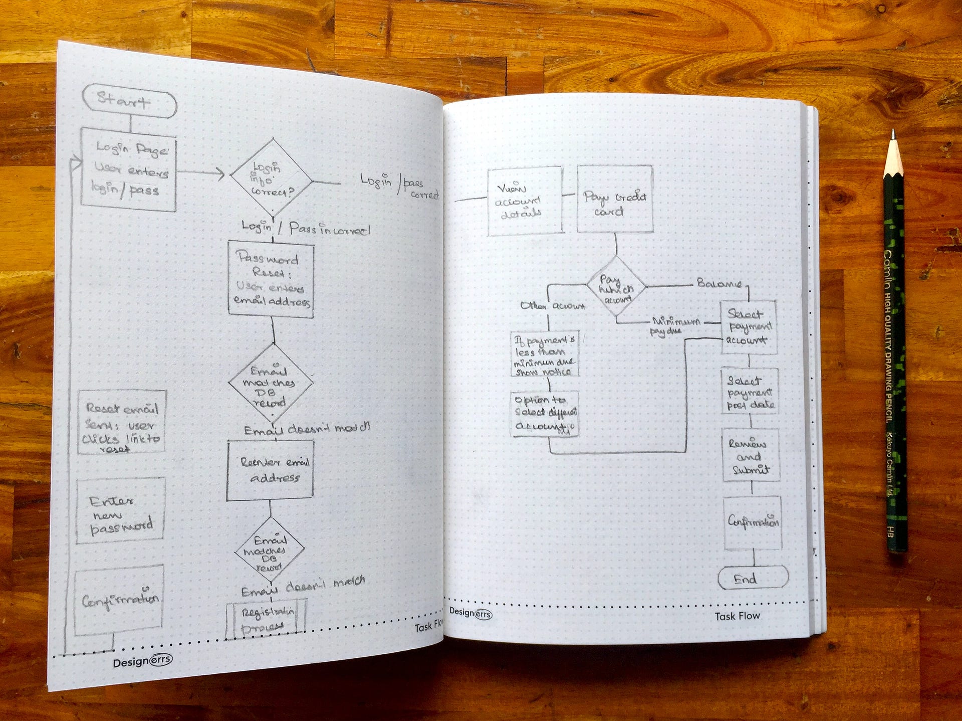
Till this point, the team has a strong and consensus understanding about the end users needs, pain points and motivations. The Define stage of the Design Process is done. At this stage, we enter to the Design phase, We start designing the interactions between the users and the application. First step here is to make sure the users should be able to achieve their goals with minimum friction. Task Flows help us focus on just that. These are simply
flow diagram, where the main focus is align these with users real life journal with offline experiences and utilise Interaction Design laws like Hicks Law to reduce user cognitive load at each interaction. (Eg. Journey of going to Super Market store is what is replicated on online platforms like Flipkart, Amazon).
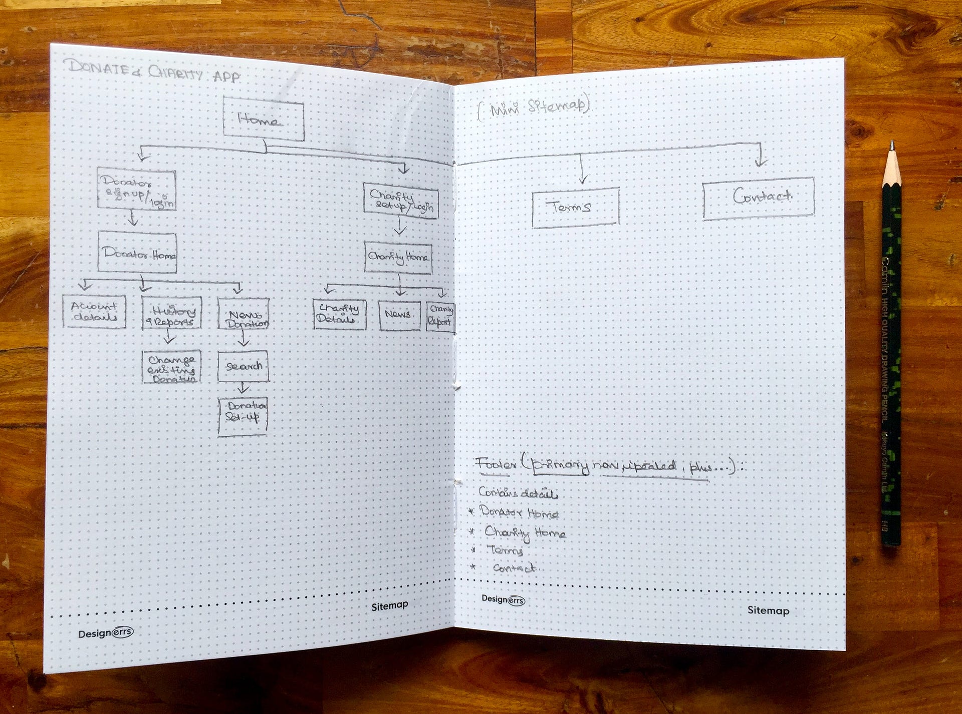
Step 6 | Defining Information Architecture
Imagine everything in your kitchen lying on the floor, without any categorisation and labels. Would it be easy for you to find all relevant information required. Imagine if all the chocolate cookie jars in the kitchen are put up at very easy access to kids. Is that what a mother wants for her kid, who is designing the interactions in the kitchen? Is it not important to put
only primary things at easy access at first level and rest in drawers or at secondary level. Similar levels of access needs to be defined in case of mobile interaction where the users have a small real estate of screen to interact, so its very important to prioritise and provide only relevant information to users, guiding them step by step to reach their goals efficiently. Creating a sitemap at this stage helps define the information hierarchy.
Step 7 | Wireframing and Heuristic Evaluation
At this stage, the structure gets converted into a skeleton. Similar to how a architect creates a blueprint of the entire building on paper before actually thinking of putting cement and interior design, a UX Designer create wireframes of their application on paper to quickly iterate. All design decision here are taken based on user personas, their needs and context of use.
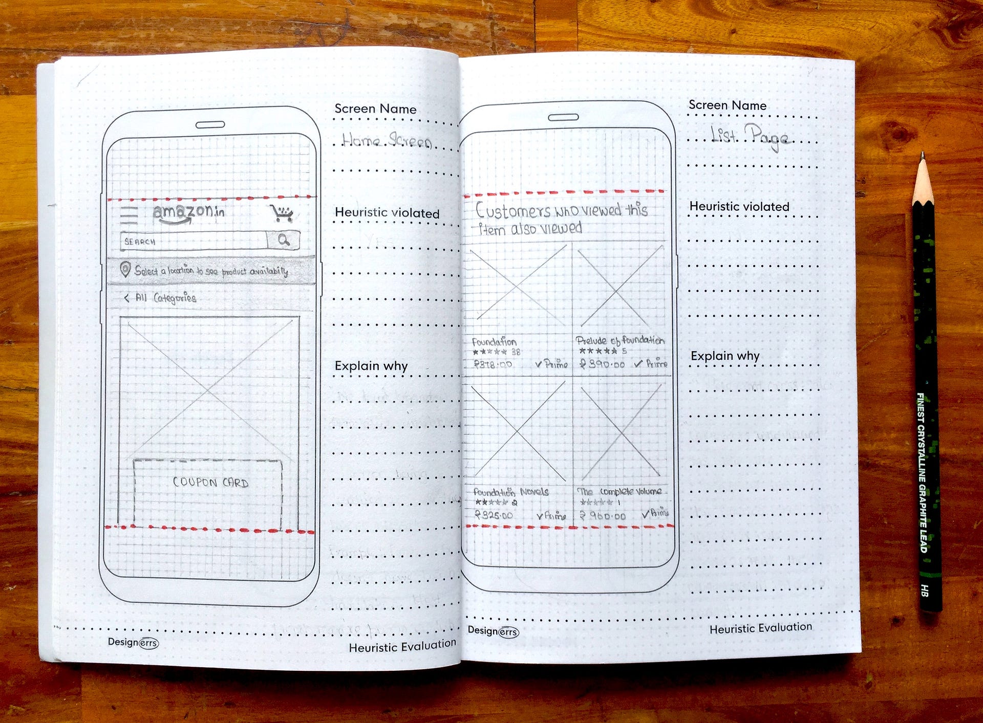
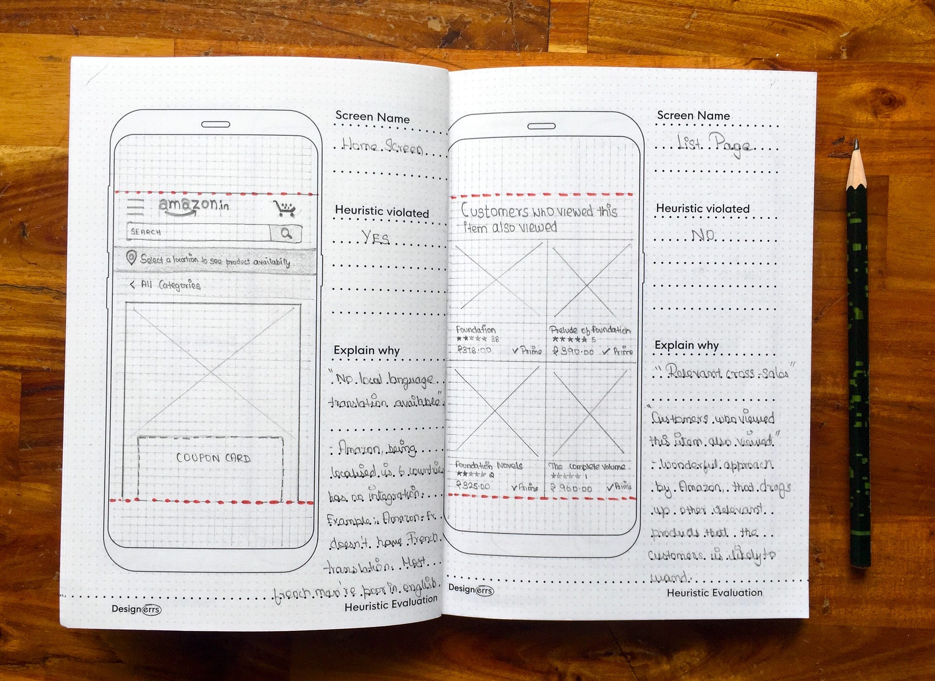
Heuristic Evaluation is a set of a guidelines proposed by Jakob Nielsen which helps designers identify the most bonehead mistakes they do at this stage. These guidelines helps designers evaluate the usability of any interface.
The UX Journal here helps you document the iterations of your wireframes and also the heuristics being violated and the reason behind.
Step 8 | Choosing Color
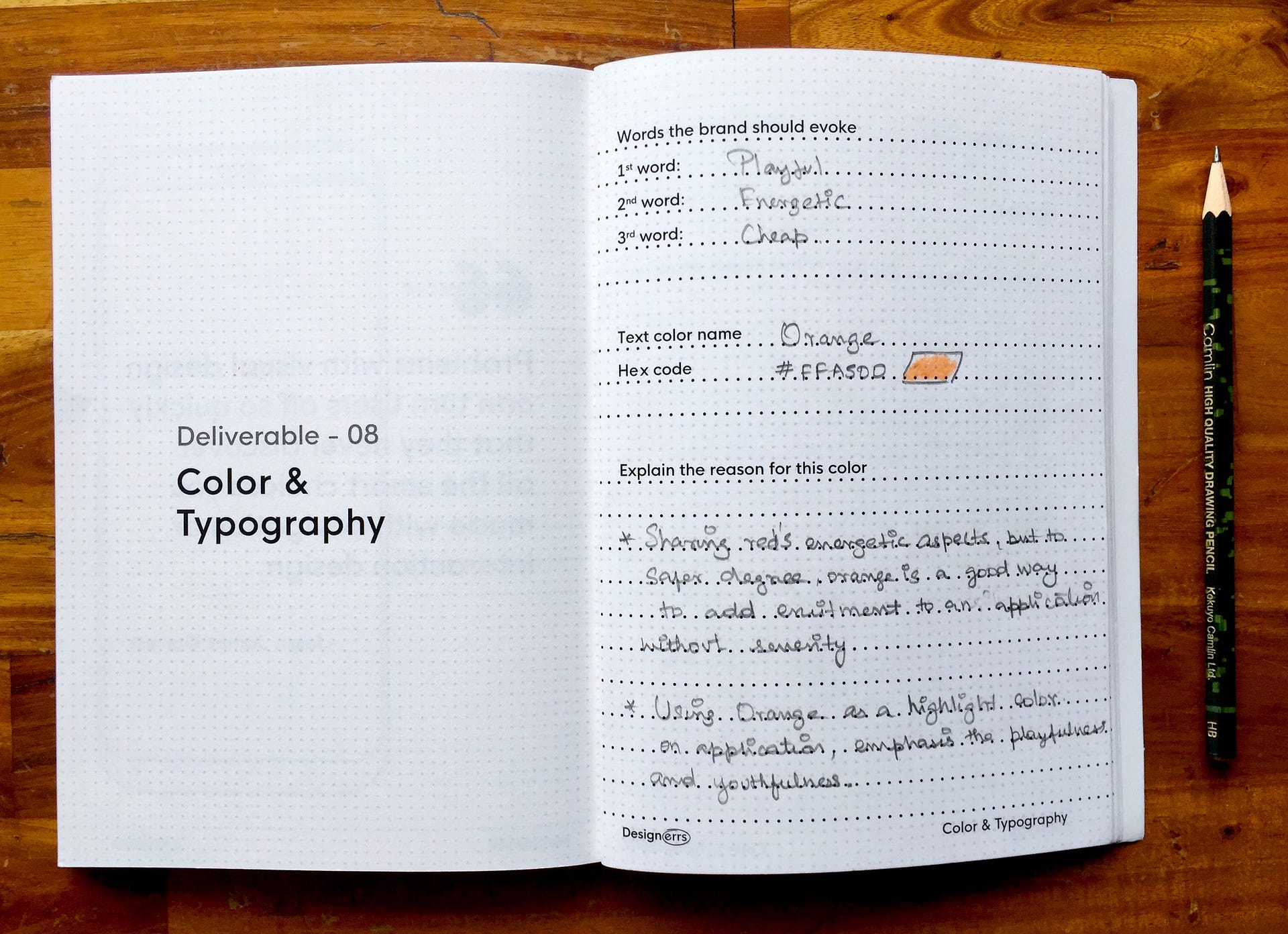
Now, when we have taken care of the usability in our design, we move towards the surface aspect of the design process, where in our focus is on the emotional aspect of the design. Different colors entices different emotions in the minds of the users as per color psychology. Colors in our application can
be used to associate our product with certain kinds of emotions and feeling which we want to evoke in our users minds. Understanding Color Psychology is important in this case. Why is Zomato Red? Why is Facebook Blue?
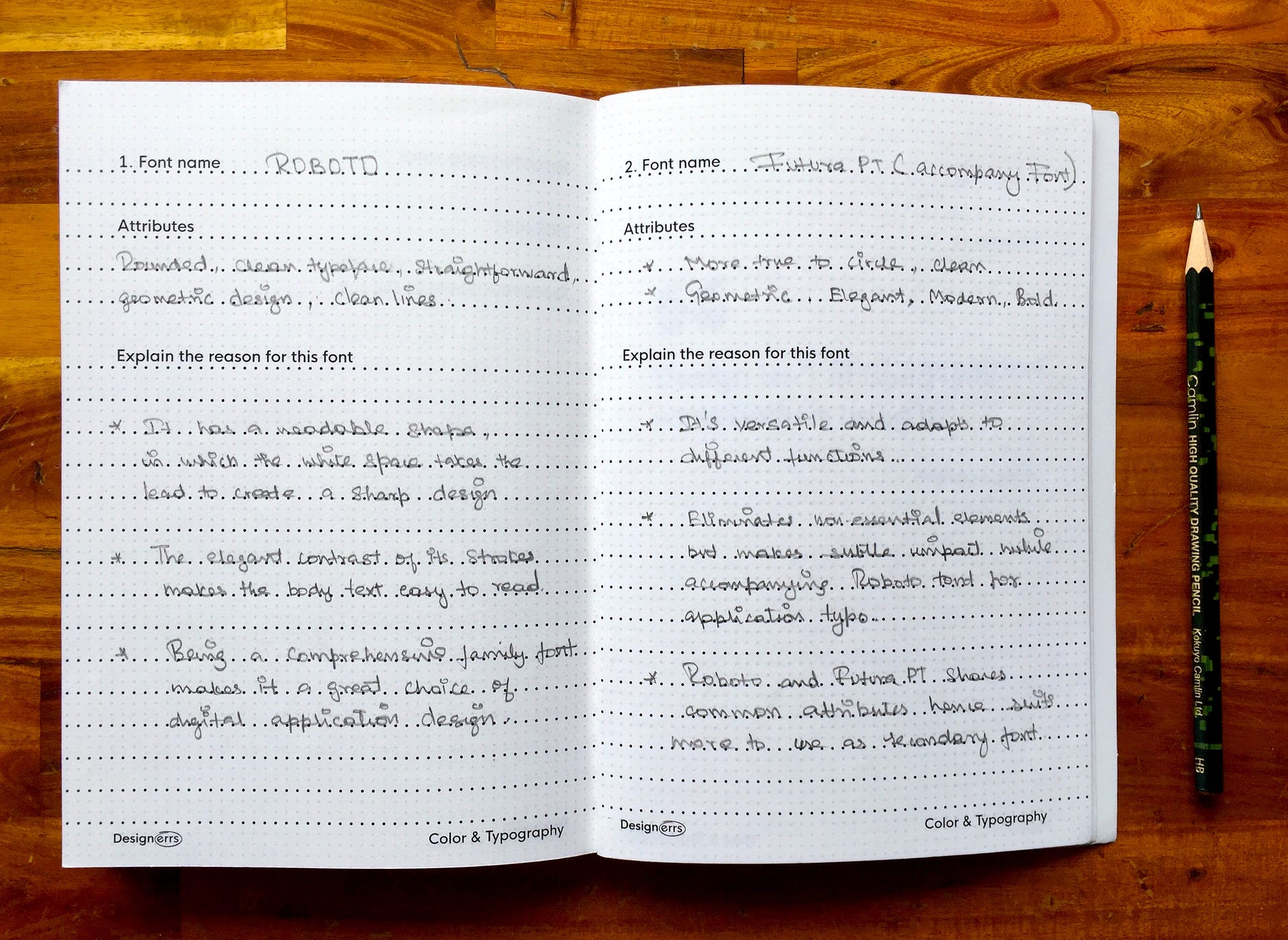
Step 9 | Choosing Typography
Typography is the art and technique of arranging type to make written language legible, readable, and appealing when displayed. We see typography all around us in real world, through which we make sense out of things. The text in our application needs to be readable for users to reach their goals faster. There is another aspect of typography which is expressive typography.
Does the Disney Logo, seems designed for children? Why? Does it use very rough strokes in the logo? Does that give an impression its been designed for kids?
After this stage, the UX Journal can be used to sketch out the micro-interactions for prototyping, sketching out the portfolio and also make sketch notes in general at the back.
To know more about Product Design, Design Thinking, Immersive Design, check out articles in Designerrs Blog written by Design Industry Experts from Samsung, Microsoft, Cisco etc. Check our different UX Case Studies completed by trainees using UX Journal at Designerrs Academy.
If you found that the UX Journal will help you become more efficient in your design workflow, get one here.
