Over the past 6 months, I have been collaborating with Clairvolex, an IPAM (Intellectual Property Asset Management) firm, we have been working on 4 different and amazing products, improving efficiency in a complex system.
IP assets are valuable to companies, it gives a strong market position and competitive advantage. And an IP Asset Management system streamlines tasks and delivers comprehensive reporting to manage their IP, tools provide a data-driven performance and further, analyzing productivity metrics to identify areas for internal improvement.
An outcome — Higher profit or returns on investment.
Need of UX
An analytical solution needs to factor in a lot of design efforts and make sure it provides the best possible user experience (UX). Your end users should find the experience effortless, allowing them to interact with data in ways that they find intuitive. It’s easier to say than done.
“Tesler’s Law, also known as The Law of Conservation of Complexity, states that for any system there is a certain amount of complexity which cannot be reduced.”
When you are designing for enterprise products, you cannot reduce the number of features or simply do away with complex use cases. Will an airplane-flying experience become better for the pilot with only a single lever for take-off and landing?
Instead of reducing features this was the opportunity to improve information architecture and prioritize.
Define your user and everything around
If you are familiar with UX design, the need to research extensively into user requirements will not be lost on you. But, when it comes to B2B, you need to understand the user, user needs and user’s business. Getting familiar with the business helps to understand what is needed and how we can create efficient flow in the business.
Our users have many different levels of skill, experience, and understanding. They consist of managers who want to get a better understanding of the business, to clients who want to look under the hood to find out what business strategy to use through analysis.
What is the content?
With the need to make big data more accessible to the user, he/she should have an immediate view of the data that they need to monitor or interact with the most. This will differ from user to user, simply observing their experience and their context.
In seeking UX insights through user research, some essential questions to answer include:
Which should be the key metrics visualized to help users make decisions?
How will different stakeholders (execs, managers, analysts) be using the data?
Will the data be displayed primarily on large monitors, or on mobile devices?
Do users need to monitor data in real-time?
To what extent will users need to interact with the data presented by the application?
Next, we need to understand how these data benefits the user and working closely with data science to create a shared richer understanding of users. Teamwork helped in crafting the questions we ask, analyzing the data, and generating insights. Besides qualitative studies, as the product already exists, we evaluated the product, and does business needs more data to inform its business strategy decisions or to improve an existing design. Through both studies, we can find new patterns that were previously hidden and access information.

Mapping it out
While we gained our data from qualitative and quantitive studies, we get on our tools and map out our strategy. Data places us firmly on the side of what our customers are actually doing, and that’s more important than what they say they want.
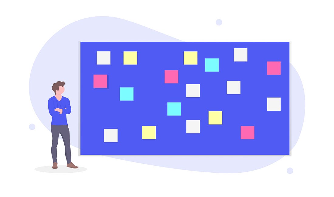
I kept my findings on sticky notes and created a map to understand the relevance and importance of every element. Considering different users in different roles, their needs, and understanding, it gives a big picture of what kind of data should be accessible and in what priority.
A lot of time may spend here in discussing internally to frame the relevance and importance of every element. In addition to this, neither software developers nor managers (unless they happen to be the people who will use your solution) are guaranteed to know what users’ real requirements are for a big data UX, and there is absolutely no substitute for time spent “observing” how users work, rather than simply asking for their views.
User Stories
Through research, we observe our user’s mental model and tools. Understanding their patterns and more important than what they want. Getting our team on well-versed user-centric practice, as UX designer we play the role of an advocate to our user.
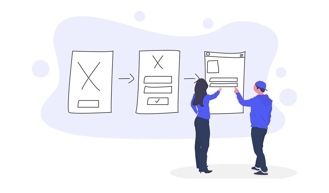
Creating user stories is key which helps us throughout the design process. This technique brings our user to life, there are personas and the journey which maps out the needs and wants, helping us to align our solution in the process. Most importantly, it helps us framing solution and justifying in internal discussions with developers and managers.
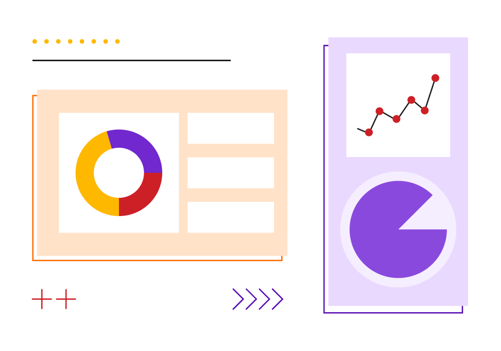
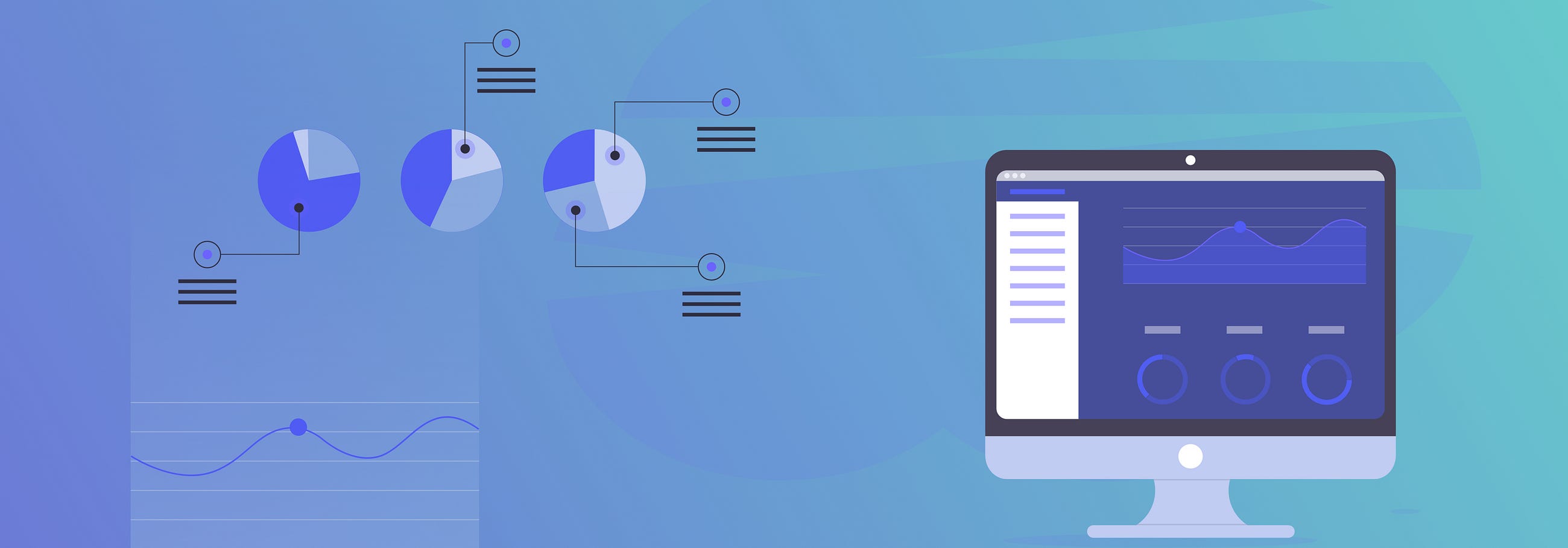
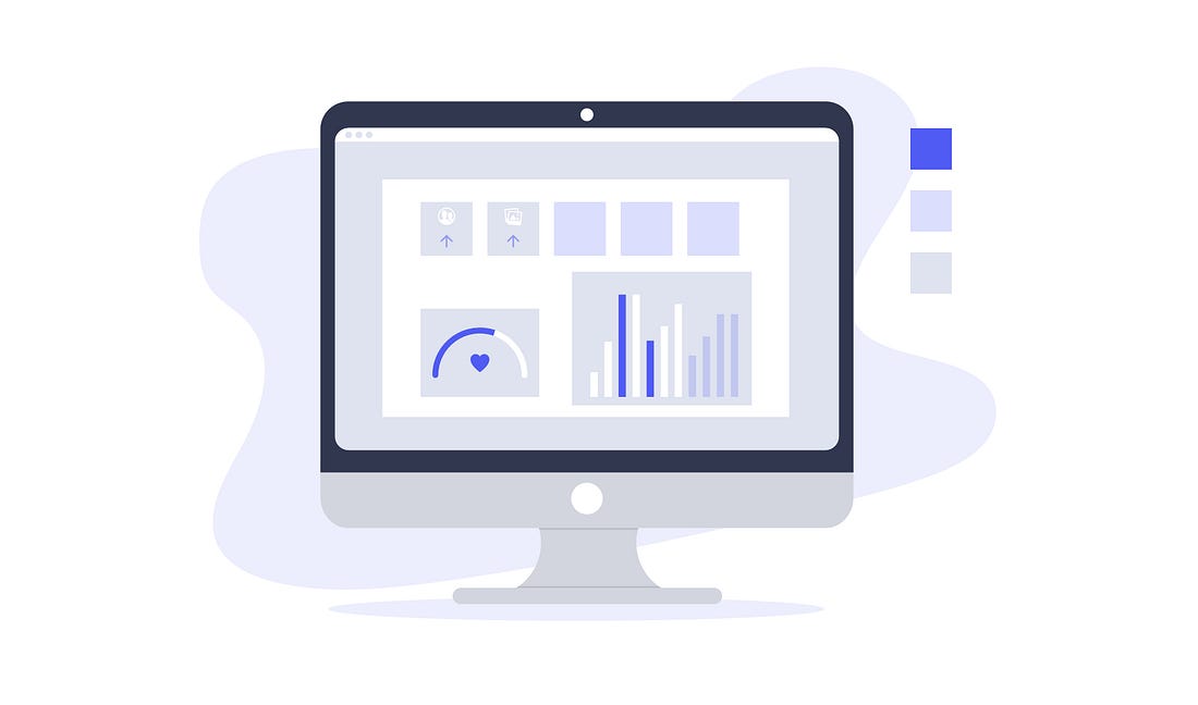
Data Visualization
Data visualization is a presentation of complex data in a visual way allows people to more easily comprehend and make sense of a big data set. Data needs to be prioritized to display key metrics the user needs. The complex data is understood easily because the human mind use visualization to convert cognition to the perceptual system.
Creating a hierarchy of data shows the data in a relevant way for decision makers. You can sort highest to lowest to emphasize the largest values or display a category that is more important to users in a prominent way.
Designing data visualization is not just about the visuals, but why those visuals matter in the data analysis process and how they can be of actual use for the user. For example, line charts are used to display trends in an interval of time, but to compare between different groups; a bar chart is used. For in-depth analysis, there are varied types of charts that make complex data easy to understand and analyze.
It is important to choose the right type of chart for accurate data analysis (you can’t have 2 pie charts for comparison, interpreting data becomes difficult) and drill deeper into their data in order to make better business decisions. But also keep in consideration, not all users needs are equal. One of the challenges of designing a data visualization tool is making it intuitive to use for anyone.
Keep the design simple, coherent and avoid distortion like a pie chart in 3D.
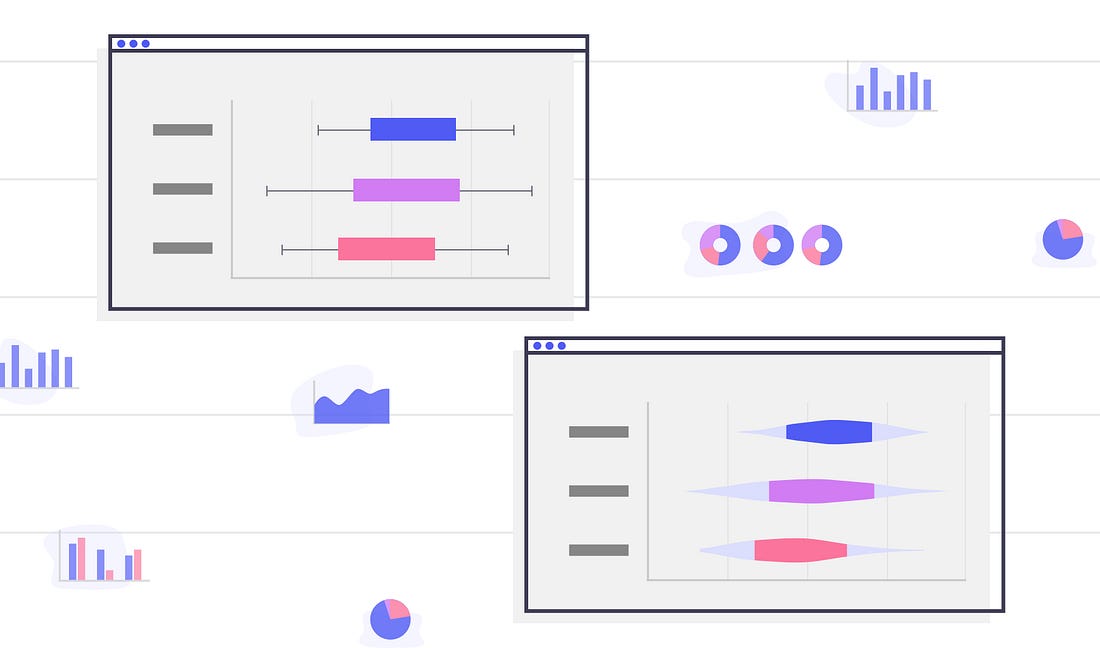
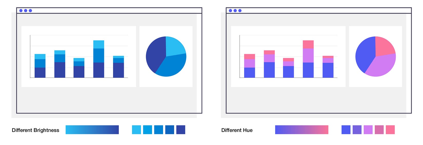
Data in Colors
Finding the right color palette for data visualizations to create consistency in the implementation of data visualizations and brings harmony to the product. It makes the content more approachable and understandable. Color implemented incorrectly can distract from the content and create confusion in the meaning.
We need a palette that offers at least five colors, flexible enough to present complex data series. Color decisions are not separate from other graphical decisions. A color palette needs to be harmonious, maintain visual consistency in saturation and color have a meaning, for instance, colors like red and orange which usually indicated errors. Colors should be used appropriately in consideration of what the data means.
Gradient palettes, with different hues and variation in brightness, can distinguish between data and also it is aesthetically harmonious. Colors can be strategically extracted from these gradients to produce a visualization that feels natural.
Usability is everything!
Gathering feedback from your users is a crucial part of any design process. It saves time and money and reduces the risk of building a product with usability issues. The benefits of usability testing are thus easy to understand and will lead to relevant results and improvements.
“UX testing process — it is an integral part of putting together a functional product on the market.”
Prototyping offers a way to test and is product fit for purpose. This provides you with insight into the functionality of your design and any changes needed in order to make your work a pleasure to use.
It is the first part of the process to test functionalities and experiences. For example, Is the navigation clear? Is the graphic or button well emphasized and noticeable? With how much difficulty the user is able to use the feature? Based on the user’s goal, pinpointing what works and iterations justifies the product to better user experiences and higher the return on investment.
Well-defined task and questions will help the user going through the product and measure the hindrance and improvements. Most importantly, the participant needs to be as close as the people who will be using the respective product, as possible. Testing can be moderated or unmoderated, a participant can be in remote areas. Findings from the result should be documented.
Screen recording and video recording. It is very helpful especially participant is in a different location.
Audio recording. Record your participant feedback about the product.
Take notes.
Based on your findings, you can prioritize the solution what will work the best. It is best to collaborate with the developers to come up with viable fixes. The most effective solutions are the ones that can address multiple issues simultaneously.
Users cannot interpret and use raw data to inform a decision if they do not make good sense of it and how it is presented. The purpose of UX is to improve the user approach towards complex data, these insights can drive powerful content strategies that ultimately help put our user miles ahead of their competitors.
To learn more about Design Thinking, UI/UX Design and Product Design, follow Dschool and Designerrs Lab stories.