A monotonous 9-hour job (for some more than that) and commute through traffic takes a big chunk of your day. Also staying fit is important for our health and mind. Chronic stress, sedentary lifestyle, sleep problems, and whatnot. These are not the only problems of urban. One of the possible solutions is, and already adopted by a lot of cities all around the world: increase rates of urban cycling!
PEDL by zoomcar is one of the cycle sharing providers and we worked on the redesigning its user experience for creating the perfect cycling experience.
My Role
Initial analysis of the existing app.
Conducting User Interviews and User Testing.
Synthesis and analysis of key opportunities, identified through the research process.
Created wireframes throughout the iteration stage.
Clearing out the myths
Cycling is only for fitness fanatic — Cycling is good for fitness and shreds some pound, but most of the user of cycle sharing app don’t do excessive cycling and don’t own a fitness band. Users cycle on their own time in their own pace.
You’ll arrive at work hot and sweaty — Going to run some errands or going to work is not the same as going to a mountain. Cycles are efficient and service is economical. Cycle at a steady pace then it’s no more taxing than walking.
Kickoff: Roaming in the city
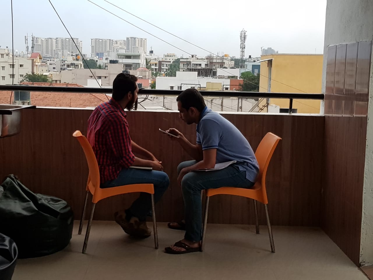
There are lots of cycles parked at PEDL station, available in a convenient distance. I went around to explore how the cyclist was getting around. I prepared a questionnaire to conduct user interviews, talk about their stories and observe them in the natural environment.
Early Insights
I had conducted 5 interviews in the city and more 8 by my fellow designers. Our goal was to understand the challenges our users face throughout the journey from locating a cycle station to reaching a destination.
Besides the user’s pain points, we observed their behavior, usage patterns and scenarios in which they were using the service as well as their expectations.
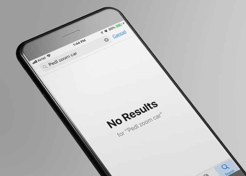
Finding the App
The user came to know about the app from their friends or noticing cycles nearby but the app name is hidden inside their parent app, which is difficult to find.
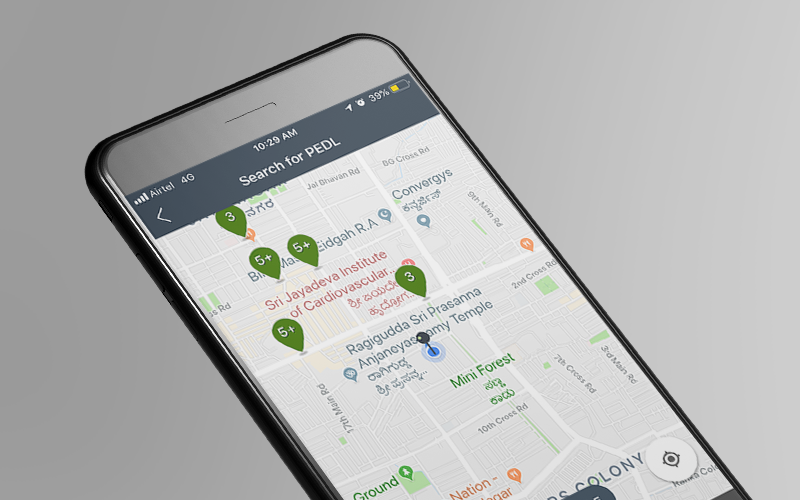
Navigation to the cycle station
The user didn’t use navigation as he/she knew the location. User preferred the service because the cycle is available nearby.
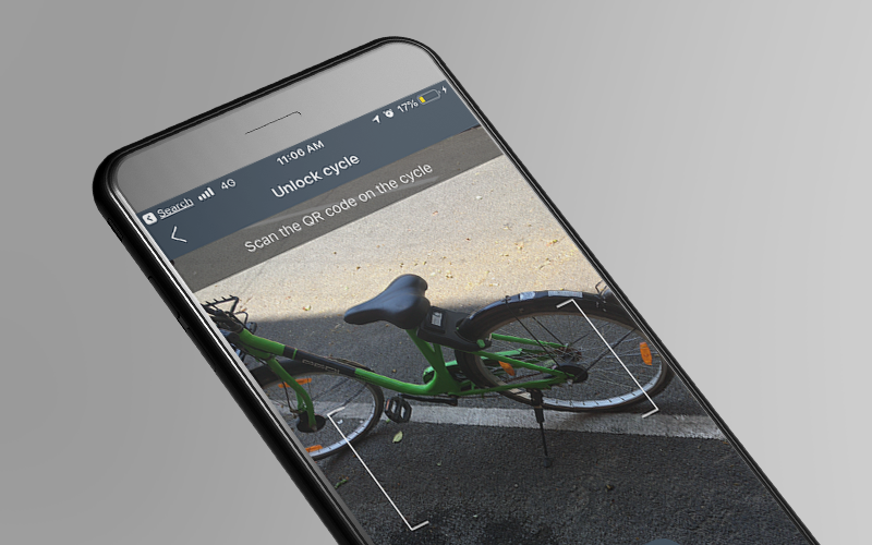
Unlocking Cycle
Most of the user face difficulty as cycle didn’t unlock immediately but they were charged for the trip.
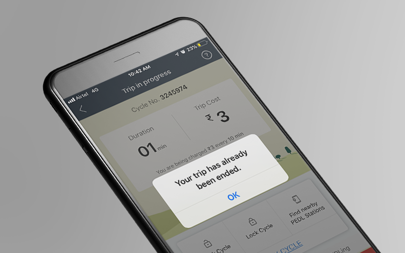
Ending Trip
Finding cycle station was difficult while cycling. The user had to multitask finding nearest cycle station to their destination.
“We like roaming around at night. HSR roads are good and lighting is good, though not safe, but there is lot of greenery. So we used to cycle around lots of greenery with lights and trees you get that breeze”
-by one of our interview
Discovery: Needs and Expectation
Empathizing through 12 semi-structured user interviews gave us lots of user stories and now it was time to make sense out of this data.
What we discovered from user interviews and their behavior, started creating a pattern. Users expect to experience with minimal effort. Pick-up cycle, roam around and back to parking station. But all trips revealed some extra effort –
Nearest cycle matters
Cycle found damage after unlocking
Back and forth from Google Maps to PEDL
For the commute, not just fitness
Reframing the problem
Cycling boosts your mood, makes you feel calm and healthy. But it has been not the same experience in availing cycle sharing service. Easy commute got difficult in search for PEDL parking station and more frequently discovering ill condition cycle as there is no option to report damage cycle.
“How might we help a user to experience hassle-free cycling, with tackling extra efforts, the user gets into?”
Our cyclist (Personas)
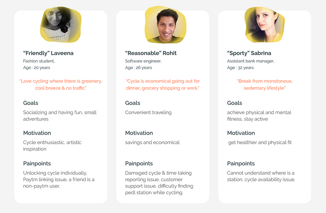
Using Affinity Mapping, we were able to find patterns in user’s behavior, pain points and had a deeper understanding of our end users. Based on the patterns identified we created User Personas which would further help us in the overall project for taking every design decision.
The Redesign — Introducing Velon
In an age where everything is demanding your time, Velon gives your time back by making your cycle experience fast, effortless and calm. Velon makes decisions for you locating the nearest cycle station. Using NB-IOT and Bluetooth for cycle lock making 95% accuracy in unlocking cycle. Seamless experience in finding a station and reach your destination. But how are we doing it?
The Thought Process
Nearest Station
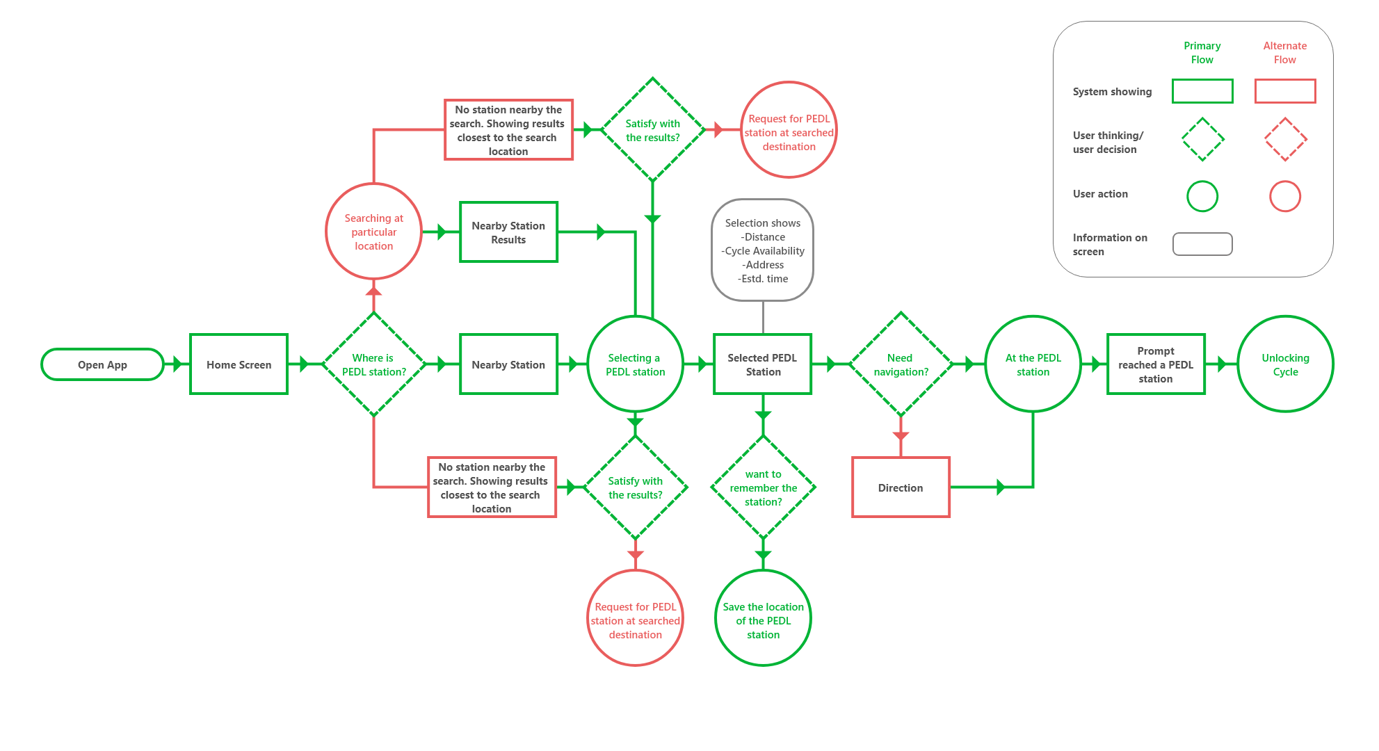
Our research indicated the user looked for the nearest cycle he/she can avail. They didn’t bother looking for other parking station. Navigation was only needed when the user didn’t know the location and that was mostly for first time user or when the user is at a new location.
For group cycling, Unlock plus 1
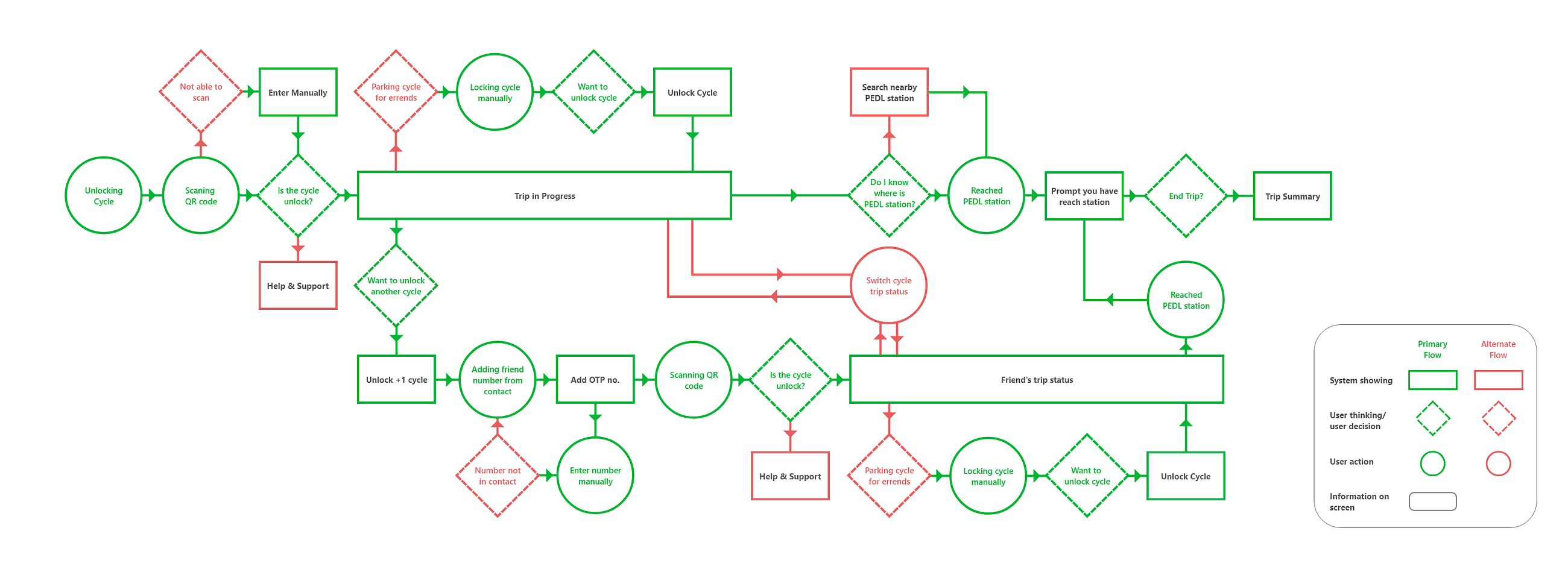
Out of our interviews, we noticed a pattern that many of our users, cycle in groups and some of them accompanied by their friends or relative who aren’t a regular customer. But to avail cycle, every user had to go the process of downloading the app and sign up, even for our secondary or tertiary user.
We ideate a new feature, where our primary user can avail cycle for one of them. Improving group cycling simpler for our primary user and giving a chance for our secondary and tertiary to have experience of cycle sharing service.
End trip offline
The purpose of using cycle sharing has been primarily for commute and secondary for fitness. It wasn’t the user who mentioned in his/her pain points regarding the mobile battery but we observed, that user is mostly on the move from work to home or getting errands done, mobile is not necessarily charged.
To improve a hassle-free experience, we went further, in a scenario where the user doesn’t need the internet or even mobile to end his/her journey. The user can simply park the cycle at Velon parking station and leave it. Within 10 minutes app will recognize the user’s cycle is not being used for a while and it will end the trip for you. The bill will be calculated moment the user took the cycle to the moment the user reached Velon destination.
From B&W to Color
Moving from structure to skeleton, the product is getting visibility, an idea is getting into motion and the prototype is ready for validation. Between-task flow and creating wireframes, we made a content inventory which also helped in forming information architecture and all the puzzle pieces started coming together into wireframes.
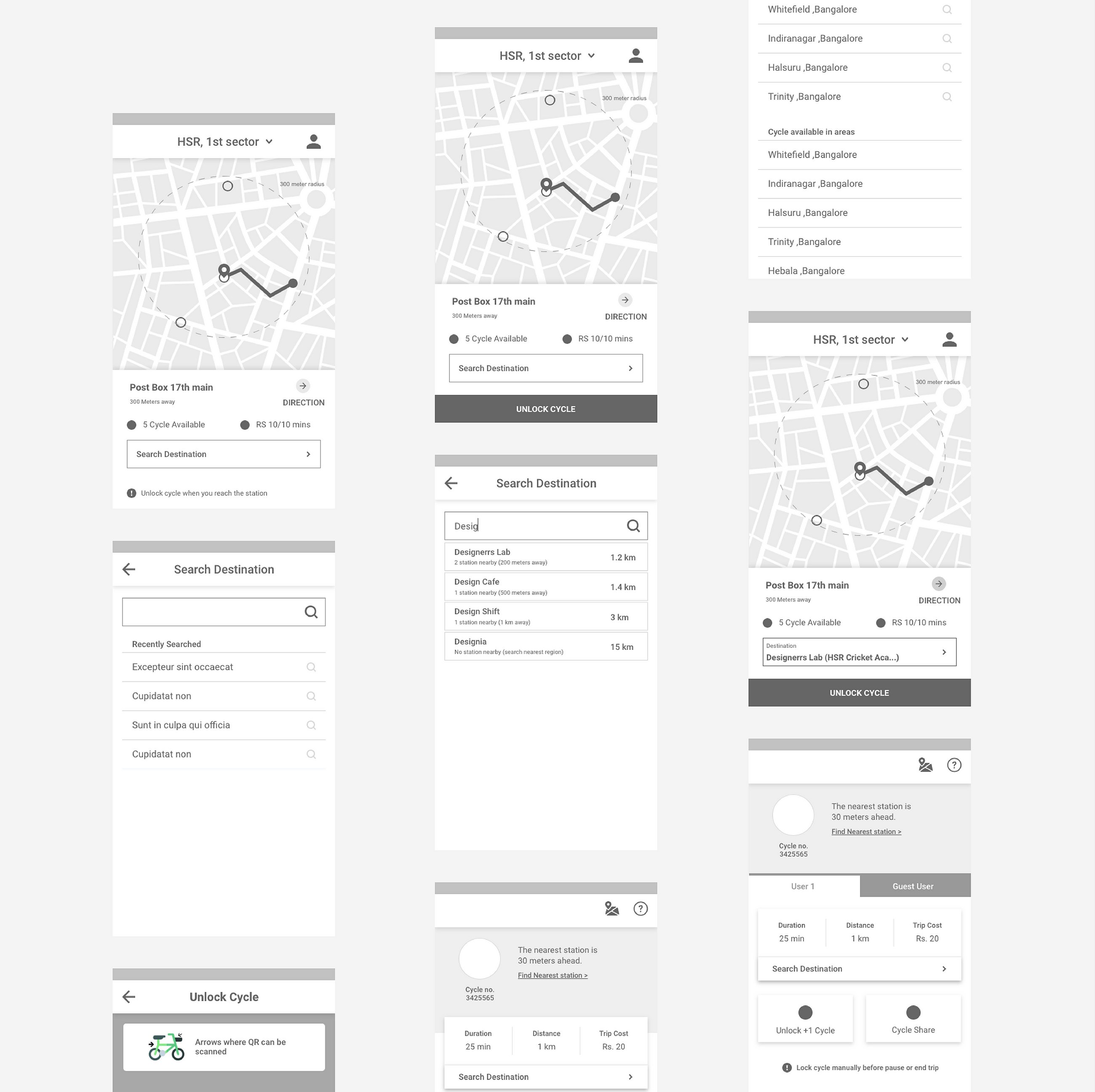
The validation & Iteration
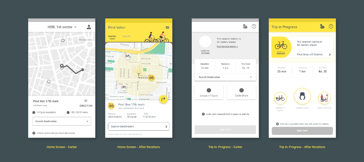
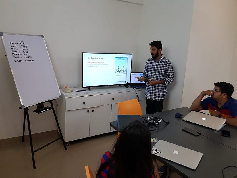
No one can get the product right at once. After an idea is implemented, the next step is validating with your users. If you think about the way people behave, and in particular the differences between the way that say they will behave (in any given circumstance) and the way that they actually behave in that circumstance, you will know that the two are rarely the same thing.
“It is useful and allows for rapid resolution of misunderstandings and established clarity in the early stage.”
Home Screen: Through user testing we discovered, while showing the nearest station, we need to inform the user why is the chosen station nearest. A better way of displaying the nearest station.
The solution was creating a tab titled ‘Nearest’ and ‘Search’, much simpler way for the user to understand where the station is and the user can search around anywhere in the city.
Trip-In Progress: The first issue we noticed in testing was, the user looking for a destination and other user looking for nearest parking station has similar goals, so we could have a single button with a better label for both users can understand.
How it looks
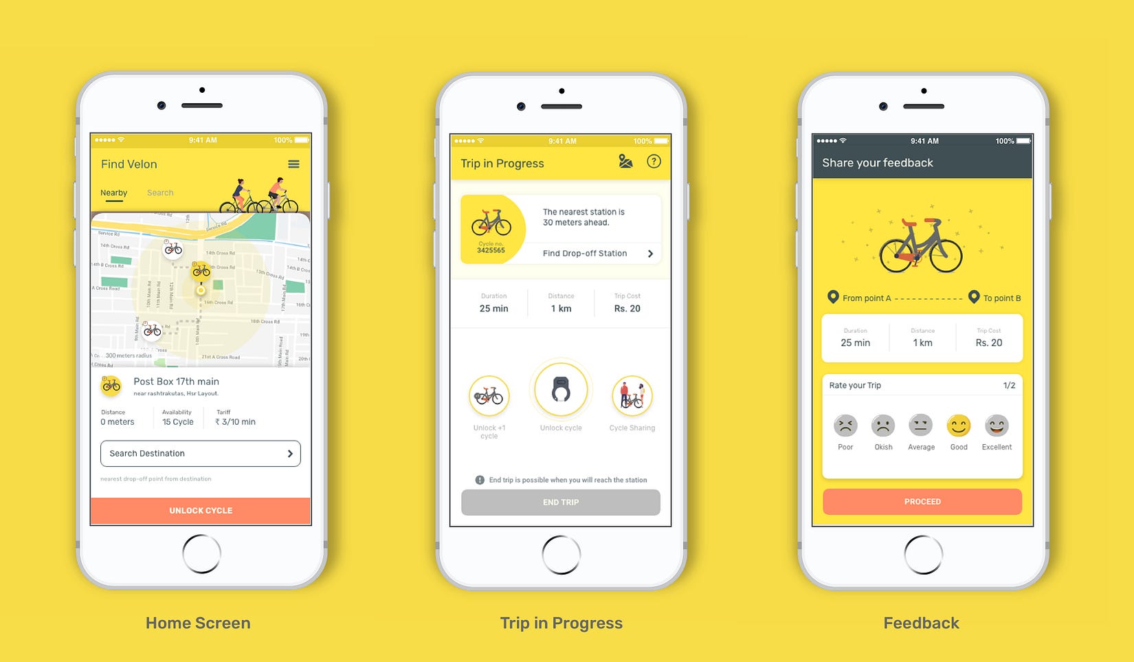
Before jumping to a solution on look & feel, even we got the product ready with UX but the last set of remaining question is, How our users will feel? what kind of emotions will our product evoke?
Velon is economical, urban cycling service. The user needs short commute/last mile commute in affordable and easily available. Also, we learned about the psychological benefits of when cycling, your body releases chemicals called endorphins, which also trigger a positive feeling in the body, similar to that of morphine.
“Happy, Economical and Urban — Attributes of Velon”
At the End
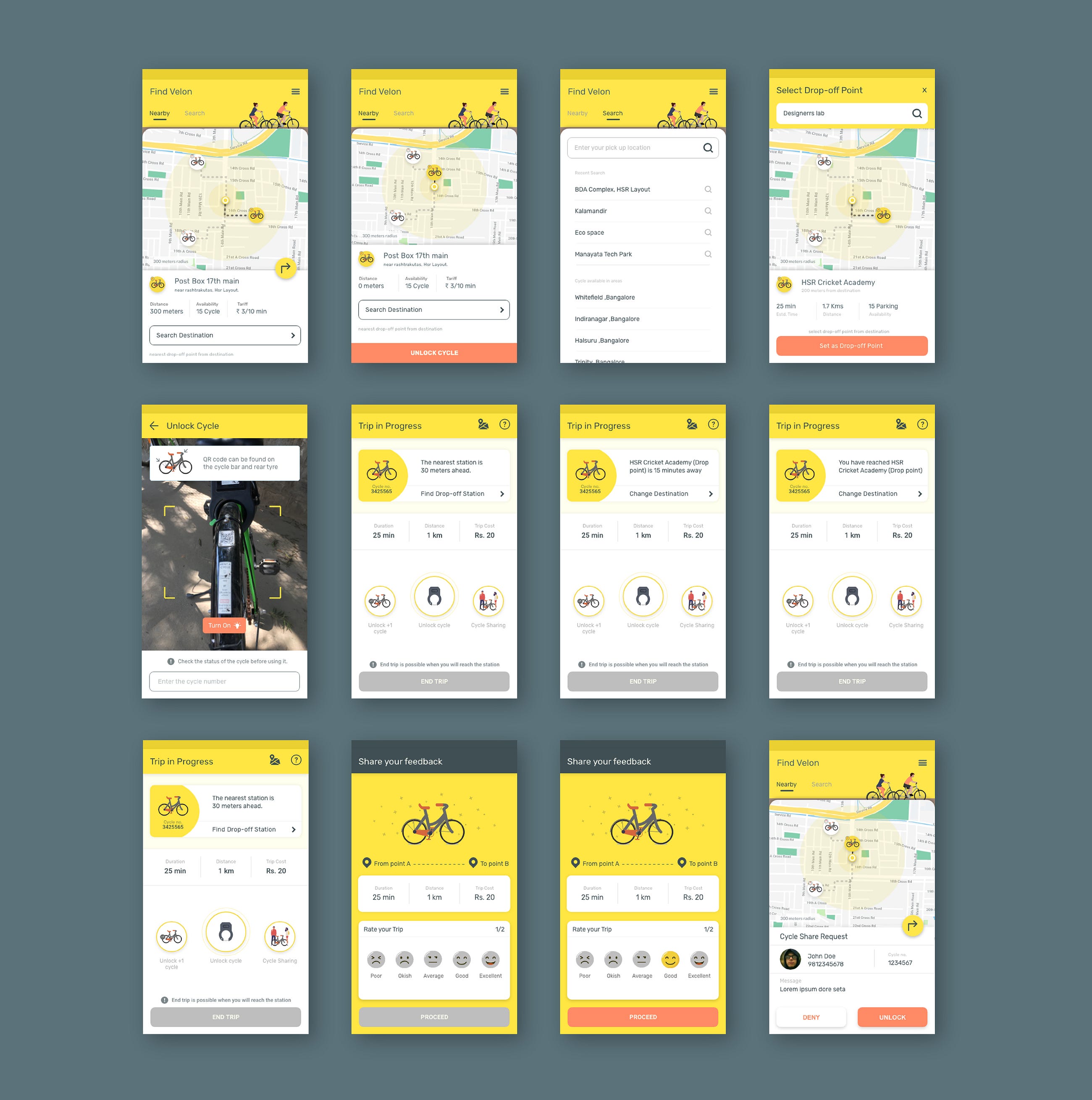
What user needs and what user will expect are different things but both the questions need to be answered.
This project was done as part of the Full Stack UX Training provided by Designerrs Lab.
Thanks for reading. Keep following Designerrs Lab for more insightful articles related to User Experience Design.
Redesigning Zoomcar PEDL User Experience was originally published in DSchool on Medium, where people are continuing the conversation by highlighting and responding to this story.
