Mobile app redesign process means something much more than looking fresh and new. It involves lots of creative thinking, iterating and testing. In UX design, process is necessary to get the results you want. Without the proper process, things are bound to fail.
Its not enough to design a nice-looking product, it also has to be usable.
Dissecting the product in order to understanding user’s pain points and insight are crucial for problem-solving. Is user able to complete task with efficiency or is it frustrating? Is the interaction for user too complicated? Navigation organised or disoriented?
In order to pin point usability issues, I conducted Heuristic Evaluation to analysis problems which can be resolved.
Heuristic Evaluation of Zoomcar PEDL
What is Heuristic Evaluation?
A heuristic evaluation can basically be defined as a review of a user interface, looking closely at user experience aspects. It helps to identify many kinds of user experience problems and is conducted against a set of design principles . There are some of the most commonly used heuristic. As an example I will be following heuristics from Jakob Nielsen’s “10 Usability Heuristics For User Interface Design”.
- Visibility of system status
2. Match between system and the real world 3. User control and freedom 4. Consistency and standards 5. Error prevention 6. Recognition rather than recall 7. Flexibility and efficiency of use 8. Aesthetic and minimalist design 9. Help users recognize, diagnose, and recover from errors 10. Help and documentation
The Task
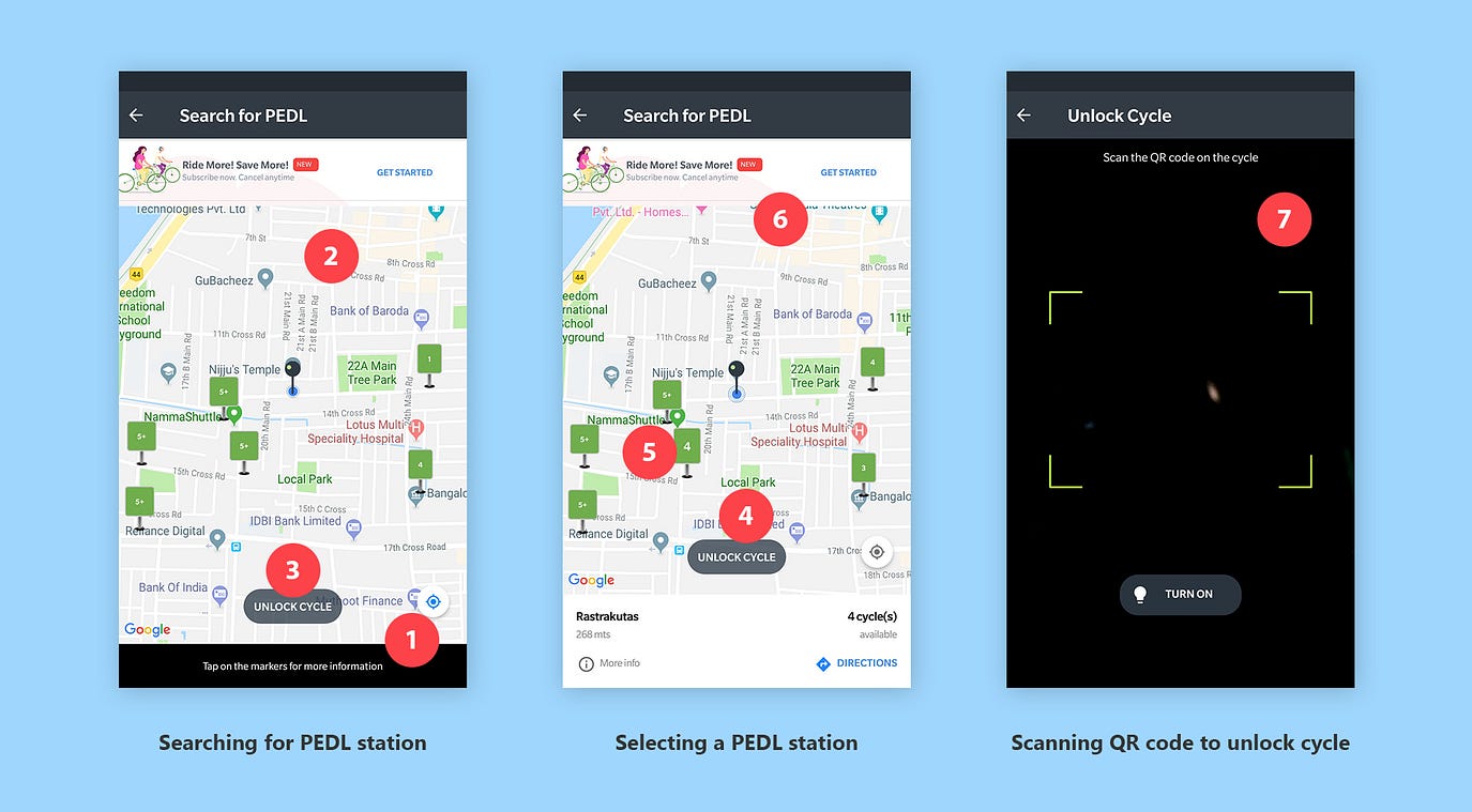
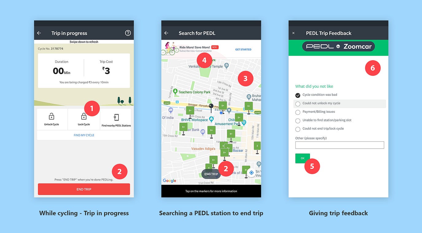
We choose PEDL, cycle sharing service. We booked a cycle using app and we cycled and ended at other cycle parking area. Our task is to analyze the user journey from finding station to ending cycling trip, in order to pin-point usability issues. Match between system and the real — At the bottom of the screen it says markers. What are markers indicating and those numbers are confusing until you tap one of the markers. And why labeling them as markers, it is more like a place to park cycle. Recognition rather than recall — Eventually I understood this markers are parking for cycle and it shows all nearby parking location but I can’t check for location where I would drop off and end the service. For that I need to zoom and pan the map to search my location, it makes more difficult to look for cycle from where I want to avail. Error prevention — I’m not at the parking area where cycles are parked, despite unlock cycle button is active and tap the button it takes to other screen to scan code which is on the cycle. The button is too prominent and at the convenient position even when it’s not needed. User control and freedom — For novice user of the app, I want to unlock the cycle as I’m at the parking area, availing the cycle. But after I tap on ‘Unlock cycle’ it suddenly takes me to sign in screen. Button should be been clear about where it will lead me. User control and freedom — Even after selecting one of the PEDL parking area, selected marker is barely visible. Leaving user in a confuse state of what is selected. Aesthetic and minimalist design — Title says ‘Search for PEDL’, but what am I looking at the screen, PEDL station or PEDL cycle, iconography is not clear and at bottom ‘Tap on the markers’ is mentioned, more confusing. There are more irrelevant information like get subscription and active unlock cycle button (as mentioned earlier) leaving most important information unavailable, that is tariff or charges for cycling in a minute/hour. User will not avail the service without knowing the price. User control and freedom — Only option to scan a QR code is camera. If camera doesn’t work or any damage/issue with the QR code, user won’t be able to unlock cycle and will leave the service.
User control and freedom — Unlike unlocking cycle, which is done through app, locking cycle can be done only manually. Interaction here, makes user believe he/she can lock cycle through app, but pop-up says otherwise. It is unnecessary to have lock cycle as a button just to tap and know lock your cycle manually.
Error prevention — User can end trip only at PEDL station. But for novice user, there is no mention of it. I would try to end trip wherever I park and tap on ‘End Trip’, leaving me with pop-up to end trip at PEDL station.
Recognition rather than recall- To look for PEDL station that would be near my destination, I have to pan the map and recognize my location.
Aesthetic and minimalist design — User is looking for drop out point and in middle of the task, get subscription is not relevant. Even the PEDL station markers look very clumsy and confusing as earlier mentioned.
Consistency and standards — After giving a rating, next screen is just ‘Next’ button after taping on it, it asks your feedback and I select ‘Done’ and again there is ‘Next’ button and it goes on. Different words is going same thing and asking double confirmation is waste of time.
Visibility of system status — There is no indication of how long this process is going to be. There are feedback and questions after questions.
Conclusion
That’s it — a part of UX design process. Understanding and analyzing current flow and how would user behave, feel and complete a task. It is the most important of the process where we understand where, what and why there is difficulty? why user reacted that way? what happened and then again why it happened? Evaluating every step the user takes to achieve his goal pin-points most of the relevant problems, which we can take it to next step to resolve it. Thanks for reading . Keep following Designerrs Lab for more insightful articles related to User Experience Design.
 Heuristic Evaluation of PEDL was originally published in DSchool on Medium, where people are continuing the conversation by highlighting and responding to this story.