Interactions with the application should be designed such that the time span of the users’ actions are shorter, yet focused.
This research is on “My Airtel” mobile based android application which belongs to Bharti Airtel Limited, a leading global telecommunications company. In this article, i will explain the design process followed behind the final design.
Why Airtel?
The red ocean competition in Telecom industry drives the decision of redesigning the telecom app.
Airtel is leading the market with approx 280 million mobile subscribers and only 15 Million app downloads which projects that the redesigning of “My Airtel” App has great potential.
Objectives
To identify the level of utilization of the Airtel app by customers.
2. To redesign the application for better Usability and Delight.
Methods used: User research, User testing, Ideation, Information architecture, Wireframes, Prototype.
User Research
For this research 2 groups of mobile subscribers i.e. Airtel subscribers and Other subscribers were considered. A small pilot study was conducted which showed that many of Airtel subscribers do not use “My Airtel” app. Hence Airtel subscribers were categorized into 2 groups
a) My Airtel app users
b) Non-My Airtel app users
The intention was to empathize with versatile, user groups individually to understand various common pain points.
1) Airtel subscribers
a) “My Airtel” app users:
The research on this user group was to gather information regarding utilization, familiarity and app usage.
Most users use “My Airtel” app to check Data balance, Postpaid bill/Prepaid balance and offers.
INSIGHT 1: Users are not aware of other existing features.
b) Non-”My Airtel” app users:
Only Airtel subscribers have the privilege to use “My Airtel” app and yet few customers do not use Airtel app. To understand the gap between number of subscribers and number of app users, it was analyzed that users requirements were fulfilled by other payment apps to pay Electricity bill, Gas bill, Fund transfer with the benefit of cash back offers. Hence users have not utilized “My Airtel” app.
INSIGHT 2: Mental model of users was that they could only do recharges and bill payments of Airtel products.
2) Other subscribers
The motive is to empathize with this set of user group to understand the common pain points they are facing irrespective of the network operators.
The data analysis from these set of users are
(a) Users are uncertain of the steps to take while calling customer care.
(b) Users follow the appropriate options to reach customer care executive but end up in a long hold. Sometimes call may get disconnected and “forcing users to start from the beginning.”
INSIGHT 3: Few menu options are confusing and are unrelated to user issues. Call traffic time is unknown.
User Testing
To understand the existing design, user testing was carried out by observation method to understand their challenges and to devise solutions. Users are not versatile with the app and puzzled with few labels and options.
The problems were derived out of extensive research to prioritize the issues. Later those problems were scrutinized to find common design solutions.
Ideation
Once problems were understood and prioritized, “How might we” questions were created to brainstorm the ideas and chosen with the help of Bull’s eye diagram.
Proposed Design Solutions:
1) Giving more visibility to users account (Data balance, Prepaid/Postpaid details, Current plan usage and Customized plan suggestions).
2) Providing more importance to various recharges and bill payments.
3) Scheduling a call back from support team. Its a turn around now the support executives are eager to contact and help the users.
4) For more transparency the feature of tracking the Call records can be added.
INFORMATION ARCHITECTURE
Open card sorting activity has helped with the categorizing and labelling of the headings, by thoroughly understanding the users mental model.
Organizing the information according to users needs. Then the organized information was arranged as Data balance, Prepaid/Postpaid details, Quick payment, Current Plan usage, Previous plan usage and Call summary which was with the most preferred features to the least preferred features.
WIREFRAMES
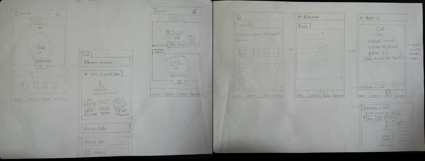
Couple of designs
Hi-Fidelity Mock ups:
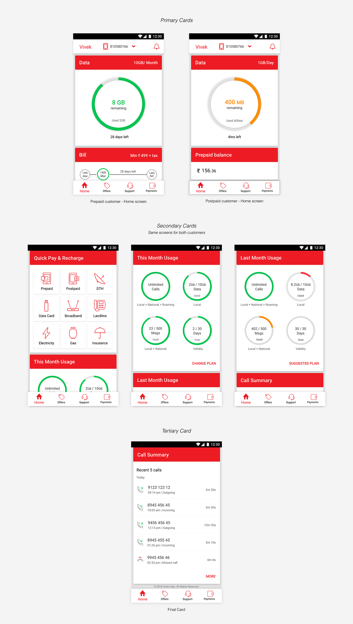
Vertical scrolling of 7 cards
Support
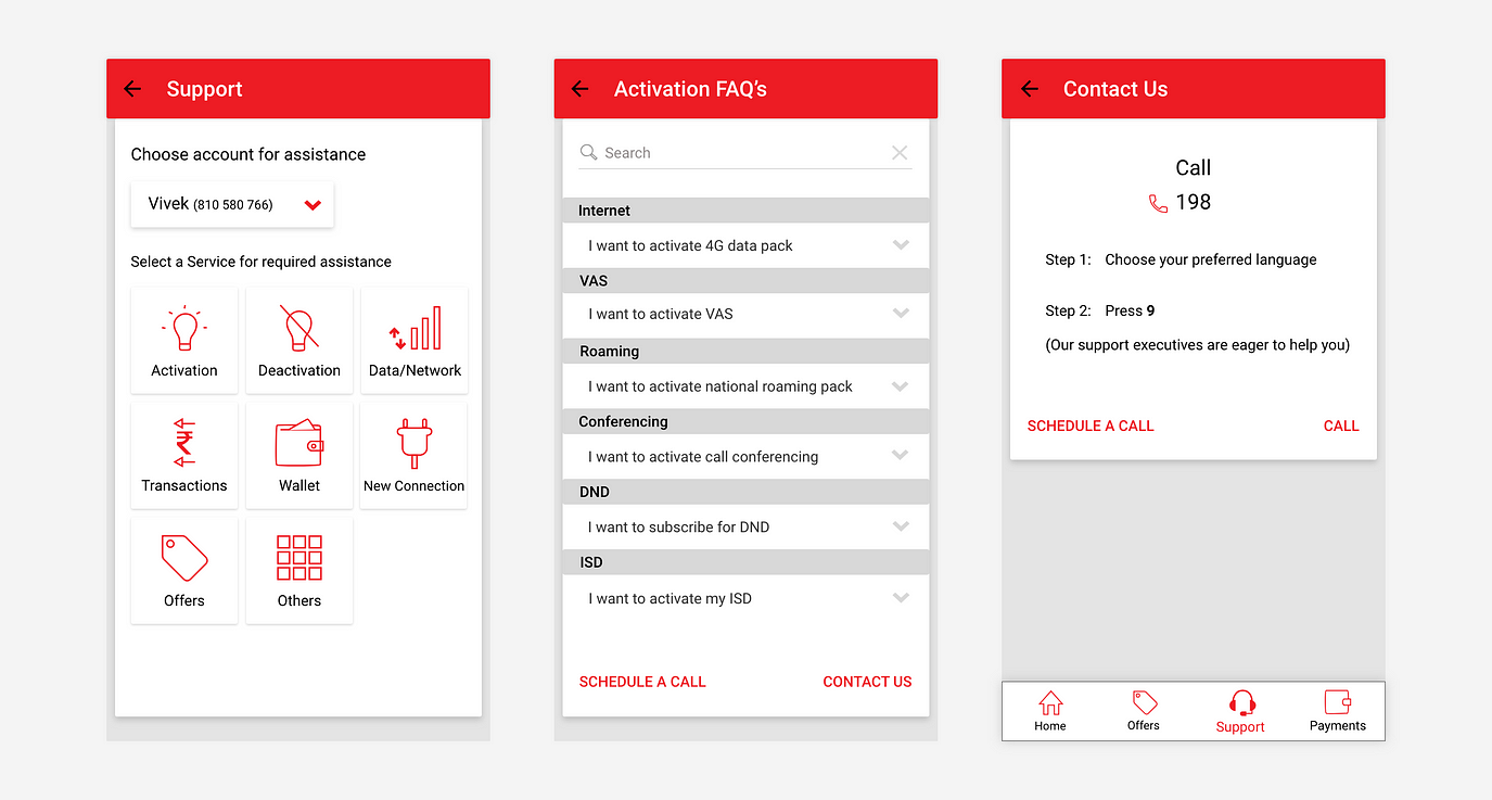
Support — FAQ’s — Contact us
ii) Scheduling a Call: Users can choose different linked numbers from “My account” to schedule a call back or they can enter the number which is not added to their account. Once the call is scheduled, users can know the status of the call from the support executive.
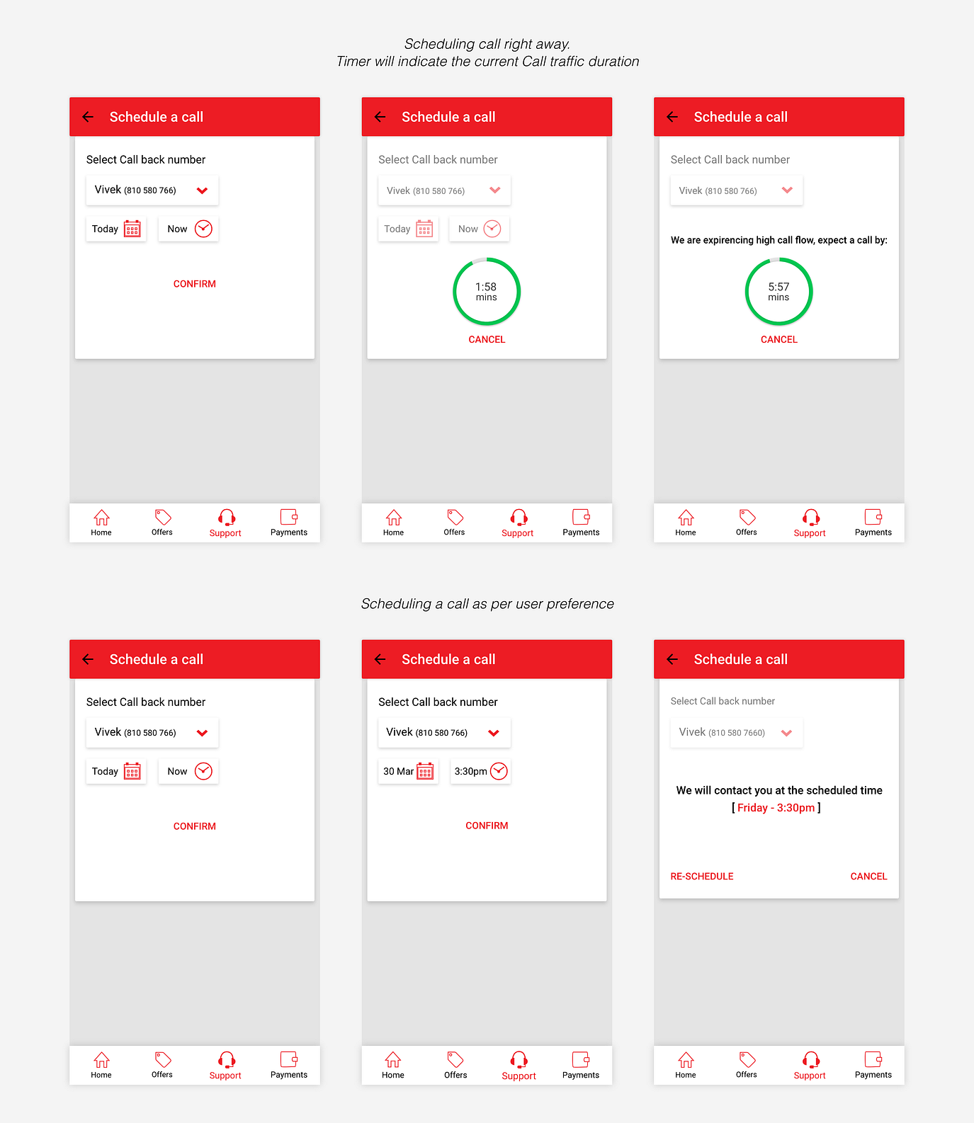
Support executives are eager to reach and help the Users
Learning Outcomes…
Working on this project has been a treat. Although there aren’t many slip ups in the “My Airtel” app, the research has helped to understand a lot more about enhancing user experience. The prototype had to be tested with users thrice and there by the design was improvised which could satisfy all that this project was needed.
Thanks for reading . Keep following Designerrs Lab for more insightful articles related to User Experience Design.
Redesigning “My Airtel” User Experience was originally published in DSchool on Medium,where people are continuing the conversation by highlighting and responding to this story.