Share At Door Step provides you with the most convenient and easy way to donate those items that are just lying at some corner of your house, gathering dust and taking up some much-needed space.
This article will take you through the journey of how we used Design Thinking to help Share at Door Step create a better donating experience, by improving the website interaction and service experience which drastically increased the no of users donating and changed their behavior.
Empathizing with Donors and Receivers
To understand the problem our users were facing in a holistic way and to see the problems from their point of view, we conducted secondary research and primary research through semi-structured users interviews with our potential users and stakeholders. Based on the research we were able to answer the following questions:
1. How do they donate?
At the doorstep
Online
Telephone
On-call
2. How do they discover?
Facebook groups
Online Social Group
Online/ Search
Offline Advertisement
3. How often they donate?
Monthly
Yearly
One Time
4. Why do they donate?
Self-satisfaction
Tax exemption
Religious reason
Influencing people/leader
Celebration
5. Who do they donate?
Corporates
Government
Individuals
Institutes
6. To whom they donate?
NGO
Local groups
Facebook groups
Event volunteering
CSR volunteering
7. What do they donate?
Time
Money
Old stuff
Medicines
Food
Water
Stakeholder Segmentation
To know different kind of users we can have within our system, we had a brainstorm session on a specific question, “Who can be the donor or is involved in this donation process”.
Donors
Volunteers
NGO
Brand Partners
Admins
Defining a seamless User Journey
Based on the analysis of the research, we were able to map out a certain user journey making it easy and frictionless for the user and also keeping the least amount of cognitive load for the user.
After landing to the website the location of the users will be detected after they click the “Donate Now” button on the homepage.
Upon success, users will be asked to choose the type of items they want to donate or if their location does not come under operating areas then they will get an alert regarding it.
After choosing items users will be asked to provide few other details on the donation items and also the way of donation. If users choose to donate by themselves, they will get the list of nearby NGOs or else they can choose for pick up at their doorstep.
After choosing for pickup user have to fill out a form with few details like date of pickup, name, address, etc. Upon success, the user has to provide a genuine email or SMS. After being verified with email or SMS the flow ends for the user.
Designing the Website Home Page
1. Above the fold
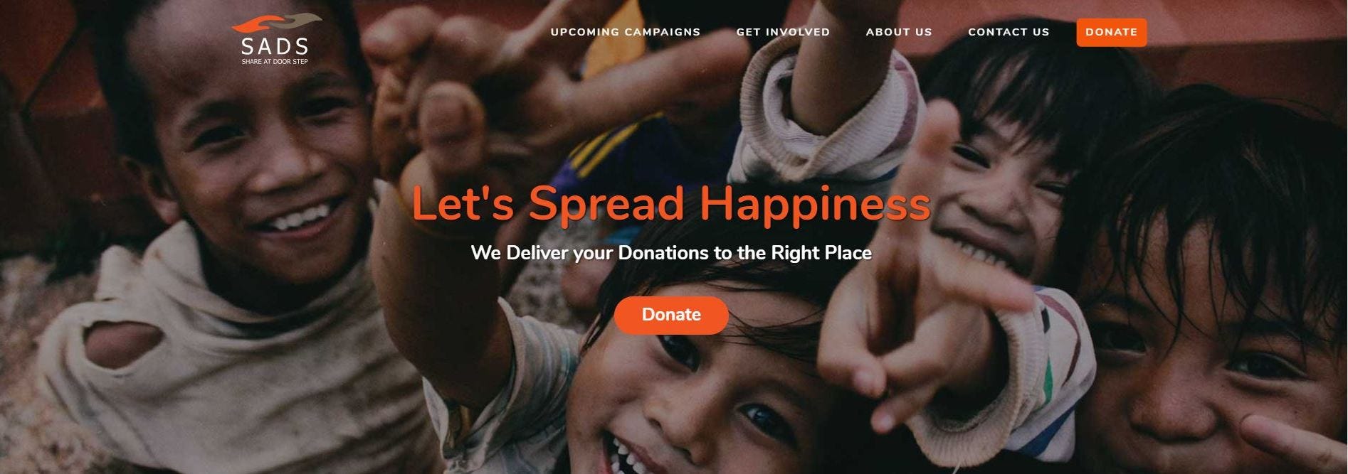
The full-width imagery of happy kids is chosen to communicate the company’s vision of spreading happiness and trust with the SADS platform.
The call to action “Donate” button makes it easy for users to start with the primary task/ intention of coming to the website.
2. Communicating the simplified User Journey
We communicated the entire user journey of donating in 3 steps to give users the holistic idea about the process and showcase transparency.
a. Scheduling a Pickup, b. Donate at your Doorstep, c. Get Rewards

3. What can we Donate?
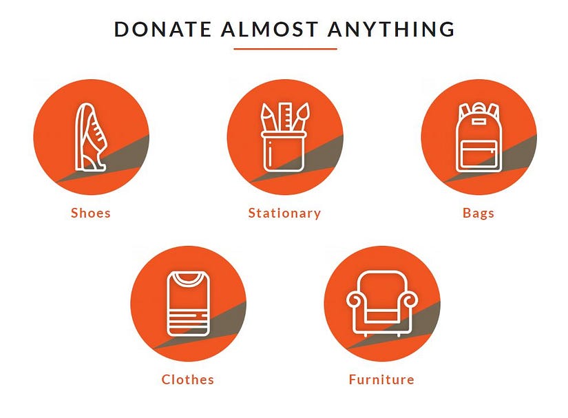
To make it clear to our users about what can they donate, simple iconography is used to showcase that. The list of these items was inspired by the user
research interviews and surveys conducted which helped us identify to most frequent items the donors have an abundance of and the basic things which are required by the receivers. Other items include Toys, Woolens, Electronics, KitchenWare, Mattresses. We are constantly working on connecting the abundance donors have to the needs of receivers.
4. Why should we Donate?
This creative showcases the core values of SADS platform and helps donors connect with the platform and builds credibility.

Simplifying User Flow of Donating
This is the major interaction which the donor has with the website interface after clicking on the Donate button. The flow is aligned with the users mental model of the user identified from the research and specific focus is given to usability issues at this stage.
1. Entering Donation Details
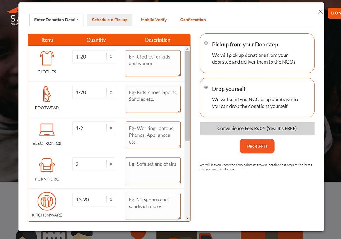
At this stage, the user is asked to add the items, the quantity he/she wants to donate. The user also can write some qualitative description of the items
which helps the operations team to organize the inventory and optimizes the supply chain management. At this stage, the donor has an option to either schedule a pickup from their place for convenience and if the user wants to have a real-time experience, they can drop it themselves to specific NGO’s.
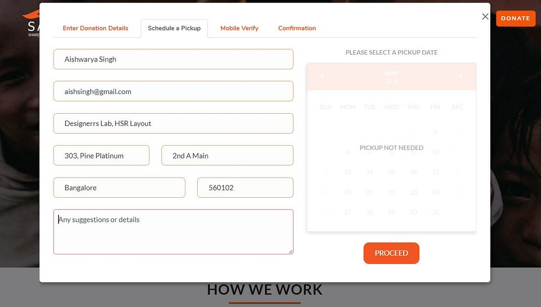
2. Scheduling a Pickup
A simplified form takes the users information about Name, Email, and Address and pickup date in case of picking from door step.
3. Mobile Verification
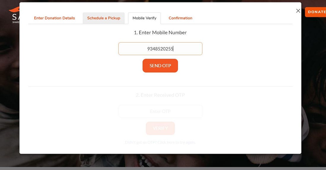
The donor enters the mobile no for verification and receives the OTP.
The donor then enters the OTP to complete the verification process.

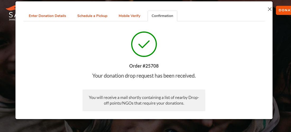
4. Confirmation
The order is confirmed by giving an order no and mail with necessary details are send to the donor.
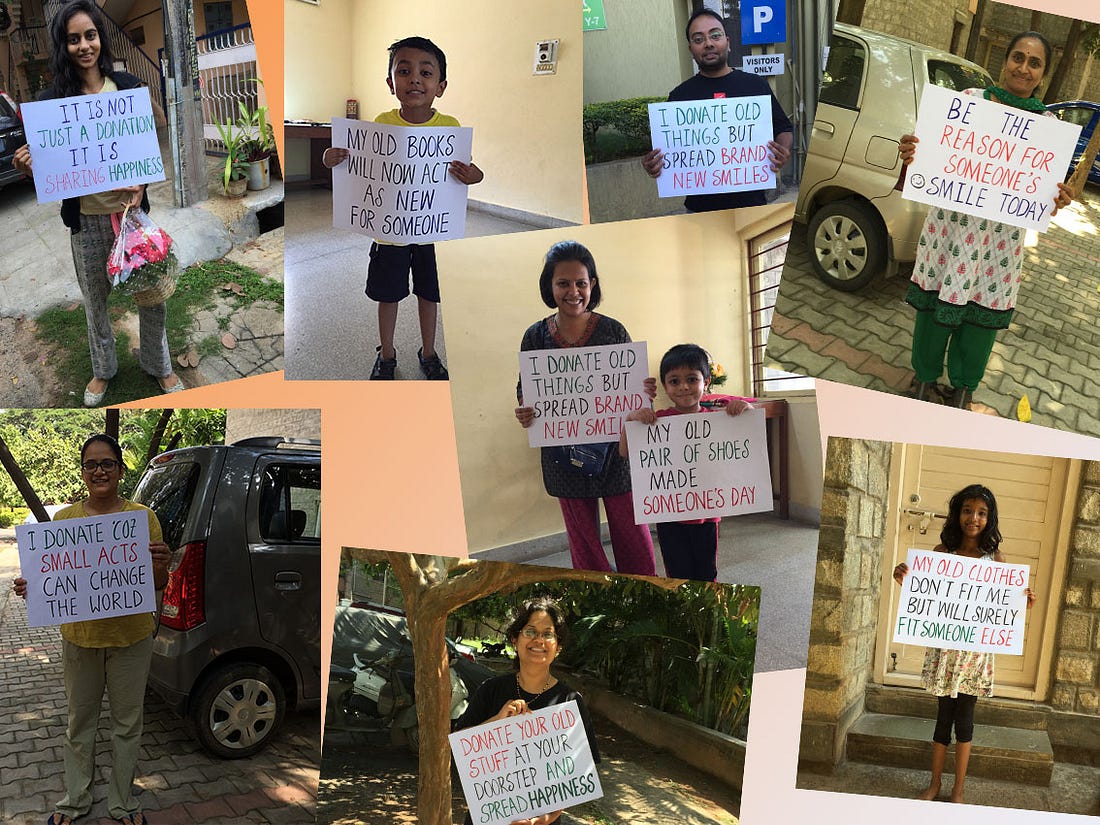
Check out the donating experience yourself at Share at Door Step and join our hands in spreading happiness and make a difference.
To learn more about Design Thinking, UI/UX Design and Product Design, follow Designerrs publication on Medium.
