In this story, we shall look at how User Experience Design principles were applied to transform the quality of one’s life in a rather simple manner. ‘You are what you eat!’ is a popular phrase used often to alert and strengthen the mind’s respond to food cravings. Addressing the basic human need to eat well, quite easily stood out as our focus area.
1. What could the problem be?
Ignited with the introduction to the principles of UX design, we expanded our minds to list out mundane problems that we face in our daily lives. The only mandate was that it should be reasonably possible to complete within the 3 month course time frame.
We independently jotted down more than 80 problem statements between our 4 team members for an average of 20 problem statements per person. The list included a wide spectrum of topics from the areas of health, relationships, well-being and lifestyle.
We then reduced this large number of 80 problems to a more manageable list of 23 problems by a process of deleting or merging in the following manner:
i. Removing problems that were either too small / large to fit into the execution time frame.
ii. Removing problems that required government intervention for successful execution.
iii. Merging some problem statements that were very similar or identical.
We applied multiple schools of thought including logical, emotional and even philosophical / spiritual considerations before finally choosing one topic. The final choice, we decided, must most importantly include:
- effectiveness of execution
- and maximum impact for the largest group of people.
The Final list of 5 problem statements that pointed to our project — A Gentle Way to Healthy Eating
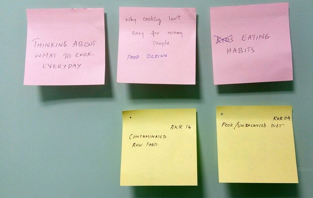
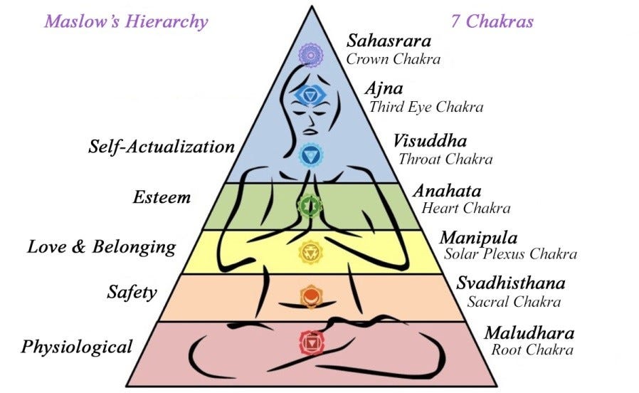
This final list of 5 problem statements belonged to the same group. Food, being in the bottom rung of Maslow’s hierarchy of needs, well balanced food habits can directly and indirectly address the wellbeing of individuals and communities.
Food — a basic need of the human body if well addressed can have a powerful impact on a person’s health, productivity, fitness in body and mind. It can go on to even impact the nature of one’s personality, the levels of happiness and well-being too.
The final problem area that we chose to address was:
“Eating Habits”
2. Secondary Research on Eating Habits
Armed with the chosen problem area, our team of 4 started our secondary research in the broad area of ‘Eating habits’.
We approached the subject independently with the hope of pooling our individual wisdom in this area without influencing one another in the process. Food being an intrinsic part of life led us to start our research (mainly internet based) from our own individual past learning as follows:
Chethan did a google search on eating habits and came up with a summary of points on some of the healthy eating habits.
Kedar did a research on do’s and don’ts. How much calories should be consumed for breakfast etc..
Padmashree came up with some statistics and graphs on various things about eating habits across the globe provided by Nielsen.
Ramessh did a research on back to the basics questions like why do we (humans) eat in the first place and the vedic/spiritual aspects of it.
We browsed through research material on eating habits of people from India and worldwide. We were also made aware later that this research would naturally be tinted by our personal biases.
Our research log may be summarised briefly as follows:
- Food is a crucial aspect of one’s physical and emotional wellbeing and it includes clean alkalised drinking water. It must be given due importance in our daily activity list like we do for work and sleep.
- The beneficial qualities of food is affected by how it is grown, harvested, stored, prepared, served and eaten.
- One’s eating habits reflect one’s personality. People eat for survival and for pleasure too. Some foods can be addictive and take over our sense of good judgement. Changing what you eat can even alter your personality gradually
- In most cases, processed food (especially when excess heat and chemicals are used) is not as good as their natural counterparts.
- Like clothing, music and dance, cuisine or food and the way it is prepared, served and eaten is an important cultural signature of a community and of an individual too.
- Looked at ways to identify and follow good habits. Good food habits may differ based on right food can differ based on age, gender, economy status, culture & geography.
- From a wellbeing perspective, eating habits can be categorised — good, average, faulty, bad and so on. Similarly people can also be categorised according to their age groups , gender, activity levels, cultural attributes and personality traits.
For geographical relevance and to explore alternative thinking on our rich cuisine we also looked at ancient Indian wisdom from the vedas:
- As per the vedas, food is divided into 3 broad categories — Satvic (mode of goodness), — light healthy and easy to digest foods that support a balanced out look to life, Rajasik (mode of passion/action) — food that incites passions or strong feelings and actions (energy to do both good and bad), Tamasik (mode of ignorance / rest)– food that increases inactivity, laziness and rest.
- Practice Inner Equipoise for balance in eating habits and other areas
-Mindful cooking and eating — Not just the way we eat, but the state of mind while preparing and serving food can also have beneficial or adverse effects on consumption of food.
Problems in maintaining a healthy diet
After logging our understanding of eating habits the next step was to look at the challenge of maintaining a healthy diet.
Misconceptions to consuming healthy food:
- Healthy food is expensive
- Not tasty
- Difficult to make
Other deterrents to eating healthy food include:
- No time to make
- No time to eat
- No hunger or desire to eat
- Lifestyle does not accommodate this diet
- Peer pressure
- Emotional tendencies
- Lure of tasty and addictive Junk food
3. Primary Research
a. Defining the Problem Statement
After the secondary research we needed to get more clarity on how to approach the problem which is what the process of primary research does.
We got acquainted with the following:
- What is primary research?
- Modes of primary research
- How to make a research plan
- How to create questionnaire
- How to pick candidates for interviewing
After an introduction to primary research we decided on the following problem statement:
“What are the problems in maintaining a healthy diet”
b. Drilling Down and QRE Preparation -The HMW approach
We translated our secondary research findings into simple sentences jotting them down on individual post-its. We grouped the post-its under various categories, refined and optimised them till we distilled them down to the following 6 categories with their corresponding ‘How Might We- HMW’ statements:
- Body & Mind — How Might We help people get good mind and body balance?
- Circumstance — How Might We help people make the right choice in various circumstances?
- Taste — How Might We support people to not give in to taste over good diet decisions?
- Price — How Might We assist one to eat healthy within their respective budgets?
- Lifestyle — How Might We empower one to lead a healthy lifestyle?
- Knowledge — How Might We help people to easily assimilate the relevant knowledge?
We had by this time understood the usefulness of HMWs to bridge the gap between an idea and it’s insight.
c. Questionnaire Preparation
Now that we were armed with the HMVs we put our 6 insights to good use. We were guided into a simple technique to formulate questions for our questionnaire.
We collectively identified knowledge gaps in each insight and framed questions that would address these knowledge gaps. Also we were made aware that the knowledge that we had may be assumptions that could be confirmed or changed after our primary research.
Look at solutions, services and products in these domains and do a competitor analysis, competition survey.
Questionnaire was designed with target audiences both male and female in the age groups of 20–30, 30–40 and 40–50 years.
These age groups These were the age groups chosen to represent the predominant target audience who might use technology oriented guidance for our problem area of ‘Eating Habits’.
d. Conducting Interviews for Primary Research
In our group of 4, we were required to interview at least 5 people each — preferably a male and female respondent from each age group which left us with a total of 20 interviews. The interview and post interview steps were as followed:
- The questionnaire interview had 55 question under the 6 categories of insight i.e. Body & Mind,Circumstance, Taste, Price, Lifestyle and Knowledge.
- The interviews we conducted by the team over the duration of a week
- The total number of interviews were over 20 in total.
- Then the data recorded on our questionnaire sheets was transcripted to post its.
4. Research Synthesis and Affinity Analysis
Now since we had some much data and understanding about our users, we started analyzing and synthesizing data from our research in the following manner:
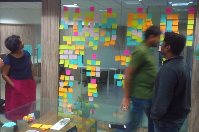
- The post-its with the user research statements were collated in our meeting and spread out for the research synthesis on the table as seen in this photograph.
- We filtered out all the cryptic answers that did not tell a story like the ‘ Yes’,’ Nos’ and blank or ‘Not Applicable’ answers. Such answers do not reveal much about the target users.
- We retained post-its which told stories for our next step of analysing the results.
The steps followed for the Affinity Analysis were as follows:
- Performing the affinity analysis on the questionnaire response data we started grouping the post-its under broadly similar themes.
- We then boiled down these themes to 16 categories.
- Next we started drawing insights/patterns from each one of these categories.
- We wrote down possible underlying reasons for the recurring pattern.
5. Personas and User Stories
We then learnt how to develop personas in the context of user experience research. Personas consists of the below elements:
- Demographics
- Daily activities/hobbies
- Behavior/characteristics
- Goals/desires/motives
- User Stories/Scenarios (which includes needs and pain points)
Based on the analysis of our Primary Research we created 3 specific personas to help us understand and profile our target users. These 3 personas were an average representation of all our 20 interviewees. This helped facilitate the user centric nature of our design.
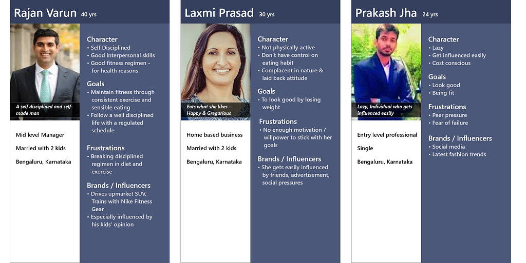
We also created user stories for each persona to get under the users’ skin therefore enhancing our comprehension of their lifestyle and the activities during their typical weekday.
6. Redefined Problem Statement
We then evaluated our Problem statement with the new insights garnered to see if we can redefine it further with the following guidelines:
- Users (Descriptive)
- Needs to(trying to achieve some Goal)
- Because (Surprising Insight)
We considered these problem statements:
- How to identify and maintain a healthy food regimen.
- Continuously using food habits to maintain Mind & Body balance
- Supporting people in the art and science of eating well.
- Personality development through mindful eating
- How to make taste and health go together
“How to accommodate individual weakness (Taste/ convenience) and continue to maintain good health and eating habits”
7. Brainstorming and Ideation
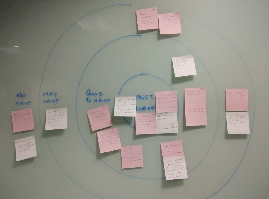
Since we had a number of different ideas that solve some individual part of the problem, the next task was to identify the priorities and possibilities of each solution to move forward. We voted each solution and categorized the solutions into must to have, good to have, may have and not to have in the Bull’s Eye Diagram.
8. Creating Task Flows
Choosing Medium of Delivery
We explored various execution/ delivery options whether it be a Digital Product or a Web based solution or an App based one.
The App based delivery was quickly decided upon as it afforded the following advantages:
- Easy installation
- Portability into the kitchen
- Ease of communication with other members
- Most suitable for execution in the time frame available.
- Follows current market trends of app based solutions so finds easier acceptance
Creating the Flow
We first decided on a list of desired features based on our ‘Must Have’ and ‘Good to Have’ ideas. We then came up with the following:
- Create / Acquire (perceived?) healthy & tasty food which can be validated by experts later
- Cooking & Presentation of healthy food with available ingredients
- Identify available ingredients by:
- Taking a pic of something in front of you Like a fridge / kitchen shelf / store and so on…
- Uber for cooks (cooks on temporary hire) or a Uber cloud kitchen
- Community support for cooking
- Presenting a recipe suggestion [New food]
- Aggregating Recipes
- Onboarding user details/Understanding profile & habits
9. Story boarding
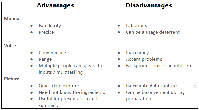
Before Storyboarding, we looked at some of the modes of user interaction with the app along with it’s advantages and disadvantages:
Creating the Storyboard
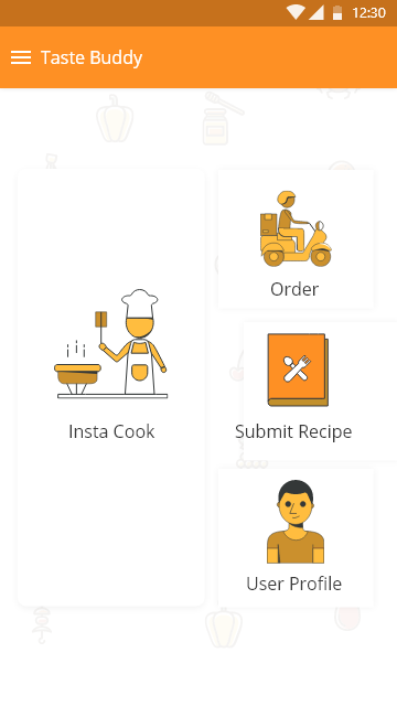
a. We initially started off with the Landing page (The splash screen being designed in due course.) The Landing board had 4 buttons for each important section:
- Insta Cook
- Order
- Submit Recipe
- User Profile
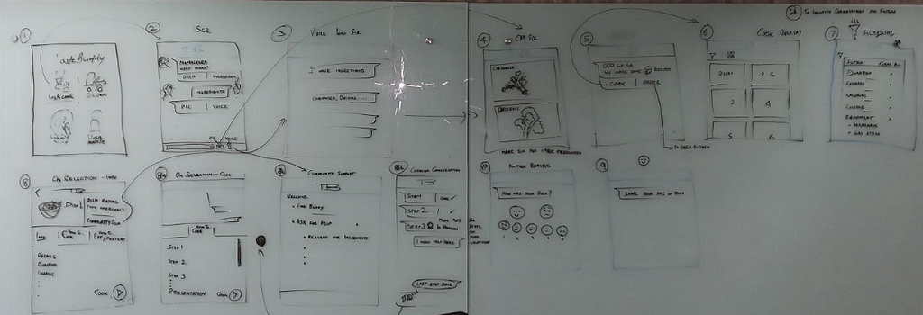
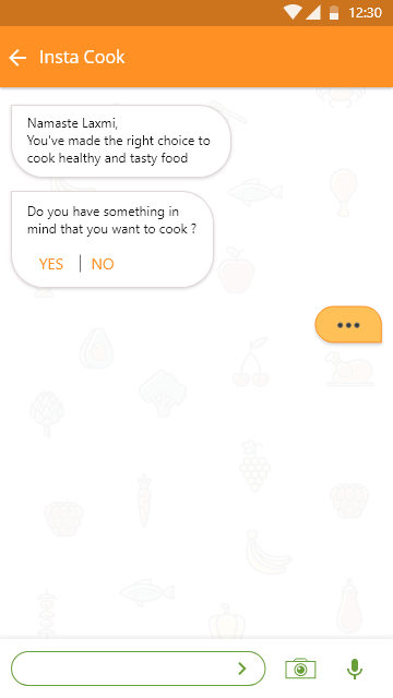
b. We decided that for this phase of the project we would concentrate on what might probably be the most popular section — ‘Insta Cook’ with the built in intelligence of a chatbot. So the subsequent screens starts off with a customised voice activated interaction with the intelligent chatbot buddy in our app.
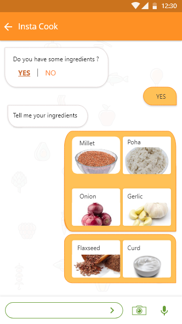
c. The app accepts our ingredients and presents the user with various recipes that may be possible with our ingredient spread. Once the item is chosen in one of the many ways the cooking section starts.
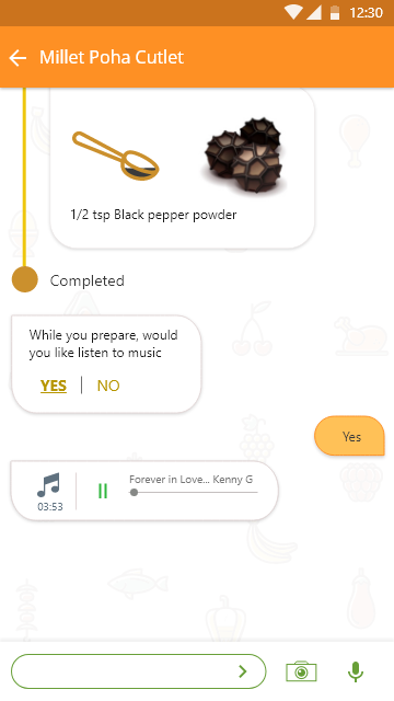
d. The chatbot then helps the user with step by step chat messages and illustrations with the food preparation process. It even sets the mood with your preferred background music, which it prompts you for, as a buddy would do.
e. On preparing the dish, the experience is rounded off with a help required / upload pics and recipe upload features for the benefit of the community that keeps building up, of those who use this app.
At this point we wanted to christen our app and with a bit of brainstorming we boiled down to the name for our app:
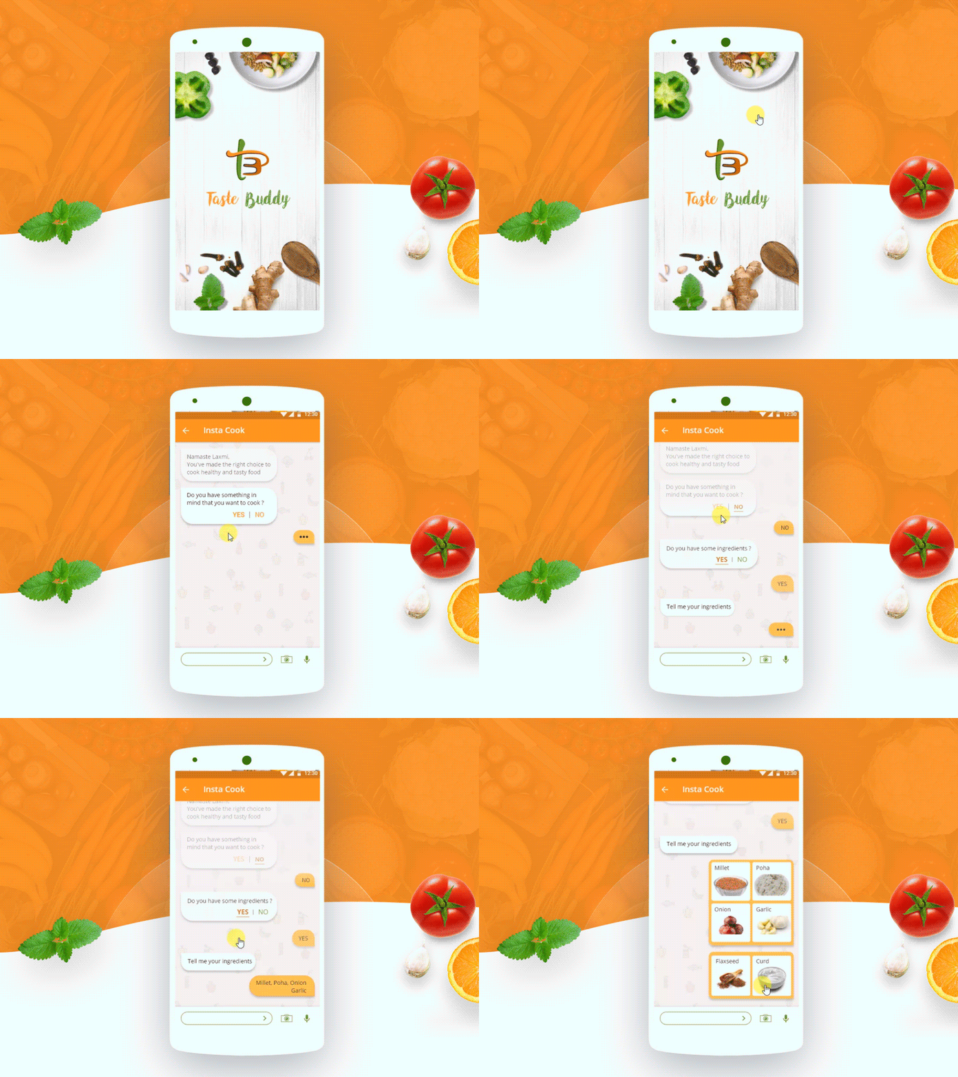
Taste Buddy had to demonstrate the following attributes:
- A chatbot of a friend who is much more than just a boring dry health conscious recipe book on line.
- TASTE BUDDY is like an intelligent personality who chats with you and learns about you making clever suggestion tailored to your body type and health condition (as seen in the user profile).
- This makes for a very engrossing experience every time one interacts with their new kitchen friend — a BUDDY who is wise in health consciousness but also works out a most TASTY route to healthy eating. And this is how our Chatbot App’s name — i.e. ‘TASTE BUDDY’ came to be.
- It can even place an order for food from your favourite restaurant, hire a cook at short notice for special occasions and build up a community repertoire of tasty health food.
Seen below is our first cut of Taste Buddy’s storyboard:
Landing Page Screen
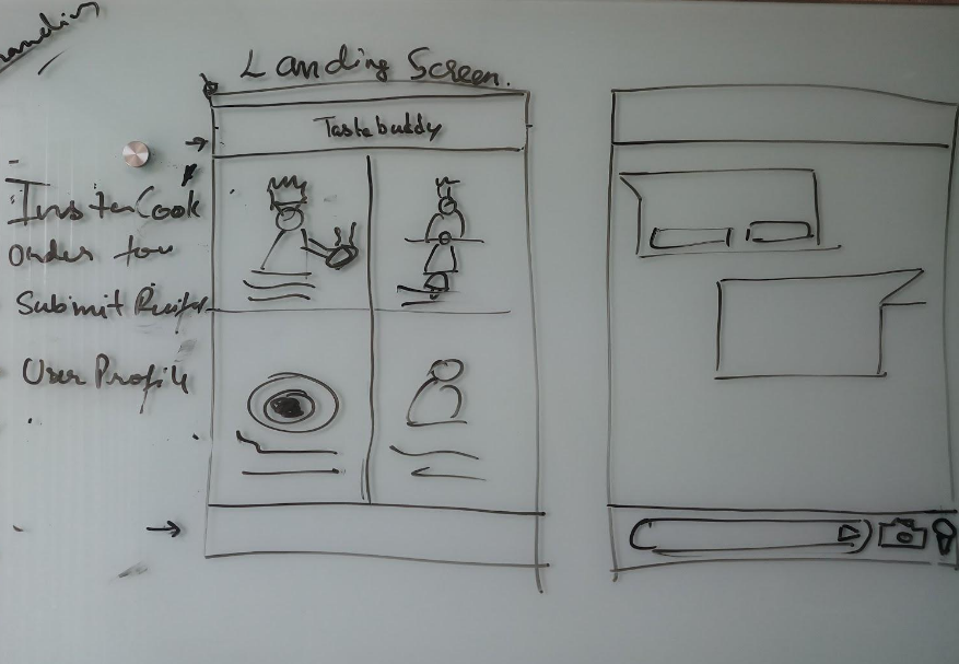
A brief description here indicates the thought behind the 4 landing page options:
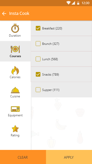
- Insta Cook — Allows User to take a snapshot of available ingredients at home or at the shop / accepts audio or manual input of ingredients and suggests a variety of (the healthiest version of the) recipes that can be prepared with these available ingredients. Or you can pick your item from a curated list of dishes through intuitive filters.
- Order — For those who can’t be bothered to cook a meal — links up with neighbourhood restaurants or delivery apps to help one quickly order food with customised advice on best food choices for you.
- Submit Recipe– which adds to a community accessible database of new / innovated dishes with peoples feedback on it.
- User Profile — A very occasional / first time access section which accepts user inputs and updates it largely with chatbot interaction going forward. Includes food preferences and develops a statistical algorithm on user behaviour patterns and food and diet preferences.
10. Wireframing
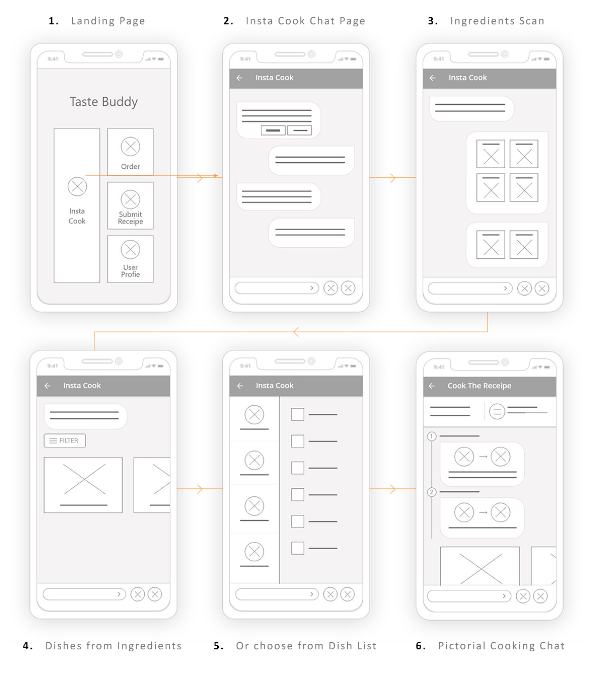
On reviewing our first storyboard we came up with these thoughts:
- Community Support would take the app to a higher level of involvement — need a hand here from a friend for example which is invaluable to many first time cooks
- I need an item/some ingredient which may be available in a friendly neighbour’s house.
- Help me to recover while or after preparing the dish which can be a brilliant option, especially for newbies in saving time, cost and wastage.
- Rework conversation flow with pictures for ingredients and bite sized cards for details
- Visual design consistency for all our slides
11. Visual Design Sign Off
We had the basic layout sorted for our screens so while maturing them we worked on evolving the design DNA of our UI. We poured through various food apps and decided on a simple flat design theme following current trend for ease of interface learning curve.
Colour and Typography
Food is grown form the earth and eating is an earthy activity too indulging all of ones senses.
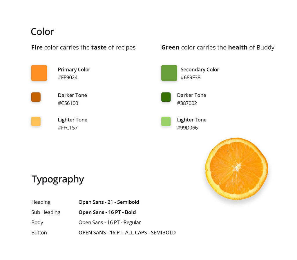
We initially went for the green theme as seen in the previous sections. However given that many natural ingredients are green we needed a complementary background. This helped us choose a warm bright shade of brown/ rust the soil on which flora florishes. This turned out to be Orange. Pastel shades go well with the Indian psyche — Indian skin tones, traditional Indian clothes and so on.
We wanted the screen to be toned down and not grab too much attention from the textual and pictorial content (pictures of ingredients or prepared dishes). This led us to choose a predominantly white screen background with a subtle veggie print texture on it. We then applied the Orange pallette on it to arrive at our Primary colours. The green pallette was chosen as a secondary colour for the occasional highlights.Open Sans for predominantly the chosen font.
Logo and Splash Screen
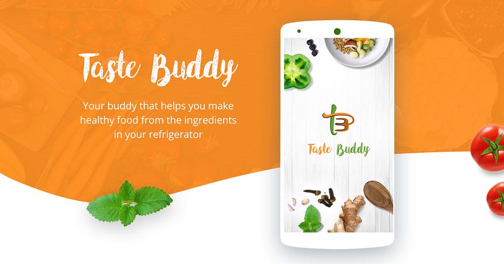
After deciding on the colours scheme, we used it to design the Logo for Taste Buddy. We used a humorous freehand approach to give it that handmade look. Universally a spoon and fork are icons connected with all things food. Presenting them in a hand drawn manner we got them to interact with each other in a dynamic manner to also form the letters ‘t’ and ‘B’ in a custom type format as seen here.

The idea was to give it that earthy emotion. To complement this logo design DNA the Splash screen too was designed with a handmade paper design backdrop with a smattering of fresh vegetables to give it a kitchen table top ambience which is where Taste Buddy is most likely to be used.
The Brand typeface can be a white handwritten font on an Orange background or an orange ‘Taste’ and green ‘Buddy’ on a white background to indicate our colour scheme.

High Fidelity Mockups
- The Landing Page with the oversized (most frequently used) Insta Cook Button.
- Taste Buddy starts chatting by displaying text in response to the user’voice on the Insta cook chatbot screen
- Taste Buddy identifies the various ingredients through image recognition
- Taste Buddy displays item list that can be prepared with available ingredients
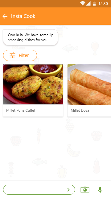
- Or Taste Buddy allows you to pick an item as per category
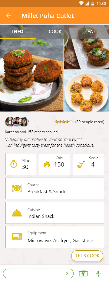
- ‘Info’ on chosen item ‘ Millet Poha Cutlet’.
- ‘How to Cook’ Millet Poha Cutlet.
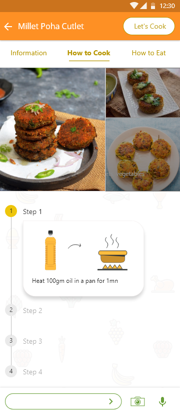
- Cooking instructions with pictorial instructions and an in build reminder for each step.

- Taste Buddy also gives you background music of your choice to set the right ambience.
Thanks for watching 🙂 Keep following Designerrs Lab for more insightful articles related to User Experience Design. Designerrs Lab provides a safe learning space for designers across the world. We are trying to make design education accessible for everyone by providing learning experiences and training programs for User Experience and User Interface Design, Design Thinking, Interaction Design, Visual Design, Designing for Immersive Experience (VR, AR, XR), Voice UX, and other specialisations.
