This project was done as part of the Virtual Reality UX Design Course at Designerrs Lab. The project focuses on Designing an Immersive Property Buying Experience in Virtual Reality. This was done in a span of 2–3 months and the design process was followed extensively.
Goal
The goal is to make the home search process experiential by using Virtual Reality.
Approach
As a first time VR designer, my approach was to understand the medium first. I experienced different VR apps on cardboard and Oculus GO. For each experience noted down different ways of interactions
Vision
Visualising a space even before it’s built is a big problem in the home search. Home is one of the biggest investments of a lifetime, yet the decision to buy it is taken by merely looking at photos and videos on flat 2D screen and then doing site visits in different parts of the city. For the Homebuyers, it is very difficult to visualize the location, property, amenities within, and the unit they are going to live in. Even after visiting different property sites for 1–2 months, they are only skeptical about the space that they are going to live in.
Competitor Analysis
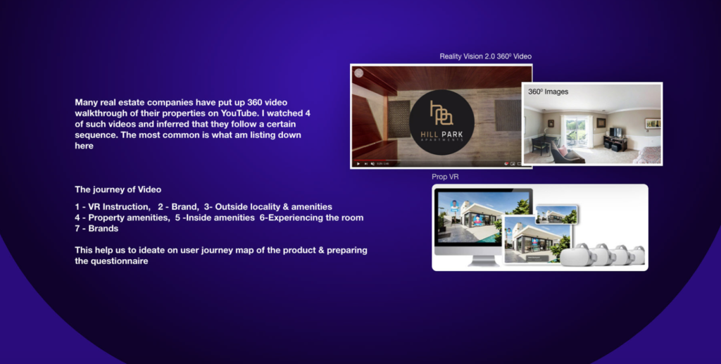
Many real estate companies have put up 360 video walkthrough of their properties on YouTube. I watched 4 of such videos and inferred that they follow a certain sequence. The most common is what am listing down here:
Shadowing
By employing the shadowing techniques during user research, we were able to get an ample amount of data related to users surrounding and body postures and their interactions with peers while they search property. The following were the main research data. The user is more engaged when there are good
1. Detailed images of the property.
2. They are interested in knowing the carpet area, super area, ventilation, etc.
3. They are keen on looking for good property dealers.
User Interview
The user interview conducted was based on the shadowing technique and a competitor journey map around the visual representation of properties (images/videos)
Example: I discussed the value of visuals (in the form of images and videos), the trust factor when it comes to property dealers, the finance, ventilation, carpet area, Vastu, etc.
Affinity Mapping
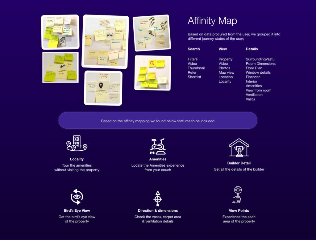
Based on data procured from the user, we grouped it into different journey states of the user
Search<: Filters, Video, Thumbnail, Refer, Shortlist
View: Property, Video, Photos, Map view, Location, Locality
Details: Surrounding, Room, Dimensions, Floor Plan, Window details, Financier, Interior, Amenities, View from the room, Ventilation, Vastu
Based on the affinity mapping we found below features to be included
Locality Tour the amenities without visiting the property
Amenities: Locate the Amenities experience from your couch
Builder Detail: Get all the details of the builder
Bird’s Eye View: Get the bird’s eye view of the property
Direction & dimensions: Check the Vastu, carpet area& ventilation details
View Points: Experience each area of the property
Personas
Goal: 1BHK, Ventilation, Locality, Amenities, Carpet Area.
Pain points: Visiting each apartment is a big task. Can’t look to area & locality before visiting. Can’t able to judge the dimension based on only an Image. Builder’s Trust
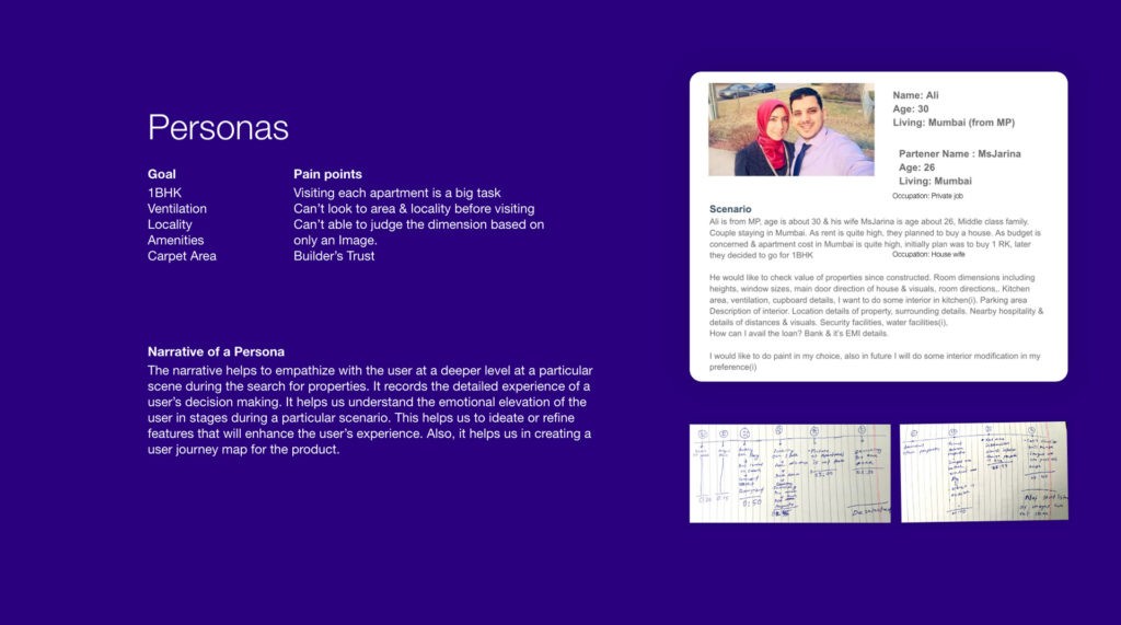

Narrative of a Persona: The narrative helps to empathize with the user at a deeper level at a particular scene during the search for properties. It records the detailed experience of a user’s decision making. It helps us understand the emotional elevation of the user in stages during a particular scenario. This helps us to ideate or refine features that will enhance the user’s experience. Also, it helps us in creating a user journey map for the product.pan
Ideation (BodyStorming)
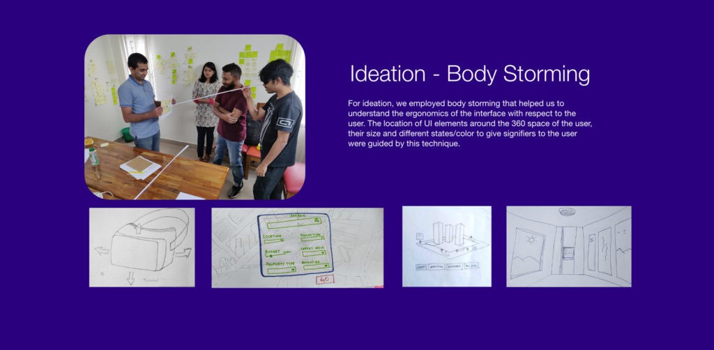
For ideation, we employed body storming that helped us to understand the ergonomics of the interface with respect to the user. The location of UI elements around the 360 space of the user, their size and different states/color to give signifiers to the user were guided by this technique.

Challenges & Solution in VR UI
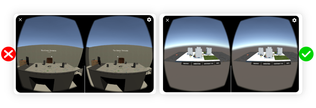
Though I had experience in 3d software like Maya and 3dsMax, designing for VR posed unique challenges as the output of 3d design on software differed when viewed in VR. Quick prototyping in Unity over multiple iterations allowed me to make UI design better
Challenge 1: A lot of time was spent on high poly 3D models of the buildings rather than VR Interactions, delaying the prototype output
Solution 1: Using the basic 3D model allowed to focus on VR Interaction
Challenge 2: UI panels block the view of properties, hindering the property viewing experience
Solution 2: Added Rotation & Zoom tools to have control the view zone

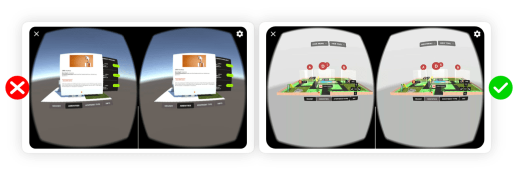
Challenge 3: Toggle Menu- The user is confused about how to disable the menu feature. That causes the conflict of menu features.
Solution 3: On gaze over one menu will show its features only.
Output
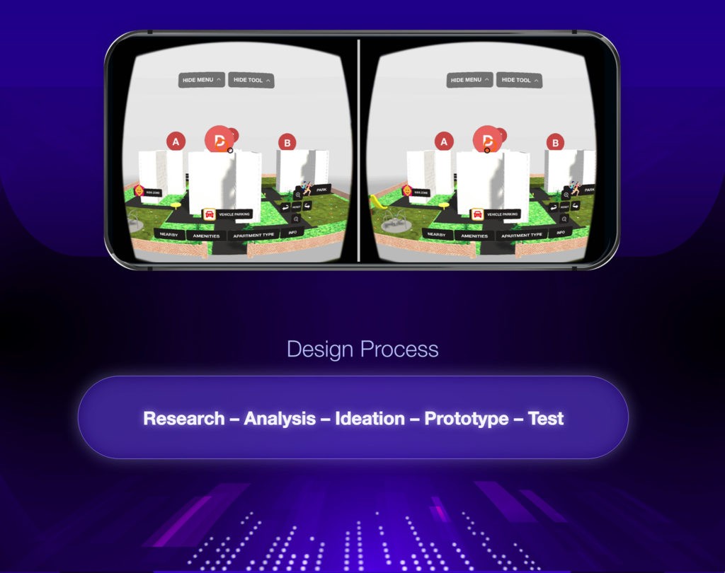
Nearby will allow showing nearby amenities of the property.
Amenities menu will to the visibility of an inside property.
The viewpoint will allow viewing a particular area in detail.
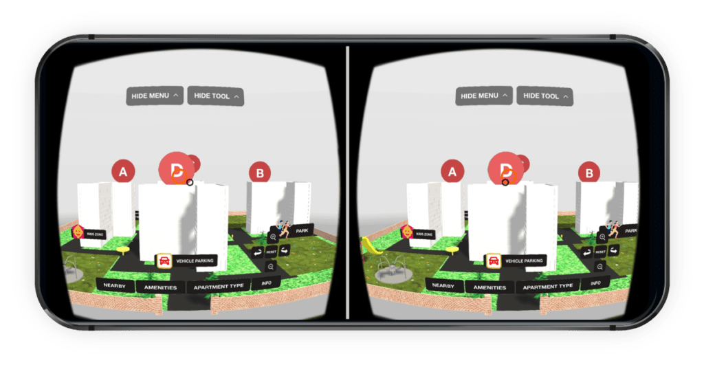
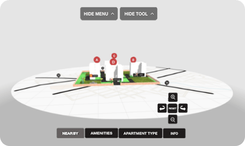
Nearby: Tour the amenities without visiting the property
Prototype: Click Here
Amenities: Locate the Amenities experience from your couch
Prototype: Click Here
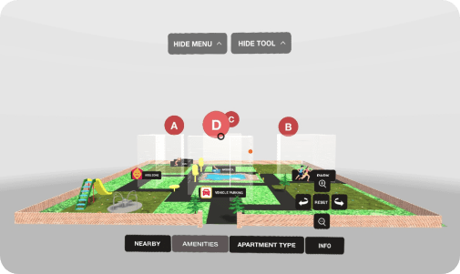
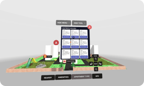
Apartment Type: Get the availability details of the apartments
Prototype: Click Here
Interested in learning UX Design for Virtual Reality? Join this 12-week course will enable you to get a thorough understanding of Virtual Reality Technology and Design Paradigms. Get mentorship from industry experts from Samsung, Microsoft, Cisco and jumpstart your career as UX Designer for Virtual Reality. Check out more articles on UX Design here on Designerrs Blog.
