In 2014 Google launched material design and it created a stir in the design world. With the passage of time, changes in the design industry took a rapid momentum, no wonder earlier this year when Google announced “Material you” design enthusiasts were all up to try out this latest design language.
As the name suggests, the Material is designed for you. In Android 12, Google is actually focusing more on making experiences personalized, private and adaptive. Although a lot of designers across the world have been relying on Material design, Google has found its way to enhance the design experience for both, creators and users. Here are the main highlights of Material, that you can’t sleep on.
Colors
Google’s Material you is redefining the colors by making a contrasting color set with primary colors and split complementary with secondary. Material you have color extractions for google pixel and uses a clustering algorithm that gives information on what color is complimentary, what is dominant and visually appealing.

Shapes
Material you bring a huge variation is shape and usage. Circular edges seem to have an edge of the current models and designs. You can see amazing work of lines and direction in Android 12 with weird shapes hovering all over, making it fun and bold at the same time.

Typography
Fonts size is another highlight of the material you. Whereat some places Big and bold fonts have been used for things like times and calendar, Small fonts with more padding have been used in navigation and title tags. In order to make things look more appealing and fancy, letters have been shaped and placed as per widgets.

Elements
The usage of elements has taken a major shift in material you. From work mode to designs everything has been centred on users’ experience. You can see depths in shadows and lights, flat designs, a lot of animations, a variety of themes, unusual icons shapes and a lot of other new stuff in Android 12. It also thrives to make your elements size fit into all the devices.

Experience
The whole experience of Android 12 revolves around making things more personal and realistic to which material lets you be a co-creator of your device and play with the looks and feels of the design. Google is rooting to translate this experience to each google device people use alongside great accessibility and real-time response.

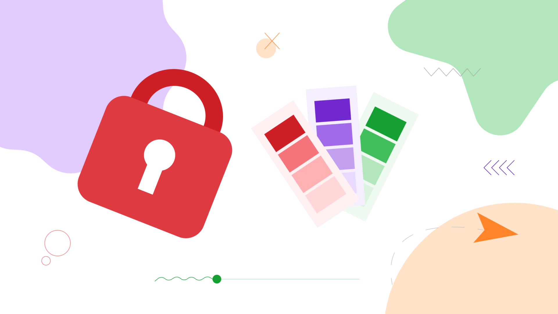
Privacy
With so many controversies around users’ data and safety, Google decided to make it a top priority with Material you. It aims to keep your location and application usage as private as it can, making it one of the main highlights of the most anticipated Android 12.

Material you is designed for you. It seems to be more alive, personalized and adaptive for users and designers. However, designers and critics have their doubts on certain aspects of it like if it’s viable on websites. What is your take on Material you? Are you a fan or critic? Let us know in the comment section.