
Vaccay, helps you plan to travel. This project was done as part of the UX Design Course at Designerrs Lab. It doesn’t just cater you to book hotels, provide information about restaurant and places to visit, but goes a step ahead and provide live itineraries. Vaccay aims to serve every traveling need from accommodation to a forum to discuss and get your queries resolved. It’s a key platform for anyone planning to travel for any purpose.
Design Process
To design “Vaccay”, we had gone through a UX process and the following paragraphs will take you through those design steps.
User Interviews
We had interesting yet challenging target users. It was a test of our skills to find out the user’s underlying pain points. So, we stepped out, met many users, tried to understand their experiences with travel planning apps.
We interviewed 6 users of diverse background and age group. We targeted the backpackers and travellers who like to explore rather than just touring the places. Such type of traveller tends to be financially independent and more into research and questioning in the forum.
There were traveller men aged between 28–40 and women backpackers aged between 27–35. Most of them work in Bangalore’s IT industry and few of them were in self-employed.
Affinity Analysis
Post user interviews, we headed to analyze the collected data. There were numerous things good or bad expressed by the users. We wrote down all the key information on the postals and pasted them on the wall.
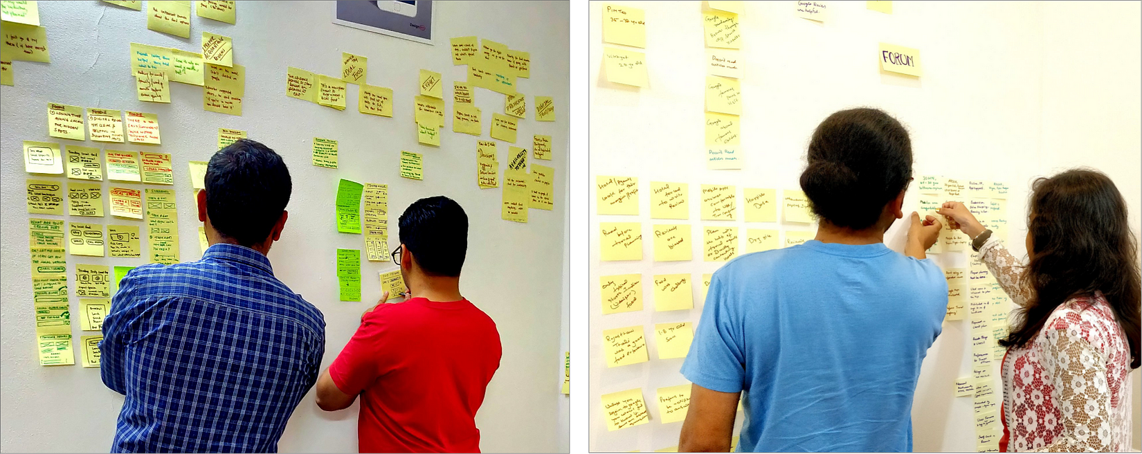
Next aim was to give that information some structure. To do that we grouped and regrouped the information to narrow it down so that we could start to see some patterns in the information. This whole exercise provided us insights about the user’s objectives, habits and pain points.
Insights
“Apps don’t show details such as travel time, duration of stay and user will have to email them for support.”


“Proper itineraries aren’t available.”
“Many of the times no response of queries.”
Redefined Problem Statement
After the primary research, we came to realize a shift in the problem statement and thus redefined it to:

“Sharing itineraries in forum which can help people plan better.”
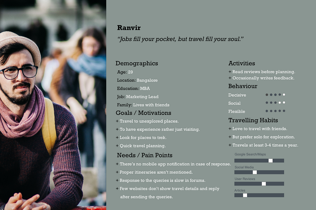
User Persona
The major pattern that we observed was about missing travel planning features. Most of the user mentioned the unavailability of itineraries and even if there were, those missed out details. Eventually, they had to depend on their friends and people around to plan.
Ideation and Brainstorming
There were many useful insights that we got from users. Users complained about the biased reviews and response in a travel forum. Unavailability of specific details such as Food and difficulty in using the travel forum.
It was at first difficult to find out the best ways to make it possible to share an itinerary so that it will resolve user pain points. So to find the effective solution we called up the discussion with the trainee’s group and requested them to feedback the ideas and help with any suggestions. Major activities involved were:
Discuss the problem statement.
Coming up with a range of ideas.
Limitation of ideas.
Finalize idea.

Potential Solutions

“User can have auto generated itinerary”
“User should be able to go live and create itinerary”


“User should be able to re-align his itinerary”
“User should be able to use pre-existing trips recorded by fellow forum users”


“User should see a map with places. Giving the flexibility to pick places and prepare an itinerary”
Selected Solutions
After much of discussions, feedback and multiple iterations, we came to conclude the following two task flows:
Search question in forum and tag the itinerary from the user’s collection.
From user profile, share itinerary to the questions, filtered based on the itinerary location. Give user flexibility to modify it.
Task flow
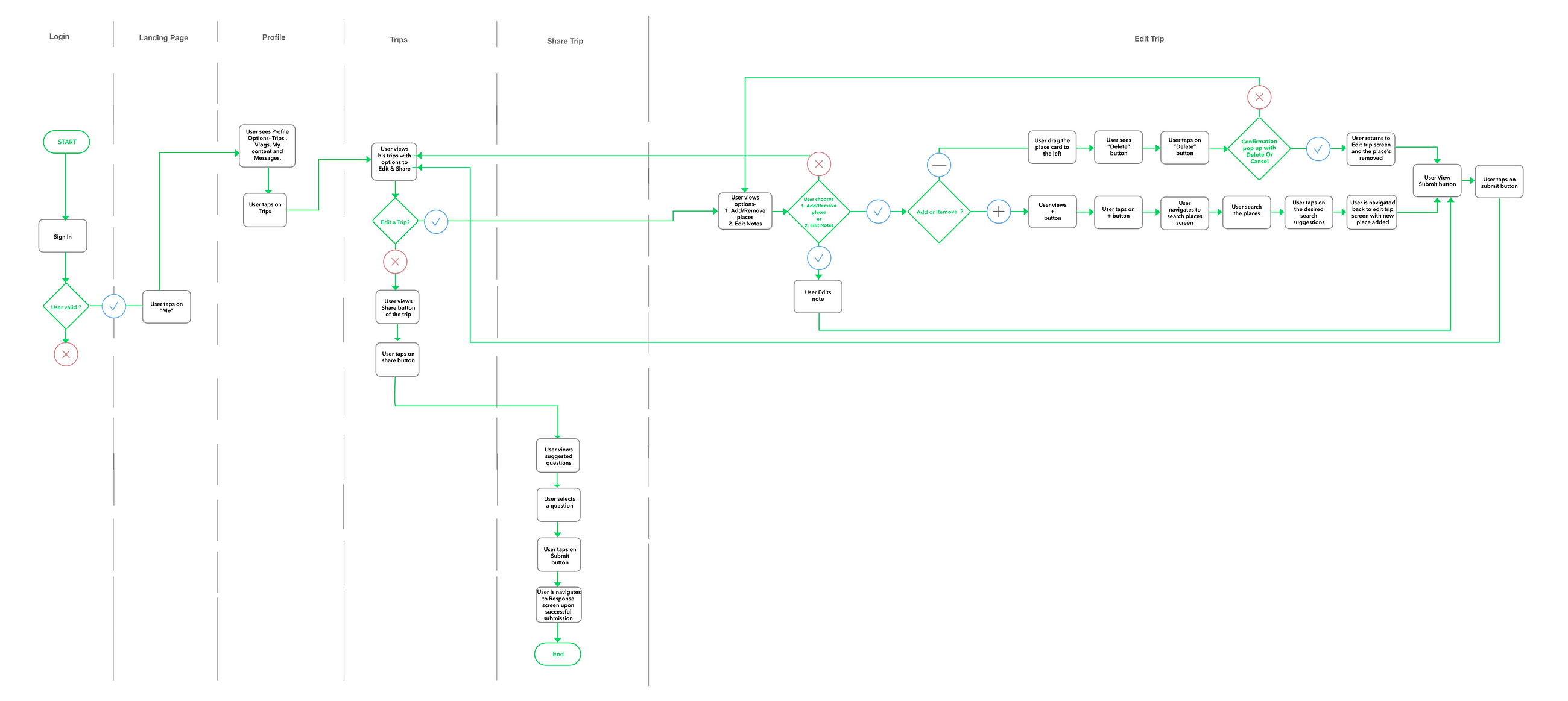
Sharing itinerary from user profile
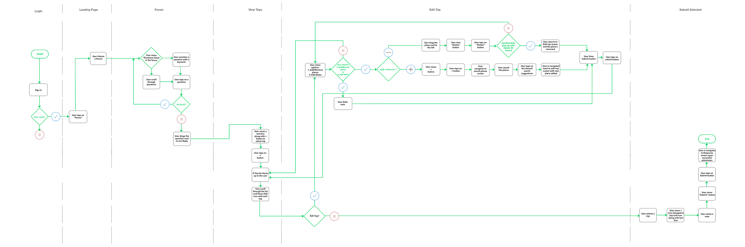
Sharing itinerary in Forum

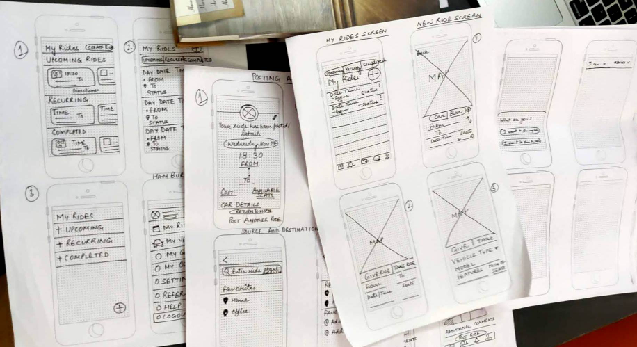
Wireframes
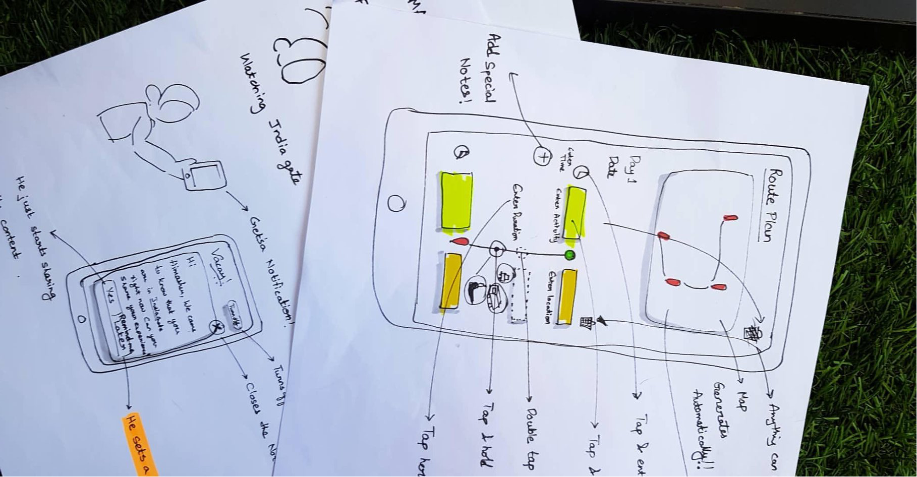
The design phase started with sketching the finalized ideas on paper. We performed many iterations to draw the layout ideas and its elements on different pages. This activity was taken ahead in three parts as described below. At each step, we went back to the stack-holders, showcased the wireframes and sought feedback and approval.
Low Fidelity
Mid fidelity Wireframes
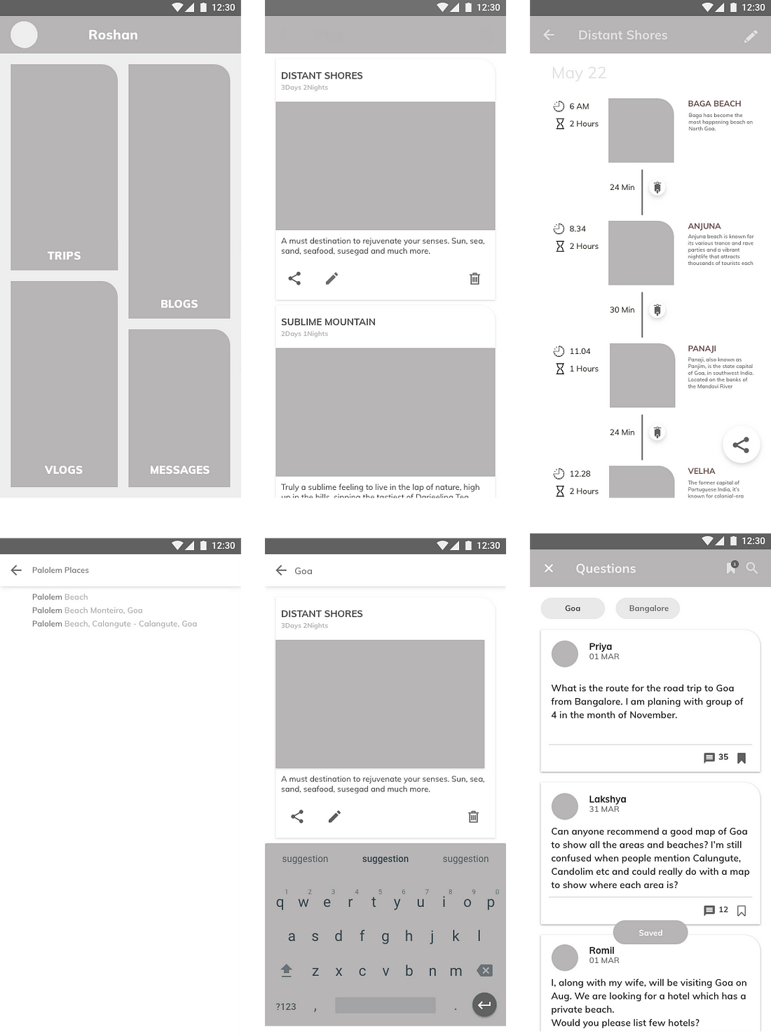
High Fidelity
Mood-board
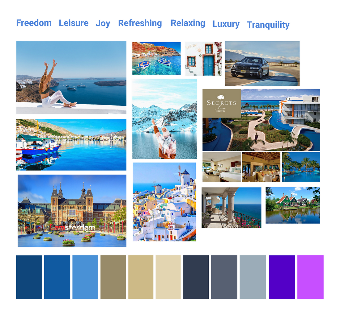
While making the decision for the primary and secondary colour for the vaccay app, We had a lot of features in this app and all of them gave out a certain expression, which in turn is manifested in a colour scheme. But to have a single colour scheme for the entire app was a tough nut to crack.
Instead of looking at individual features, we took a few steps back and concentrated on the holistic view.
Who is this app for? This is an app for vacationers.
Why do people take vacations? People take vacations to get away from the hustle of daily life, to experience new things, to relax.
Again, what is basically happening when people take vacations?They are treating themselves, they are giving themselves times, they are giving themselves the luxury of time, the luxury of forgetting about work, the luxury of being a king/queen for a few days.
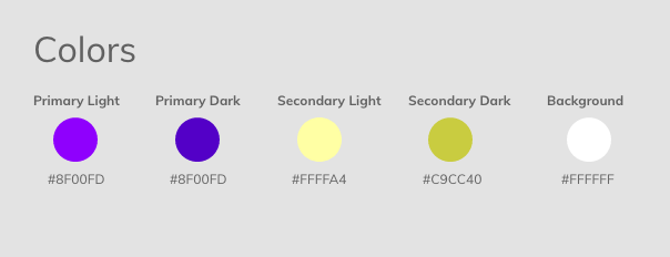
“According to the above thought process, Luxury of time, Luxury of being carefree were the expressions of the app. Tints/shades of purple along with its complementary colour pattern were then chosen as the primary and secondary colours.”
Color Palette

Typography
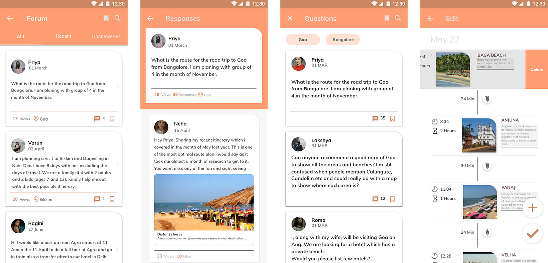
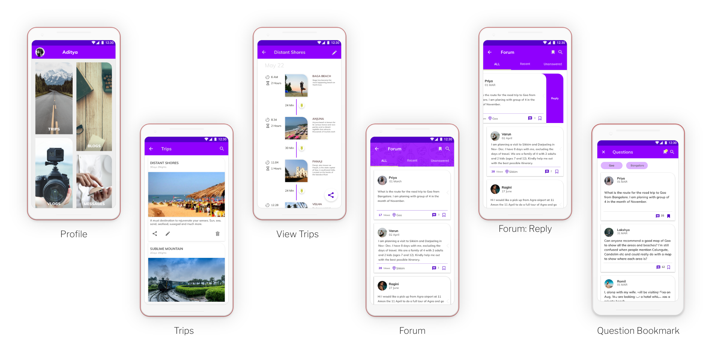
Final screens
Conclusion:
We could mange to design the new and refreshing itinerary sharing feature as part of travel app “Vaccay”. Which certainly is going to improve the usability of travel forum and help people to plan better.
This article is written by Himanshu Varshney as part of Dschool publication on Medium hosted by Designerrs Lab.