If you’ve ever wanted to take a road trip with your friends or needed to drive down to someplace urgently and did not prefer your own car for that, chances are that you’ve come across the Zoomcar mobile app.
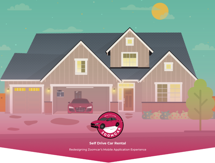

This service allows a user to rent a car on the basis of distance or time requirements and allows for airport pickups and drops along with home delivery of cars in select areas. Apart from the car rental service, they also have bike rental services. But for this case study, the team has primarily reworked the car rental services alone. During the initial stages of the redesign process, the team tried to understand the business ecosystem of Zoomcar, consumption patterns among its customers and the competitor landscape. Currently, the app lets a registered user search for a car or a bicycle (For shorter distances) to rent for a number of days. The charges are fixed for a certain number of days and kilometers. Extra charges are incurred when a user overshoots the predefined time or kilometer usage. The user may also have to pay of damages incurred while on the drive. Interstate taxes and governmental issues are handled by the company. Accident helpline is also embedded in the app. The application also allows for airport pickups and drops. This was followed by a thorough heuristic evaluation of the current mobile application of Zoomcar. Here is an overview of the Design Process followed for the project: 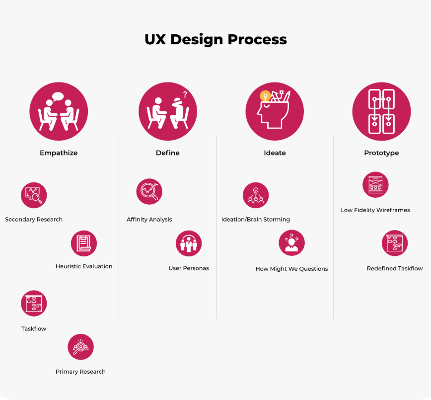
This usability evaluation method of the heuristic evaluation helped the team find usability issues in the user interface at an early stage of the current application. Some of the major findings are discussed below:
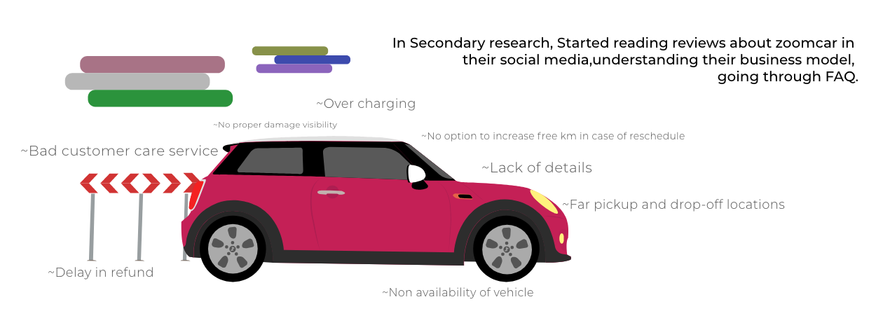
No visibility of system status: The user, while signing up did not know how many steps to follow. In fact, some of the users who were observed while the app was being used could not tell if and when during the task flow, sign in might be required. Same was the case during the selection of the car make and model. It looked like the application expected the user to tap next and find their way out till a screen showing the end of the process popped up. Inconspicuous touch targets:Several important touch targets like, selection of delivery type were not very prominently placed leading to several users backtrack to the initial pages when they discovered they haven’t made the choice earlier. The filtering mechanism for the search results was also a difficult touch target placed at a zone that might require the user to exert extra effort to tap on. The heuristic point violated, in this case, is “Flexibility and efficiency of use”. Freedom of choices few and far between: The filter mechanism only showed three choices based on the car make. This feature wasn’t very useful for some of the users who were observed while using the application. This is because most users wanted to filter cars on the basis of the number of seats or transmission type and did not find those choices in the filter field. Here the system violated the heuristic of “User control and freedom”. Steeper learning curve than most applications: With no noticeable on-boarding screens, the application required several users to work with what other people already knew about the process or take extra time out to figure out the booking process. During the drive, grievance redressal and customer care process was long and was hidden away in an improbable area. The process itself required a double-handed, heavy involvement searching to find which wasn’t possible while driving a car. Given a complex setup, the app violated the heuristic of “Error prevention” by not easing out the workflow. No way to know anything about the car:There were no ways to know anything about the status of the car during delivery or about customer feedback on each model before accepting delivery thereby taking away freedom from the user. Here the system violated the idea of “match between the system and the real world”. In a brick and mortar rental service, users get to see the condition of the car being rented out to them. The mobile application was then tried and tested to reveal the path a typical user has to take in order to meet a goal. This was done by several users so as to reveal the various ways in which someone intending to rent a car might go about the process 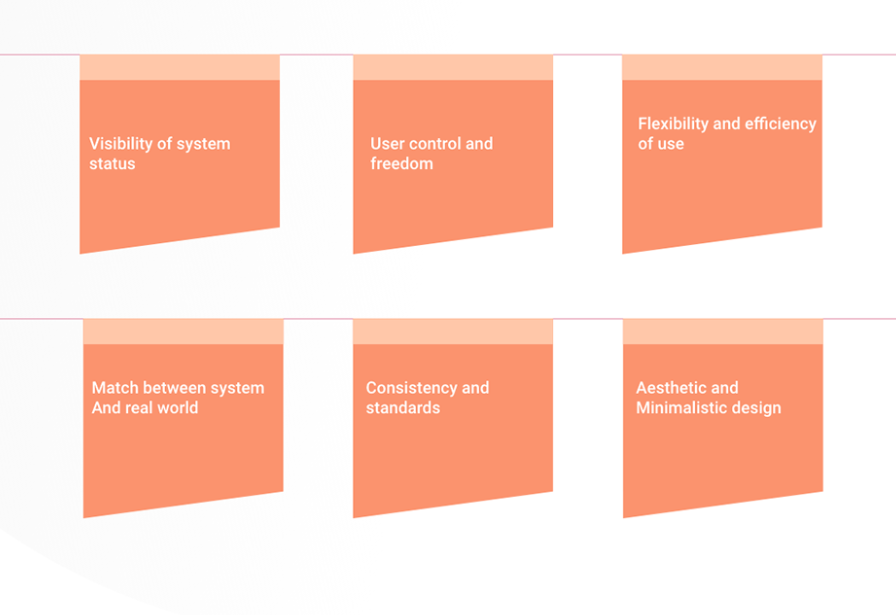
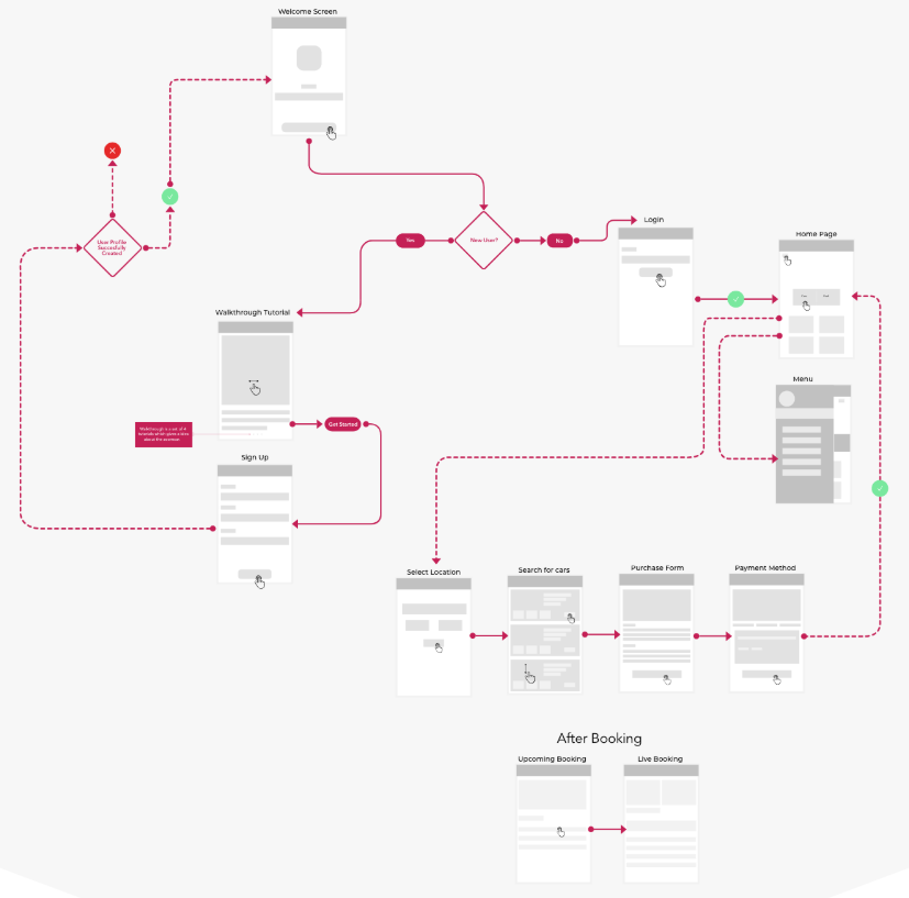
Task Flow Analysis
Deeper inspection and observed usage of the application revealed the task flow did not augment the user journey map that was revealed at user research stage later and required the user to break away from the natural flow of their decision-making process. Some of the example questions were “When was the first time you thought of renting a car for yourself?”, “why did you want to drive the rental car yourself?”, “what were you specifically looking to do with the rental car?”, “What device do you use often while booking rental cars? , “what kind of traveling do you generally take part in?” From the collective responses, we discovered the following: The complete user journey map revealing the process the user goes through from goal setting to satisfaction of the need. The pain points that the user feels such as their frustrations. The users’ delight and motivation from the whole process Several heuristics based questions were also asked the users. This was a part of a separate questionnaire detailing basic usability questions. This was mostly done with potential users or early stage users who weren’t familiar with the application’s task flow and were placed at the bottom of the learning curve associated with it. Examples of questions are as follows: “What do you think this button does?” “What would you expect to go after you click here?” “What does this screen make you feel?” These questions revealed the following: 1.Users’ decision making process 2. Predictability of the interface and user expectations.
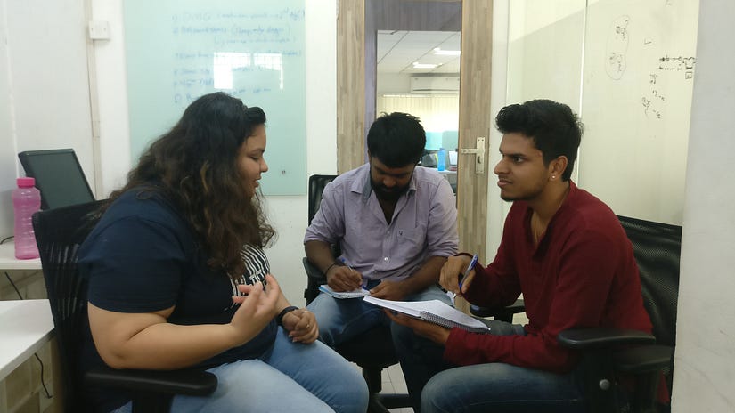
One of the users describes her journey while booking a car
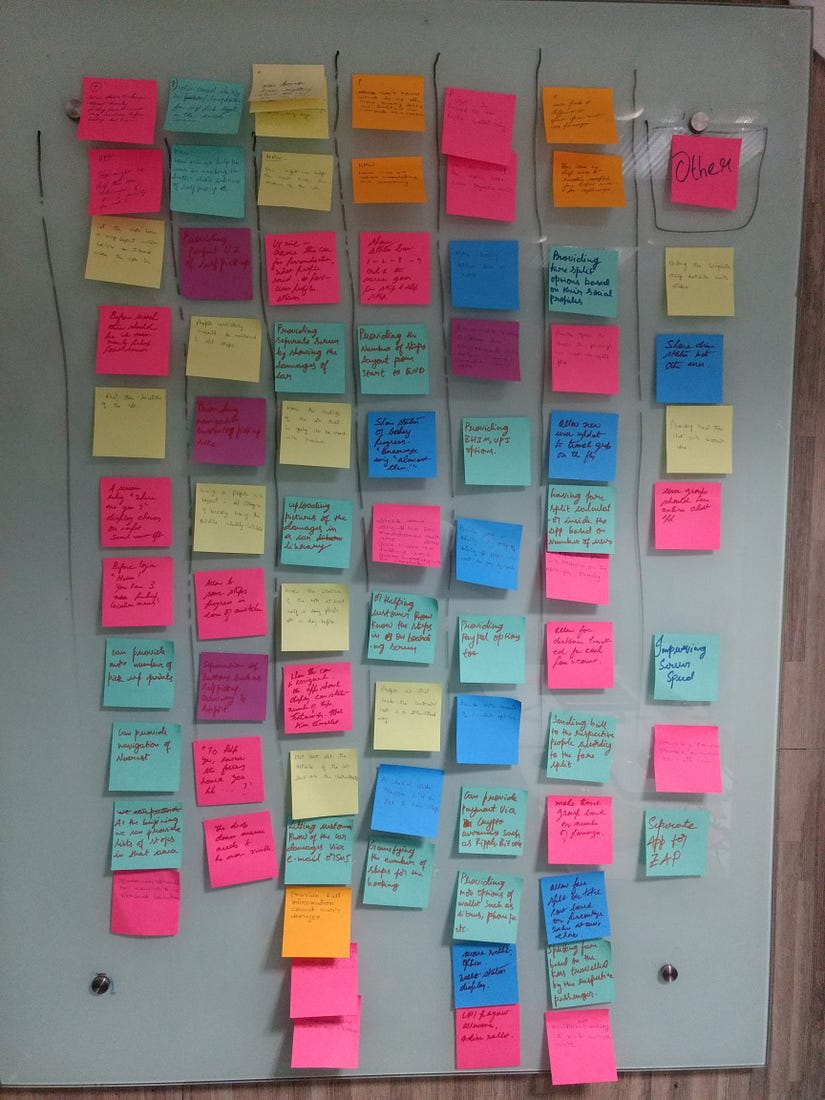
Synthesizing research through affinity analysis
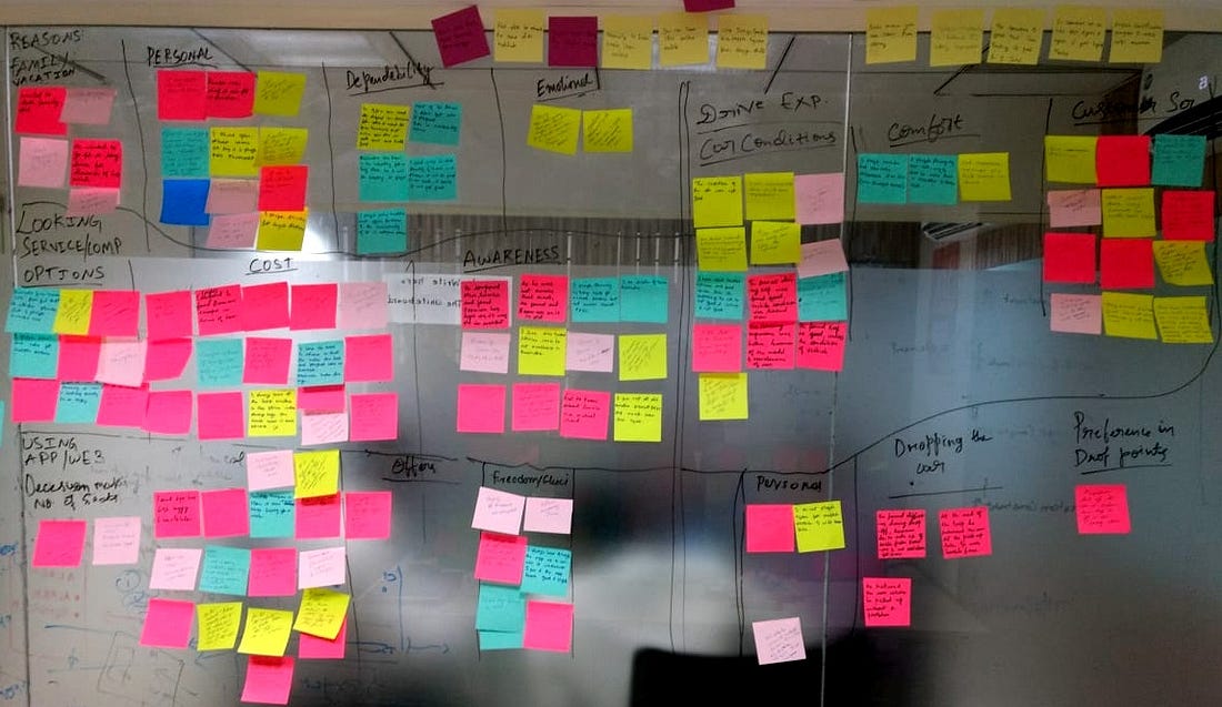 Affinity Analysis
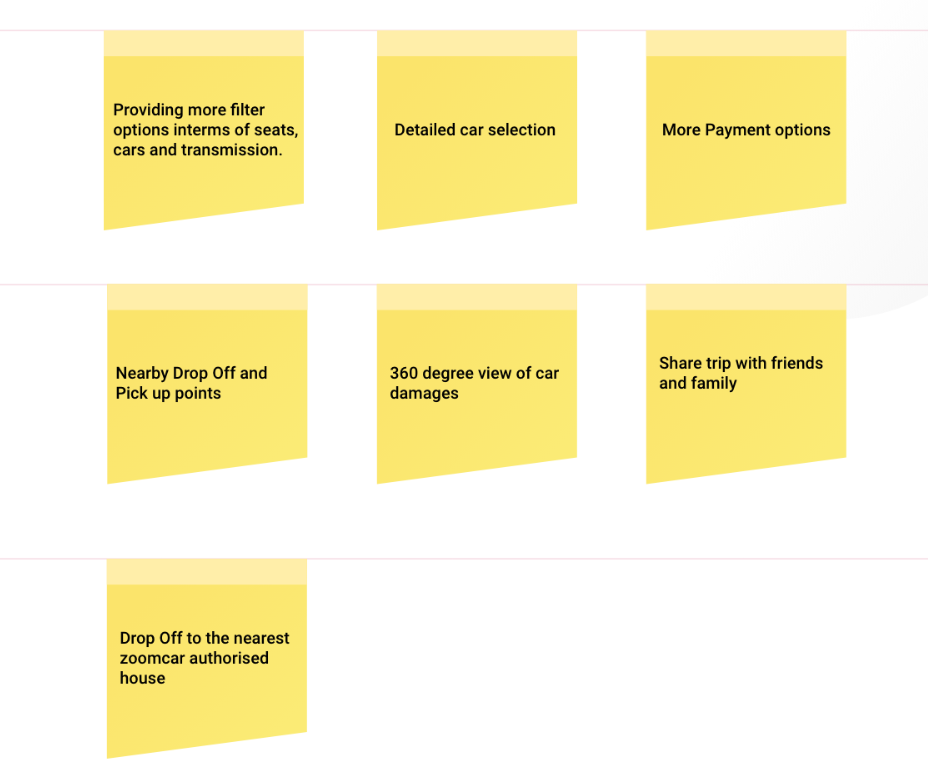
Once all the user statements were transcribed on sticky notes, they were then organized in accordance with their natural relationships and grouped together through affinity analysis. This helped to see the how’s and why’s of each and every user behavior and also let to the identification of user personas and their major pain points. Affinity analysis revealed some of the major pain points of the users. Some of them lie in the following areas: The users found it difficult to locate certain buttons such as the toggle between the types of pickup. Search results for cars did not have filter criteria such as number of seats, or transmission type. There were no easy methods available to the user to find out about the condition of the car or damage log because of which several users were left in the dark. 4. There was no feedback mechanism in place regarding the driving experience of a car for subsequent users. 5. During the drive there was no feedback mechanism giving the user the ride status with regard to time remaining or KMs remaining from the original deal or keeping the user updated with regard to overshot time and KMs. 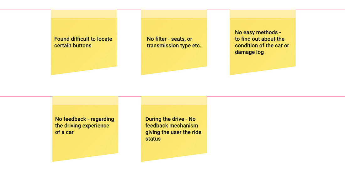 Users Pain Points
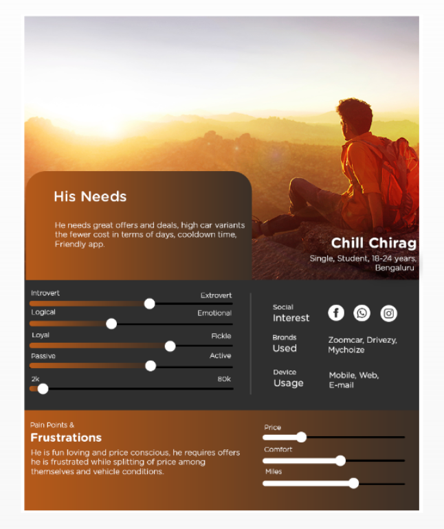
Identifying User Personas
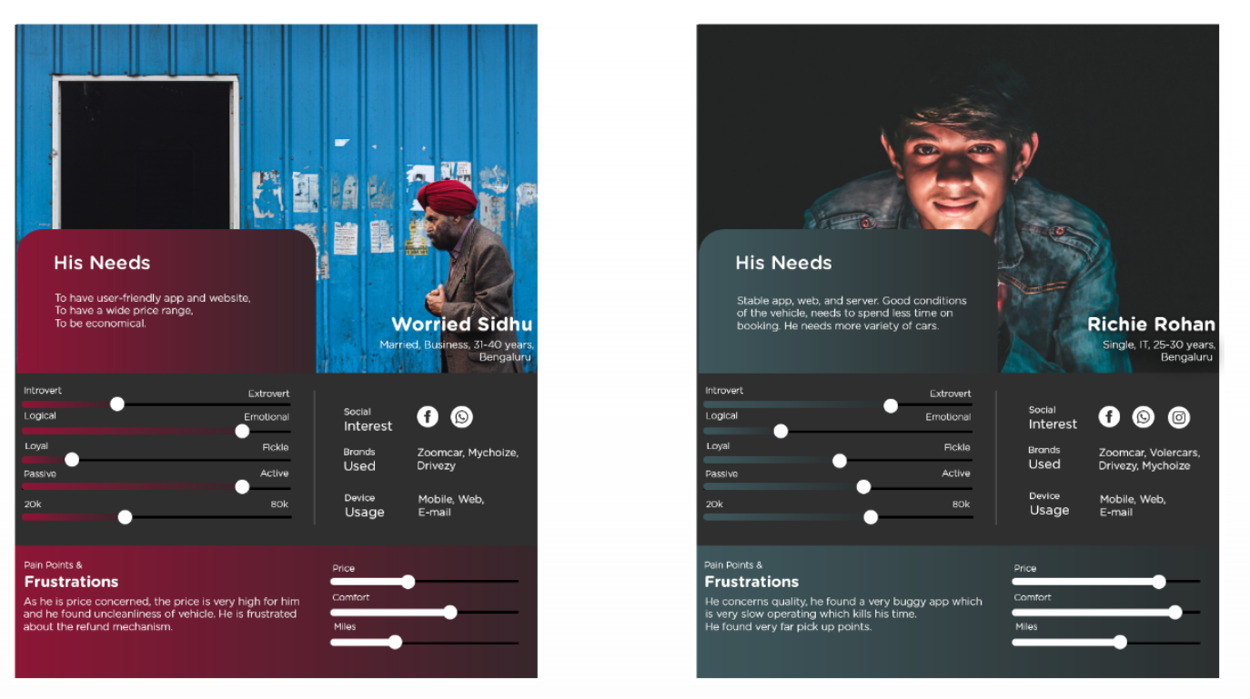
User Personas
Based on the analysis of user responses through affinity analysis, the team created user personas who represented different personalities who would be using the app to meet certain goals and having certain motivations.
Bridging the gap between pain points to ideas
Based on the cumulative analysis of all of the above, the team listed down all the major pain points and created ‘how might we’ (HMW) questions that would help us kickstart the ideation phase. Here are some of the major HMWs: How might we make it easy for the users to find the vehicle they need? How might we make it easier for a driver to keep an eye of the time and Kilometer limit? How might we use the available business set up to optimize the satisfaction of user in terms of pickups and drops? How might we help the user feel more in control of the vehicle allocation process? How might we give the user a voice in becoming part of the larger community of users? How might we help the users be in control of the costs they incur? How might we help the users feel at ease in cases of emergency involving the vehicle or the company? After a thorough brainstorming session, a few areas of exploration were zoomed in on.
How Might We questions | Ideation
Ideation (Brainstorming)
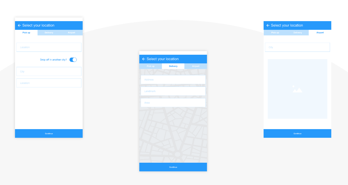
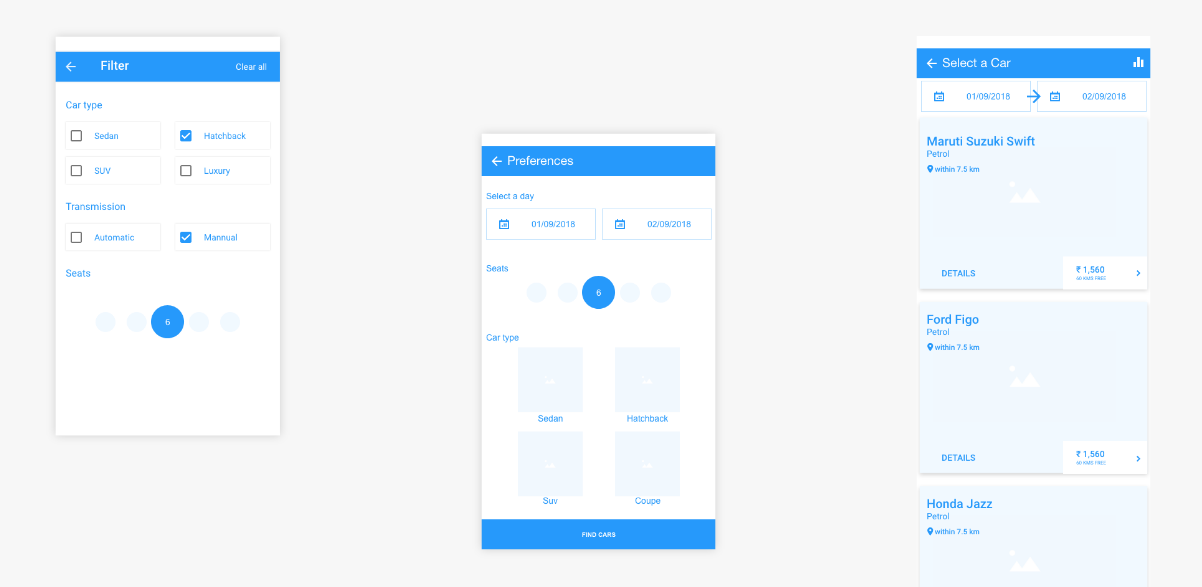
The User flow that is currently in place in the mobile app doesn’t put the user in control and is prone to errors and irreversible choice scenarios. In the research phase, it was found that the first point that users focus on is the location they want their cars at. In order of preference, another important area is the number of seats the user is looking for. The car make is third in line and transmission type is fourth. Another important area of consideration was the touch target sizes for important filters such as the delivery type (Home, Self-pickup or Airport). During the usability analysis, most respondents found it difficult to set it to their liking. The third area of need as seen in the team’s research was the accessibility to SOS features. It needed to be made easier and more obvious. The above were areas where the User Interface of the application needed to be spruced up. Some more broad ideas that were explored are as follows: Park anywhere: A rental parking space that is crowd-sourced from people who have free garage spaces will allow users to park at a wider number of locations across a city. Chatbot assistant for instant help during the drive: A chatbot assistant that helps users out with basic QandA regarding the drive and the car will add to the involvement of the riders and the company as a whole. The team believed that this would lead to a sense of ownership among the people renting the car. Additionally, the progress of the drive can be shared socially as well as within a closed group as a user delight. After weighing in on all ideas presented, the team proceeded to redefine the task flow of the application and further wireframes.
Making Skeleton through Wireframing
Here is when the functionalities of the product take a more tangible shape in the form of wireframes, where the designer focuses more on the interactions and usability to make an intuitive UI.
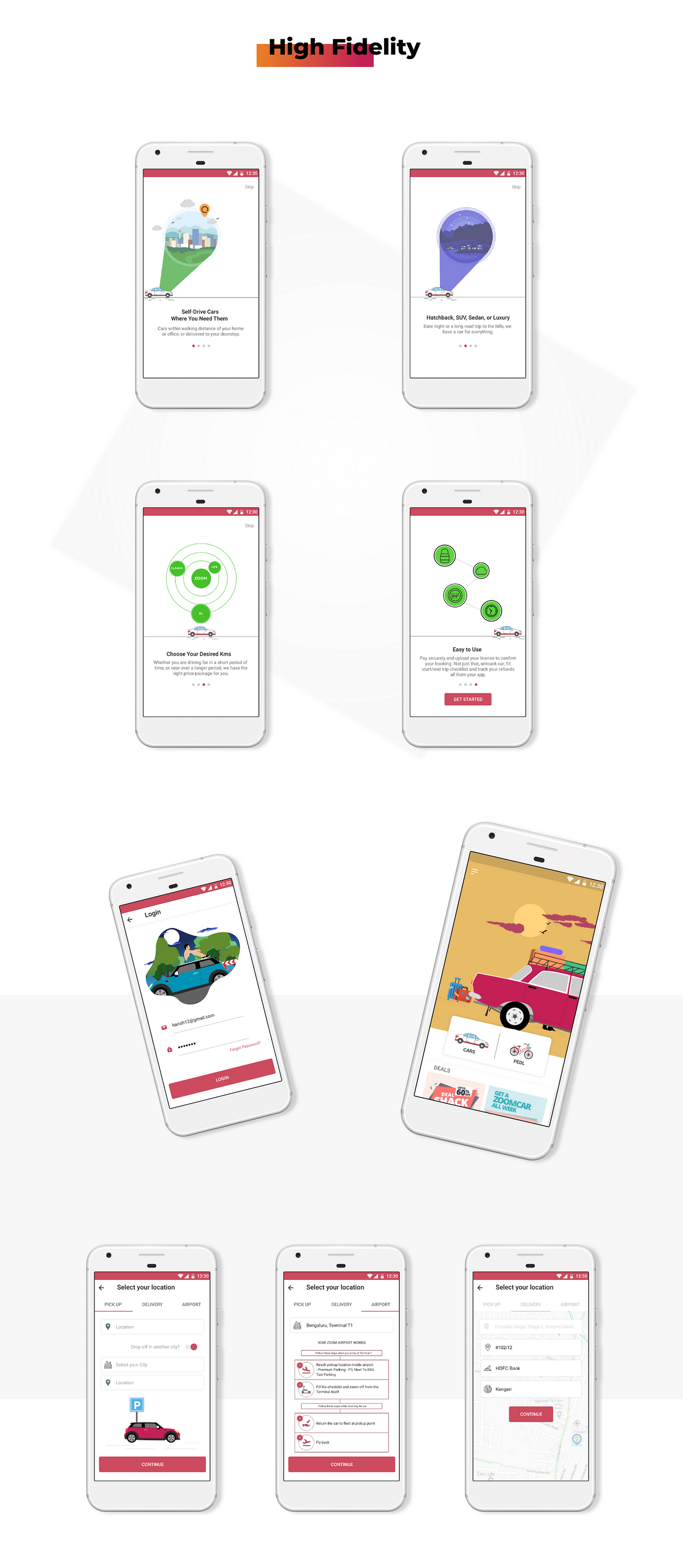
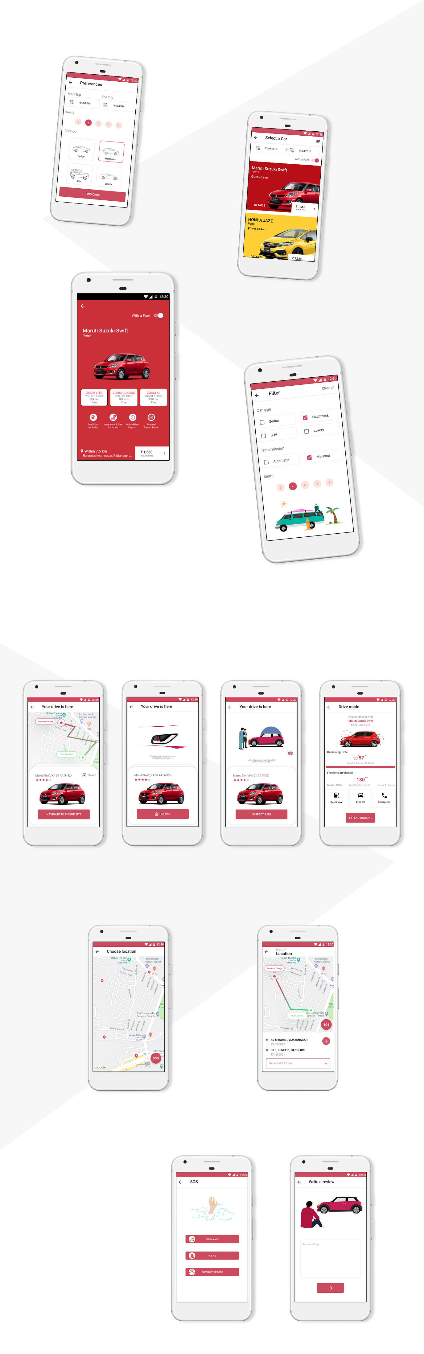
Using Aesthetics to complement Usability
 Here is when the skeleton of the mobile application is given skin or surface to make the UI more relatable to the user and to evoke certain feelings in users mind.
This project was done as part of the Full Stack UX Training provided by Designerrs Lab. Designerrs Lab provides a safe learning space for designers across the world. We are trying to make design education accessible for everyone by providing learning experiences and training programs for User Experience and User Interface Design, Design Thinking, Interaction Design, Visual Design, Designing for Immersive Experience (VR, AR, XR), Voice UX, and other specializations.